Volume-Confirmed Momentum Across 17 Markets: +7.60% in the UK, -1.15% in India
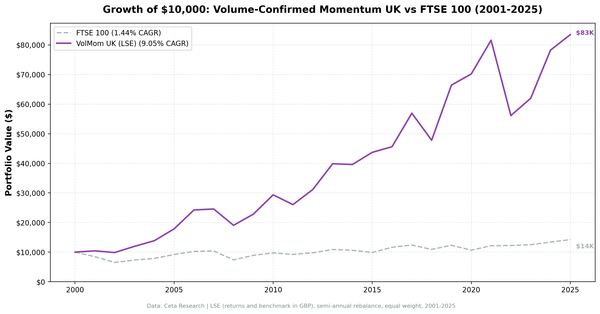
Same strategy, 17 global exchanges, 25 years. Volume-confirmed momentum returned +7.60% excess vs the FTSE 100 and +6.81% vs the OMX Stockholm 30, but -1.15% vs the Sensex in India and -0.67% vs the S&P 500 in the US. The local benchmark drives most of the ordering.

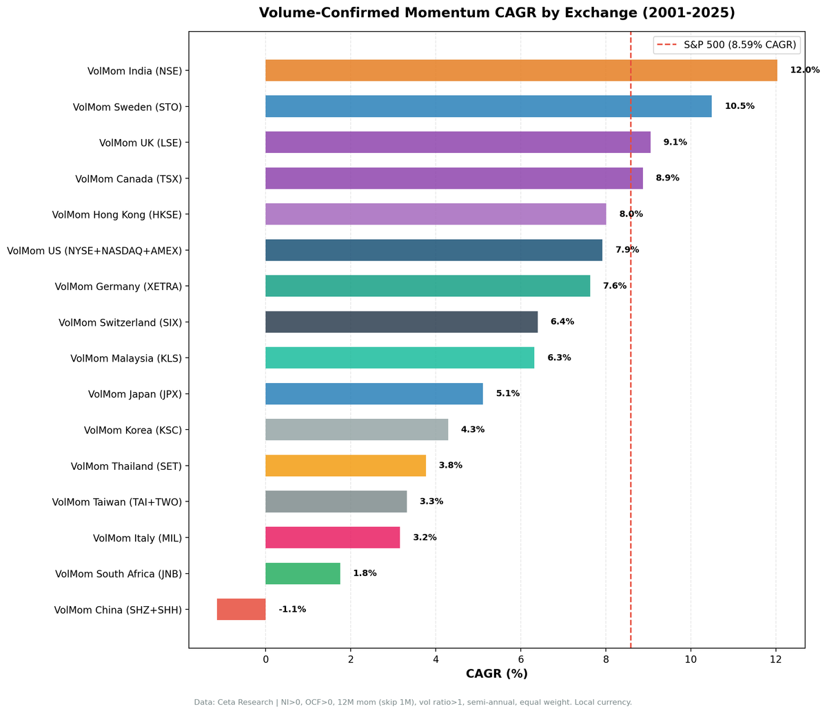
Same signal, 17 markets, 25 years. Volume-confirmed momentum, meaning rising 3-month volume plus skip-last-month momentum plus basic quality filters, returned +7.60% excess annually in the UK, +6.81% in Sweden, +5.99% in Hong Kong and +4.80% in Switzerland when measured against local benchmarks. It returned -0.67% in the US and -1.15% in India, where the strategy appears strong against SPY but actually underperforms the Sensex. The difference isn't the strategy. It's the benchmark.
Contents
- Method
- What We Found
- Market by Market
- Backtest Methodology
- Limitations
- Takeaway
- Part of a Series
- References
Data: FMP financial data warehouse, 2000–2025. Rerun September 2026.
Method
| Parameter | Value |
|---|---|
| Universe | 17 global exchanges |
| Rebalancing | Semi-annual (January, July) |
| Signal | 12-month return, skip last month (T-1M to T-12M) |
| Volume filter | 3-month avg daily volume > 12-month avg (vol_ratio > 1.0) |
| Quality filter | netIncome > 0 AND operatingCashFlow > 0 (FY, 45-day lag) |
| Selection | Top 30 by momentum, equal weight |
| Min threshold | 10 qualifying stocks to deploy capital |
| Data source | FMP via Ceta Research warehouse |
| Benchmark | Local currency index for each exchange (see table) |
| Period | 2001–2025 |
| Academic reference | Lee & Swaminathan (2000), Journal of Finance 55(5) |
The same backtest code ran on every exchange. No parameter tuning per market. Market cap thresholds scale to local market size. Everything else is identical.
Important note on benchmarks. Earlier runs compared all exchanges against SPY. That comparison is useful for a global investor allocating capital, but it obscures how the strategy performs against what a local investor would actually use. For example, India produces +3.44% annual excess vs SPY, but vs the Sensex the strategy underperforms by 1.15%. This study uses local benchmarks throughout. The SPY comparison is noted where it materially differs.
These benchmarks leave dividends out. Portfolio returns here use dividend-adjusted prices, so they include dividends. Most of the indices we measure against do not. The FTSE 100, Hang Seng, KOSPI, Nikkei 225, OMX Stockholm 30, Oslo All Share, SET Index, SMI, SSE Composite, Sensex, TAIEX and TSX Composite are price indices, so excess return against them is overstated by roughly the local dividend yield. We measured this for the UK, the market where it bites hardest: over 2002-01 to 2025-07 the FTSE 100 price index compounded at 2.24% while the iShares FTSE 100 tracker with dividends reinvested compounded at 5.79%, a gap of 3.55 percentage points. Two comparisons in the table are like for like: the S&P 500 figure runs through SPY, which is dividend-adjusted, and the DAX is a performance index. Treat any edge thinner than the local yield as a tie rather than a win.
What We Found
The spread across markets is wide, and the local benchmark does much of the work. Some markets that looked weak against SPY perform well against their own index, because the local index itself underperformed SPY. We report the spread below and are deliberately cautious about explaining it: nothing in this study measures who is trading in each market.
Full results across 17 exchanges:
| Exchange | CAGR | Local Benchmark | Benchmark CAGR | Excess (local) | Sharpe | Max DD | Down Capture | Cash% |
|---|---|---|---|---|---|---|---|---|
| LSE (UK) | 9.05% | FTSE 100 | 1.44% | +7.60% | 0.303 | -39.32% | 54.4% | 4% |
| STO (Sweden) | 10.49% | OMX Stockholm 30 | 3.68% | +6.81% | 0.487 | -32.10% | 30.7% | 31% |
| HKSE (Hong Kong) | 8.01% | Hang Seng | 2.01% | +5.99% | 0.181 | -54.70% | 64.8% | 10% |
| SIX (Switzerland) | 6.40% | SMI | 1.60% | +4.80% | 0.407 | -28.05% | 54.9% | 29% |
| TSX (Canada) | 8.87% | TSX Composite | 4.75% | +4.12% | 0.404 | -43.03% | 34.8% | 4% |
| XETRA (Germany) | 7.63% | DAX | 5.58% | +2.05% | 0.304 | -42.96% | 64.8% | 8% |
| JPX (Japan) | 5.11% | Nikkei 225 | 4.45% | +0.66% | 0.220 | -56.29% | 89.5% | 4% |
| NYSE/NASDAQ/AMEX (US) | 7.92% | S&P 500 | 8.59% | -0.67% | 0.243 | -61.11% | 145.7% | 0% |
| NSE (India) | 12.03% | Sensex | 13.18% | -1.15% | 0.209 | -67.18% | 69.3% | 20% |
| SET (Thailand) | 3.77% | SET Index | 5.98% | -2.21% | 0.084 | -31.81% | 47.1% | 33% |
| KLS (Malaysia) | 6.32% | S&P 500† | 8.59% | -2.27% | 0.365 | -12.89% | 8.1% | 41% |
| TAI_TWO (Taiwan) | 3.32% | TAIEX | 6.40% | -3.08% | 0.110 | -51.36% | 96.6% | 31% |
| SHZ_SHH (China) | -1.15% | SSE Composite | 2.05% | -3.20% | -0.100 | -68.33% | 94.2% | 8% |
| KSC (Korea) | 4.29% | KOSPI | 7.52% | -3.23% | 0.067 | -37.94% | 57.3% | 31% |
| MIL (Italy) | 3.16% | S&P 500† | 8.59% | -5.43% | 0.010 | -38.61% | 85.4% | 43% |
| OSL (Norway)* | 5.07% | Oslo All Share | 11.20% | -6.13% | 0.173 | -19.24% | n/a | 82% |
| JNB (S. Africa) | 1.75% | S&P 500† | 8.59% | -6.84% | -0.722 | -33.37% | 45.8% | 67% |
†No local benchmark available in FMP. SPY used as fallback, so these rows compare a local-currency portfolio against a US-dollar index. *Norway result unreliable: the Oslo All Share series begins in 2013, so 25 of the 49 rebalances are unmeasured and the leg sat in cash 40 of 49 periods.
The local benchmark drives most of the ranking. Markets where the local index underperformed (Sweden, UK, Hong Kong, Switzerland) look like alpha generators. Markets where the local index performed strongly (India, Korea, Norway) look like failures. Before reading a market-structure story into that ordering, note that it is close to an ordering of how badly each local index did.
Markets where the benchmark choice changes the narrative: - India: +3.44% vs SPY, but -1.15% vs the Sensex. The factor doesn't beat the home index. - UK: +0.46% vs SPY, but +7.60% vs the FTSE 100. The FTSE 100 price index returned 1.44% CAGR. - Germany: -0.96% vs SPY, but +2.05% vs the DAX. - Switzerland: -2.19% vs SPY, but +4.80% vs the SMI, which returned only 1.60% CAGR. - Hong Kong: -0.58% vs SPY, but +5.99% vs the Hang Seng.
Market by Market
First, the citation this strategy is usually hung on. Lee & Swaminathan (2000) did not argue that rising volume signals accumulation that extends a trend. They found the reverse for the long leg: "high (low) volume winners (losers) experience faster reversals," and "among winners, low volume stocks show greater persistence in price momentum." Their momentum life cycle classes high-volume winners as late-stage momentum, and high volume as a marker of glamour and investor favouritism rather than informed buying. A long-only high-volume-winner portfolio, which is what every row in the table above is, is not the trade the paper supports. It is also a US study of NYSE and AMEX stocks ranked on turnover, so it makes no prediction about the other 16 markets here.
What follows is description, not mechanism. A market-structure story is available for most of these rows, and we cannot test any of it with this data.
Sweden. The highest Sharpe ratio in the study (0.487) and a 30.7% down capture, the lowest of the markets that stayed largely invested. It also sat in cash for 15 of 49 periods, including 2008 and 2009, so part of the risk profile is absence from the market rather than resilience within it.
Switzerland. Sharpe of 0.407 with 54.9% down capture, against an SMI that compounded at 1.60%. The SMI is a narrow index dominated by three mega-caps, so a broad Swiss momentum book is not holding what the benchmark holds. Cash in 14 of 49 periods.
Canada. +4.12% excess with 34.8% down capture and only 2 cash periods, the second-lowest down capture among the markets that stayed invested throughout. The TSX's weighting toward energy and materials is the most likely source: those sectors track commodity cycles that decouple from equity drawdowns.
India. The strategy underperformed the Sensex by 1.15% annually. The high absolute return (12.03% CAGR) reflects India's structural growth. The volume filter didn't add to that. The 2009 recovery (+76.3% Sensex) while the strategy held +29.7% explains much of the shortfall.
China: the clearest failure. The A-share market returned -1.15% CAGR over 24.5 years against +2.05% for the SSE Composite, the only negative absolute return in the study, with a -68.33% maximum drawdown. It is the one market where the strategy lost money outright.
The US. Always invested, 0 cash periods, and a 145.7% down capture, the worst risk feature in the study. This is also the only market the cited paper actually covers, and the direction matches it: the high-volume winner leg underperformed, with heavier crash participation.
Norway and South Africa results are unreliable. With 82% and 67% cash rates respectively, there aren't enough invested periods to draw meaningful conclusions. Norway holds only 9 invested periods of 49, and its benchmark window covers just 12 of the 25 years.
Backtest Methodology
- Data: FMP financial data via Ceta Research warehouse. Price data from
stock_eod(adjusted closes). - Point-in-time: Quality filters use annual FY filings with 45-day reporting lag. No look-ahead bias.
- Signal: Price at T-12M to T-1M. Skip last month avoids short-term reversal contamination per Jegadeesh & Titman (1993).
- Volume ratio: 63-day avg daily volume divided by 252-day avg daily volume, computed at each rebalance date.
- Data quality: Stocks with an entry price under one local currency unit are excluded, and any single-period return above 200% is dropped as a price artifact. Phantom holiday rows and broken split adjustments are removed from the price series before any lookup.
- Equal weight: 30 positions, 3.33% each. No intraperiod rebalancing.
- Transaction costs: Modeled as size-tiered commissions. See methodology.
- Execution: Next-day close (MOC model). Entry prices use the trading day after the rebalance signal date.
- Benchmarks: Local currency indexes where available. SPY used for Malaysia, Italy, South Africa (no local index data).
- Global count query: View qualifying stocks globally
Limitations
Survivorship bias. The FMP dataset includes many delisted companies, but coverage isn't uniform across all 17 exchanges. Emerging market and smaller exchange data may under-represent companies that failed. This biases results upward.
No mechanism is established. We don't measure retail versus institutional trading composition anywhere, and we didn't run a pure-momentum control, so we cannot separate the volume filter's contribution from the momentum ranking beneath it. Any market-structure reading of this table is inferred from the outcomes it is meant to explain. With 17 markets and no pre-registered prediction, the spread of results is also what sampling noise would look like.
Currency effects excluded. All returns are in local currency. An investor running this strategy globally faces FX risk not captured in individual exchange numbers.
Local indexes have different return profiles. The FTSE 100 (1.44% CAGR), SMI (1.60%) and OMX Stockholm 30 (3.68%) all underperformed SPY massively over 2001-2025. A global investor comparing against SPY would see a much less favourable picture: the UK edge falls from +7.60% to +0.46%, Switzerland from +4.80% to -2.19%, Sweden from +6.81% to +1.90%.
Semi-annual rebalancing. Momentum signals decay faster than six months. The strategy carries stale signals through much of each holding period.
Takeaway
The benchmark selection matters more than anything else in this table: exchanges where the local index underperformed (the UK, Sweden, Switzerland) show strong apparent alpha that's partly an artifact of comparing against a weak, dividend-free benchmark.
Only two exchanges clear both the local and the global comparison: Sweden (+6.81% vs the OMX, +1.90% vs SPY) and Canada (+4.12% vs the TSX Composite, +0.28% vs SPY). The UK's +7.60% is the largest local edge in the study but shrinks to +0.46% against SPY, and to roughly +4% once FTSE 100 dividends are added back.
The US and India, the two most-discussed markets, both underperform their respective benchmarks. The US down capture of 145.7% is the worst risk feature of any developed-market exchange in the study.
Part of a Series
This is part of a multi-exchange volume-confirmed momentum study:
- Volume-Confirmed Momentum: US Stocks
- Volume-Confirmed Momentum: UK Stocks
- Volume-Confirmed Momentum: India
- Volume-Confirmed Momentum: Canada
- Volume-Confirmed Momentum: Sweden
- Volume-Confirmed Momentum: 17-Exchange Comparison
References
- Lee, C. & Swaminathan, B. (2000). Price Momentum and Trading Volume. Journal of Finance, 55(5), 2017-2069.
- Jegadeesh, N. & Titman, S. (1993). Returns to Buying Winners and Selling Losers. Journal of Finance, 48(1), 65-91.
- Daniel, K. & Moskowitz, T. (2016). Momentum Crashes. Journal of Financial Economics.
Past performance does not guarantee future results. This is educational content, not investment advice.