Sector Momentum in the UK: 11.09% CAGR vs a FTSE 100 That Went Nowhere (LSE)
The FTSE 100 compounded at 1.55% a year from 2000 to 2025. Sector momentum on the same market compounded at 11.09%, a +9.54% annual excess with the highest win rate of our 13 markets at 70.19% of quarters. Never held cash in 104 quarters. Technology led 35 of them.

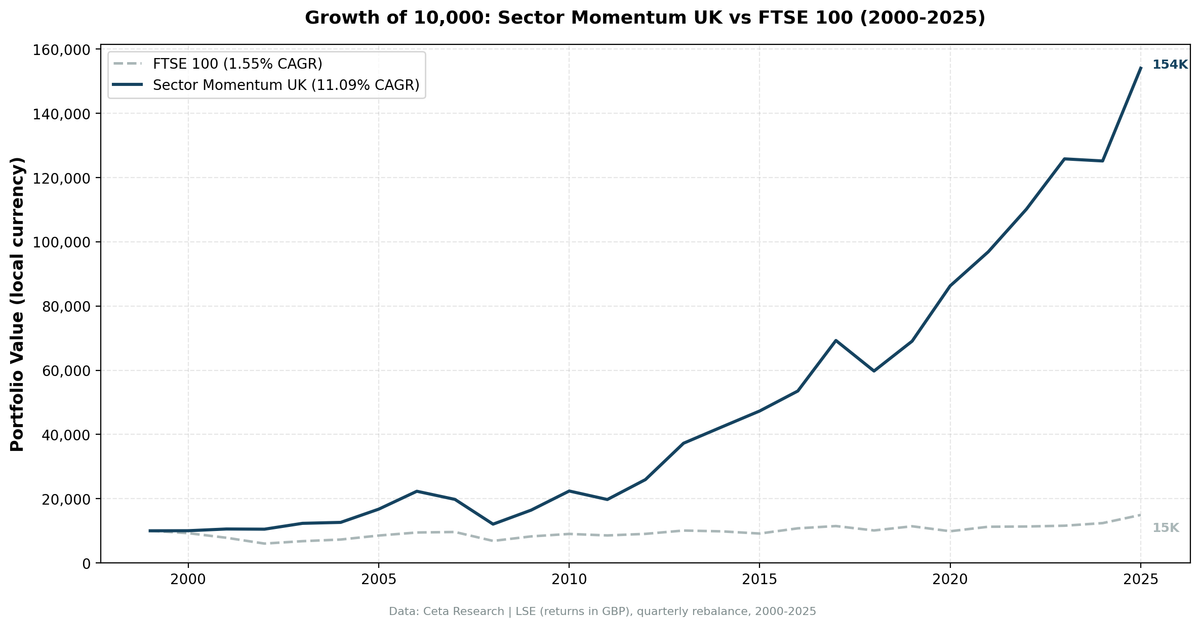
The FTSE 100 compounded at 1.55% a year from 2000 to 2025. Twenty-six years, and £10,000 became £14,929.
Contents
- The Strategy
- Results
- Which Sectors Drive the UK Rotation
- When It Worked
- When It Struggled
- Full Annual Returns
- Run It Yourself
- Limitations
- References
Sector momentum on the same market compounded at 11.09%, turning £10,000 into £154,059. That's a +9.54% annual excess, the fifth largest of the 13 markets in this study, and it came with the highest win rate we measured anywhere: the strategy beat the FTSE 100 in 70.19% of quarters and in 18 of 26 calendar years.
The UK is the clearest illustration of why the benchmark you choose decides the story. Measured against the S&P 500, this looks ordinary. Measured against the index a British investor could actually have bought, it's one of the strongest results in the study.
Data: FMP financial data warehouse, 2000-2025. Updated August 2026.
The Strategy
Each quarter, we rank all 11 GICS sectors by their equal-weighted 12-month trailing return across LSE-listed stocks. We hold stocks from the top 2 sectors, equal-weighted, and rebalance quarterly. Stocks must clear a £500M market cap threshold. Entry is at the close of the trading day after each rebalance date.
Full methodology: backtests/METHODOLOGY.md
| Parameter | Value |
|---|---|
| Universe | LSE (London Stock Exchange) |
| Signal | Top 2 sectors by trailing 12-month equal-weighted return |
| Selection | All qualifying stocks in those sectors |
| Rebalancing | Quarterly |
| Period | 2000-2025 (26 years, 104 quarters) |
| Execution | Next-day close after each rebalance date |
| Market cap min | £500M |
| Cash rule | Cash if fewer than 5 sectors qualify or fewer than 10 stocks pass |
| Cash periods | 0 of 104 |
| Avg stocks held | 69.0 |
| Benchmark | FTSE 100 (GBP) |
| Transaction costs | Size-tiered by market cap, 0.1% to 0.5% one-way |
| Data source | Ceta Research (FMP financial data warehouse) |
The tier is a one-way rate and the model charges a full round trip every quarter, on every holding, even when a sector stays in the top 2 and the position carries over untouched. That's deliberately conservative: real turnover is lower than the cost model assumes.
Returns are in GBP. The FTSE 100 is also GBP-denominated, so this is an apples-to-apples comparison.
Results
| Metric | Portfolio | FTSE 100 (GBP) |
|---|---|---|
| CAGR (2000-2025) | 11.09% | 1.55% |
| Excess CAGR | +9.54% | |
| Alpha (Jensen) | +9.39% | |
| Total return | 1,440% | 49% |
| £10K grows to | £154,059 | £14,929 |
| Max drawdown | -51.63% | -43.69% |
| Annualized volatility | 17.51% | 14.19% |
| Sharpe ratio | 0.433 | |
| Sortino ratio | 0.691 | |
| Calmar ratio | 0.215 | |
| Up capture | 145.05% | |
| Down capture | 54.85% | |
| Beta | 0.926 | |
| Win rate vs FTSE 100 (quarterly) | 70.19% | |
| Information ratio | 0.826 |
Three numbers carry this result.
The win rate of 70.19% is the highest of the 13 markets in this study. Korea has a larger excess return, but the UK beat its benchmark more consistently than any other market tested. The information ratio of 0.826 says the same thing in risk terms: a lot of excess per unit of tracking error.
Up capture 145.05% against down capture 54.85%. The strategy captured roughly 1.45x the FTSE's gains in rising quarters and only 55% of its losses in falling ones. That asymmetry, sustained over 104 quarters, is where the compounding comes from.
A beta of 0.926 means the excess survives risk adjustment. Jensen alpha comes in at +9.39% against a +9.54% raw excess, so almost none of the headline is leverage.
The honest cost is the drawdown: -51.63% against the FTSE 100's -43.69%. The strategy is less volatile quarter to quarter than that number suggests, but 2008 hit the portfolio harder than the index.
Which Sectors Drive the UK Rotation
| Sector | Quarters in Top 2 |
|---|---|
| Technology | 35 |
| Utilities | 26 |
| Consumer Cyclical | 26 |
| Real Estate | 22 |
| Basic Materials | 22 |
| Energy | 22 |
| Healthcare | 18 |
| Communication Services | 14 |
| Consumer Defensive | 12 |
| Industrials | 10 |
| Financial Services | 1 |
Technology held a top-2 slot in 35 of 104 quarters, the same count as Germany. This surprises people who think of the LSE as a market of oil majors, miners and banks. Those are the largest companies by market cap, but they aren't the ones generating the strongest 12-month momentum, and this strategy weights sectors equally by constituent return rather than by size.
That is exactly why the strategy beats the index so consistently. The FTSE 100 is dominated by a handful of mega-cap energy, mining, pharma and banking names, and those sectors compounded poorly over this period. A rotation that ignores market cap and follows momentum spent most of its time somewhere else.
Financial Services appeared once in 26 years. UK banks spent the post-2008 period rebuilding balance sheets rather than producing momentum.
When It Worked
2000-2002: three years of divergence. The FTSE 100 fell 7.37%, then 15.49%, then 23.16%. The portfolio returned +0.23%, +5.34%, and -0.53%. It didn't make much money, but it avoided almost the entire dot-com drawdown, banking +7.59%, +20.83% and +22.63% of relative return.
2020: the largest single-year margin in the UK series.
| Year | Portfolio | FTSE 100 | Excess |
|---|---|---|---|
| 2020 | +24.96% | -13.58% | +38.54% |
The FTSE 100 had a terrible pandemic year, weighed down by energy and banks. The momentum rotation was positioned in Technology and Basic Materials and gained 25%. A 38.54-point spread in one year.
2010-2013: the post-crisis run.
| Year | Portfolio | FTSE 100 | Excess |
|---|---|---|---|
| 2010 | +36.20% | +9.34% | +26.86% |
| 2012 | +31.45% | +5.74% | +25.70% |
| 2013 | +43.63% | +11.46% | +32.17% |
Three of the four largest margins in the series land in this window. 2013 is also the best absolute year at +43.63%.
2022: the inflation year. The portfolio returned +13.69% while the FTSE 100 managed +0.65%. Energy and Basic Materials were in the top 2 as commodity prices climbed.
When It Struggled
2007: the worst relative year. The portfolio fell 11.37% while the FTSE 100 gained 1.68%, a 13.05-point shortfall. UK Real Estate peaked in 2006-2007 and the momentum signal held it into the reversal.
2008: no protection. -38.99% against the FTSE 100's -28.91%. The strategy fell 10 points further than the index in the worst year of the period. This is where the -51.63% max drawdown comes from, and it's the honest counterweight to a 54.85% down capture: the average down quarter is cushioned, the crisis year is not.
2024: a flat year against a rising index. -0.52% against +6.97%. The rotation stalled while the FTSE ground higher.
Full Annual Returns
| Year | Portfolio (GBP) | FTSE 100 (GBP) | Excess |
|---|---|---|---|
| 2000 | +0.23% | -7.37% | +7.59% |
| 2001 | +5.34% | -15.49% | +20.83% |
| 2002 | -0.53% | -23.16% | +22.63% |
| 2003 | +17.36% | +12.49% | +4.87% |
| 2004 | +2.38% | +7.47% | -5.09% |
| 2005 | +32.70% | +17.22% | +15.49% |
| 2006 | +33.25% | +11.08% | +22.17% |
| 2007 | -11.37% | +1.68% | -13.05% |
| 2008 | -38.99% | -28.91% | -10.09% |
| 2009 | +36.24% | +20.57% | +15.66% |
| 2010 | +36.20% | +9.34% | +26.86% |
| 2011 | -11.83% | -5.22% | -6.61% |
| 2012 | +31.45% | +5.74% | +25.70% |
| 2013 | +43.63% | +11.46% | +32.17% |
| 2014 | +13.54% | -2.53% | +16.07% |
| 2015 | +11.83% | -6.94% | +18.77% |
| 2016 | +13.13% | +17.80% | -4.67% |
| 2017 | +29.40% | +6.55% | +22.85% |
| 2018 | -13.74% | -11.95% | -1.79% |
| 2019 | +15.56% | +12.92% | +2.64% |
| 2020 | +24.96% | -13.58% | +38.54% |
| 2021 | +12.30% | +14.20% | -1.90% |
| 2022 | +13.69% | +0.65% | +13.03% |
| 2023 | +14.22% | +2.22% | +12.00% |
| 2024 | -0.52% | +6.97% | -7.49% |
| 2025 | +23.07% | +20.47% | +2.60% |
The strategy beat the FTSE 100 in 18 of 26 calendar years, and never held cash in 104 quarters.
Run It Yourself
This query ranks UK sectors by 12-month equal-weighted trailing return on the LSE. The top 2 are where the signal points today.
WITH prices AS (
    SELECT e.symbol, e.adjClose, CAST(e.date AS DATE) AS trade_date
    FROM stock_eod e
    JOIN profile p ON e.symbol = p.symbol
    WHERE p.sector IS NOT NULL AND p.sector != ''
      AND p.marketCap > 500000000
      AND p.exchange = 'LSE'
      AND CAST(e.date AS DATE) >= CURRENT_DATE - INTERVAL '400' DAY
      AND e.adjClose IS NOT NULL AND e.adjClose > 0
),
recent AS (
    SELECT symbol, adjClose AS recent_price
    FROM prices
    QUALIFY ROW_NUMBER() OVER (PARTITION BY symbol ORDER BY trade_date DESC) = 1
),
year_ago AS (
    SELECT symbol, adjClose AS old_price
    FROM prices
    WHERE trade_date <= CURRENT_DATE - INTERVAL '365' DAY
    QUALIFY ROW_NUMBER() OVER (PARTITION BY symbol ORDER BY trade_date DESC) = 1
),
stock_returns AS (
    SELECT r.symbol, pr.sector,
           (r.recent_price / ya.old_price - 1) * 100 AS return_12m
    FROM recent r
    JOIN year_ago ya ON r.symbol = ya.symbol
    JOIN profile pr ON r.symbol = pr.symbol
    WHERE ya.old_price > 0 AND r.recent_price > 0
      AND (r.recent_price / ya.old_price - 1) BETWEEN -0.99 AND 5.0
)
SELECT
    sector,
    ROUND(AVG(return_12m), 2) AS avg_return_12m_pct,
    COUNT(DISTINCT symbol) AS n_stocks,
    ROW_NUMBER() OVER (ORDER BY AVG(return_12m) DESC) AS rank
FROM stock_returns
GROUP BY sector
HAVING COUNT(DISTINCT symbol) >= 5
ORDER BY avg_return_12m_pct DESC
Run this query on Ceta Research: cetaresearch.com/data-explorer?q=QV8AQpSxub
Note the n_stocks column for Financial Services. It runs into four figures on the LSE against a few hundred for every other sector, because FMP files closed-end funds and investment trusts under that sector, and London lists a great many of them. This matches how the backtest ran, so the screen and the results agree, but read that row as a fund average rather than a bank average.
Limitations
The FTSE 100 is a low bar. A 1.55% CAGR over 26 years is a weak benchmark, and a large part of the +9.54% excess reflects how poorly the UK large-cap index compounded rather than how well the strategy performed. The absolute 11.09% CAGR is the more useful number, and it sits mid-table among the 13 markets.
Crisis drawdown exceeds the index. -51.63% against -43.69%, and 2008 alone cost 38.99%. The 54.85% down capture describes an average down quarter, not a crash.
Currency exposure. Returns are in GBP. Non-UK investors face GBP exchange rate exposure on top of equity volatility.
Listed is not domiciled. The LSE lists a large number of foreign companies, so an exchange filter picks up secondary listings alongside British ones. We measured this effect on Germany and Switzerland, where it matters most, and neither flipped sign. The UK has not been re-run under a domicile filter for this strategy, so treat the universe as "listed in London" rather than "British companies."
Fund contamination. FMP classifies closed-end funds and investment trusts under Financial Services. That sector reached the top 2 once in 104 quarters, so it barely touched the portfolio, but any screen you run on the LSE will show a badly inflated Financial Services stock count.
Sector concentration. With 69 holdings across just 2 sectors, and Technology in the top 2 a third of the time, this is a concentrated position rather than broad UK market exposure.
References
- Moskowitz, T. J., & Grinblatt, M. (1999). Do industries explain momentum? The Journal of Finance, 54(4), 1249-1290.
- Jegadeesh, N., & Titman, S. (1993). Returns to buying winners and selling losers: Implications for stock market efficiency. The Journal of Finance, 48(1), 65-91.
Data: Ceta Research (FMP financial data warehouse). Universe: LSE (United Kingdom). Period: 2000-2025 (26 years), quarterly rebalance, next-day-close execution, returns in GBP. Past performance does not guarantee future results. This is educational content, not investment advice.
Part of the Sector Momentum Rotation series. US flagship blog