Small-Cap Growth in 14 Markets: The Alpha Is Real Where the Index Was Weak
We tested one small-cap growth strategy across 14 exchanges over 25 years, each against its own index. It beat 8 of them. The catch: the biggest excess returns sit on top of indices that returned under 3% a year.

Slug: small-cap-growth-backtest-global-comparison
Contents
- Executive Summary
- What We Tested
- The Core Finding
- Where the Local Alpha Is Real
- China: +7.03% over the SSE Composite
- Switzerland: +5.71% over the SMI
- Canada: +4.29% over the TSX Composite
- Sweden, UK and Germany
- Where It Fails
- Japan: -6.73% against the Nikkei 225
- Hong Kong: -2.44% against the Hang Seng
- Thailand: -2.33% against the SET Index
- US, Korea and Taiwan: level with the index
- The Fund Problem
- Full Results Table
- What Actually Separates the Winners
- Limitations
- Run It Yourself
- Detailed Analysis by Market
- Takeaway
Data: FMP financial data warehouse, 2000-2025. Updated August 2026.
Executive Summary
We tested one small-cap growth strategy across 14 exchanges over 25 years, measuring each market against its own index rather than against a US benchmark. The strategy beat the local benchmark in 8 of the 14 markets. Only 5 of those 8 keep the edge once you allow for the dividends those price indices leave out.
That sounds like a win for the size premium. It mostly isn't.
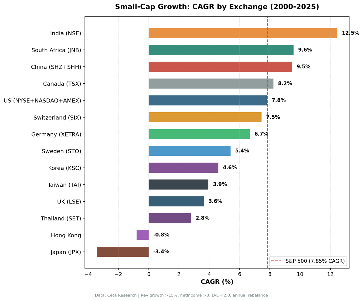
The five largest local excess returns come from China, Switzerland, Canada, Sweden and the UK, and four of those five sit on top of an index that went almost nowhere for 25 years. The SMI compounded at 1.74% a year. The FTSE 100 managed 1.23%. The SSE Composite did 2.43%. Beating a flat benchmark by five points a year is not the same as making money, and the absolute returns say so: only India, South Africa, China, Canada and the US cleared roughly 8% a year, and the US did it by matching the S&P 500 rather than beating it.
The clean developed-versus-emerging story we reported earlier doesn't survive the local-benchmark treatment. Germany beats the DAX. Switzerland beats the SMI decisively. India barely beats the Sensex. The dividing line isn't a market's stage of development, it's whether its large-cap index was worth beating.
What We Tested
Signal: Companies with market cap between 5% and 200% of each exchange's small-cap threshold, revenue growth above 15% year-over-year (fiscal year), positive net income, and debt-to-equity below 2.0.
Selection: Top 30 stocks by revenue growth, equal weight. Cash if fewer than 10 qualify.
Rebalancing: Annual, every July, with a 45-day filing lag.
Execution: Next-day close after each rebalance date, so the screen can't trade on a price it hasn't seen.
Period: 2000-2025 (25 years).
Benchmark: each exchange's own local index, in the same currency as the portfolio. Sensex for India, DAX for Germany, Nikkei 225 for Japan, and so on. South Africa is the exception: the dataset has no usable JSE index, so the S&P 500 stands in and its excess figure isn't currency-matched.
Exchanges tested: NYSE+NASDAQ+AMEX (US), NSE (India), SHZ+SHH (China), JNB (South Africa), TSX (Canada), LSE (UK), JPX (Japan), XETRA (Germany), STO (Sweden), SIX (Switzerland), TAI (Taiwan), SET (Thailand), KSC (Korea), HKSE (Hong Kong). India uses NSE only, to avoid the roughly 38% dual-listing duplication with BSE.
Small-cap bounds differ by exchange, calibrated to local market cap distributions. A $50M company is small-cap in South Africa and mid-cap in Vietnam.
Full methodology: METHODOLOGY.md
The Core Finding
| Exchange | CAGR | Local benchmark | Benchmark CAGR | Excess vs local | Sharpe | MaxDD |
|---|---|---|---|---|---|---|
| India (NSE) | 12.46% | Sensex | 12.06% | +0.41% | 0.181 | -53.19% |
| South Africa (JNB) | 9.57% | S&P 500 | 7.85% | +1.72% | 0.026 | -43.74% |
| China (SHZ+SHH) | 9.46% | SSE Composite | 2.43% | +7.03% | 0.175 | -72.15% |
| Canada (TSX) | 8.24% | TSX Composite | 3.95% | +4.29% | 0.212 | -46.72% |
| US (NYSE+NASDAQ+AMEX) | 7.82% | S&P 500 | 7.85% | -0.03% | 0.303 | -37.50% |
| Switzerland (SIX) | 7.45% | SMI | 1.74% | +5.71% | 0.278 | -42.69% |
| Germany (XETRA) | 6.68% | DAX | 5.04% | +1.64% | 0.201 | -40.77% |
| Sweden (STO) | 5.41% | OMX Stockholm 30 | 2.55% | +2.86% | 0.150 | -49.24% |
| Korea (KSC) | 4.60% | KOSPI | 5.35% | -0.75% | 0.082 | -26.61% |
| Taiwan (TAI) | 3.94% | TAIEX | 4.09% | -0.14% | 0.143 | -40.17% |
| UK (LSE) | 3.64% | FTSE 100 | 1.23% | +2.41% | 0.008 | -35.89% |
| Thailand (SET) | 2.80% | SET Index | 5.13% | -2.33% | 0.013 | -61.02% |
| Hong Kong (HKSE) | -0.80% | Hang Seng | 1.64% | -2.44% | -0.104 | -91.91% |
| Japan (JPX) | -3.42% | Nikkei 225 | 3.31% | -6.73% | -0.182 | -72.06% |
Returns are in each market's local currency and are not comparable across rows in dollar terms. The spread from best to worst local excess is 13.8 percentage points; in raw CAGR it's 15.9.
Sort by excess and you get China, Switzerland, Canada, Sweden, UK, South Africa, Germany, India. Sort by absolute return and you get India, South Africa, China, Canada, US, Switzerland. Only China, Canada and South Africa appear near the top of both lists. That gap between the two orderings is the whole story.
Where the Local Alpha Is Real
China: +7.03% over the SSE Composite
The largest local excess in the study. 9.46% CAGR against an SSE Composite that managed 2.43% over 25 years, with a 68% win rate and no cash periods.
The obvious objection is the two A-share manias, 2006 and 2014, and they cut in opposite directions. 2014 helped: +115.90% against the SSE Composite's +89.99%, a 25.91 point win. 2006 hurt: +105.59% against +128.14%, so the largest bubble year in the sample cost the strategy 22.55 points of excess. Neither year carries the result. The strategy beat the SSE Composite in 17 of 25 years, the highest win rate in the study. The maximum drawdown is -72.15%, and the 2001-2004 stretch was four consecutive losing years. Up capture of 127% against down capture of 47% is a genuinely good asymmetry, and it reflects that A-shares move on domestic flows rather than the global cycle.
The honest reading: the strategy consistently beat Chinese large caps, and Chinese large caps were a low bar.
Switzerland: +5.71% over the SMI
7.45% CAGR against the SMI's 1.74%, with 151% up capture and 31% down capture, the best asymmetry in the study. Swiss small-caps that clear a profitability and leverage filter tend to be conservative, well-financed businesses, and it shows in the risk profile.
Two caveats. The portfolio averaged 11.4 holdings, the thinnest of any market we tested, so single-stock outcomes dominate. And restricting the universe to Swiss-domiciled companies rather than everything listed on the SIX cuts the excess from +5.71% to +4.15%. Still positive, but a chunk of the headline comes from foreign secondary listings.
Canada: +4.29% over the TSX Composite
8.24% CAGR against 3.95%, fully invested in all 25 years, and one of the few markets that clears 8% in absolute terms as well as beating its index. The TSX small-cap universe is heavy in energy, materials and junior miners, businesses whose revenues swing hard with commodity prices. That dispersion is exactly what a revenue growth screen can exploit.
The cost is a 175% up capture against a 100% down capture, which is to say the strategy is a leveraged bet on Canadian equities rather than a defensive one.
Sweden, UK and Germany
Sweden returned 5.41% against the OMX Stockholm 30's 2.55%, with a 32% down capture. Germany returned 6.68% against the DAX's 5.04%, reversing the small deficit we reported in March. The UK returned 3.64% against the FTSE 100's 1.23%, winning 60% of years.
All three beat their local index. None of them made much money. The UK case is the clearest: +2.41% a year of excess return on a 3.64% absolute return, with a Sharpe of 0.008 and a -35.89% maximum drawdown. You took equity risk for a quarter century to earn roughly what cash paid.
Where It Fails
Japan: -6.73% against the Nikkei 225
The worst result in the study and the only one that lost money outright. -3.42% CAGR turned $10,000 into $4,186 while the Nikkei 225 turned it into $22,574. Up capture of 33% against down capture of 88% is the wrong asymmetry in both directions.
Japan had five cash years (2000-2004) because the universe couldn't produce enough qualifying companies. In an economy with near-zero nominal growth for most of the period, a company posting 15% revenue growth is usually a cyclical outlier rather than a structural grower, and the screen can't tell the difference.
Hong Kong: -2.44% against the Hang Seng
-0.80% CAGR and a -91.91% maximum drawdown, the deepest in the study by a wide margin. That number is not a data artifact: it's compounded losses across the financial crisis, the 2015 A-share unwind, the protests, COVID, and the regulatory crackdown on Chinese tech. Hong Kong has no dedicated post in this series because we don't think a strategy with a -92% drawdown deserves one.
Thailand: -2.33% against the SET Index
2.80% CAGR against a SET Index that did 5.13%, with 103% up capture and 134% down capture. Thailand's small-cap universe is thin and concentrated in tourism, property and consumer names, where revenue growth is cyclical rather than mean-reverting. The strategy bought them on the way up and held through the reversal.
US, Korea and Taiwan: level with the index
The US finished at -0.03% against the S&P 500, Taiwan at -0.14% against the TAIEX, and Korea at -0.75% against the KOSPI. All three are ties within the noise of a 25-year backtest.
The US case is worth its own post because of how it got there. All the outperformance came from 2002-2008, seven consecutive winning years, and then it stopped: the strategy beat the index in 3 of the following 16 years. It also has a universe problem we describe below.
The Fund Problem
Closed-end funds and ETFs file income statements, and a closed-end fund books its investment income as revenue. When its holdings mark up, it looks to a screen like a company that grew revenue 40% and turned a profit. A market cap, revenue growth, net income and leverage filter does nothing to exclude it.
In the US this stopped being a rounding error and became the portfolio. Funds and ETFs were 0% of holdings from 2000 to 2004, under 12% through 2012, then 33% in 2013 and 84% in 2020. Across the full period they filled 32% of all portfolio slots. Rerunning the US with funds and ETFs excluded gives 4.22% CAGR instead of 7.82%, and a Sharpe of 0.087 instead of 0.303. The funds didn't earn more, they cushioned: in 2015 the operating companies lost 18.1% while the funds gained 16.1%.
Other markets are far less exposed. Excluding funds moves India by +0.42pp, China by +0.04pp, Japan by 0.00pp, the UK by +1.23pp and Canada by -1.33pp.
We report the unfiltered numbers throughout because that's the universe definition applied consistently across all 14 markets, and changing it for one would break the comparison. But the US row above should be read as a market where the screen stopped selecting operating companies a decade ago.
Full Results Table
| Exchange | CAGR | Excess vs local | Sharpe | MaxDD | UpCap | DnCap | WinRate | Cash | AvgStk |
|---|---|---|---|---|---|---|---|---|---|
| India (NSE) | 12.46% | +0.41% | 0.181 | -53.19% | 97% | -39% | 56% | 5/25 | 15.3 |
| South Africa (JNB) | 9.57% | +1.72% | 0.026 | -43.74% | 102% | 39% | 60% | 4/25 | 16.0 |
| China (SHZ+SHH) | 9.46% | +7.03% | 0.175 | -72.15% | 127% | 47% | 68% | 0/25 | 19.9 |
| Canada (TSX) | 8.24% | +4.29% | 0.212 | -46.72% | 175% | 100% | 52% | 0/25 | 22.7 |
| US (NYSE+NASDAQ+AMEX) | 7.82% | -0.03% | 0.303 | -37.50% | 97% | 79% | 44% | 0/25 | 21.3 |
| Switzerland (SIX) | 7.45% | +5.71% | 0.278 | -42.69% | 151% | 31% | 52% | 5/25 | 11.4 |
| Germany (XETRA) | 6.68% | +1.64% | 0.201 | -40.77% | 87% | 42% | 56% | 4/25 | 18.8 |
| Sweden (STO) | 5.41% | +2.86% | 0.150 | -49.24% | 88% | 32% | 52% | 5/25 | 19.1 |
| Korea (KSC) | 4.60% | -0.75% | 0.082 | -26.61% | 67% | 40% | 52% | 8/25 | 25.2 |
| Taiwan (TAI) | 3.94% | -0.14% | 0.143 | -40.17% | 95% | 90% | 36% | 6/25 | 23.2 |
| UK (LSE) | 3.64% | +2.41% | 0.008 | -35.89% | 137% | 86% | 60% | 0/25 | 16.3 |
| Thailand (SET) | 2.80% | -2.33% | 0.013 | -61.02% | 103% | 134% | 40% | 4/25 | 18.0 |
| Hong Kong (HKSE) | -0.80% | -2.44% | -0.104 | -91.91% | 122% | 102% | 48% | 0/25 | 14.0 |
| Japan (JPX) | -3.42% | -6.73% | -0.182 | -72.06% | 33% | 88% | 36% | 5/25 | 22.6 |
Up capture, down capture and win rate are all measured against the local benchmark in that market's currency. For reference, the S&P 500 returned 7.85% CAGR with a Sharpe of 0.352 and a -38.01% maximum drawdown over the same period, in dollars.
Hong Kong is the one market with no dedicated post in this series, because of its -91.91% drawdown. Korea has one, but read it with the cash years in mind: the screen spent 8 of 25 rebalance periods holding nothing.
What Actually Separates the Winners
The developed-versus-emerging framing doesn't hold. Three of the five biggest local excess returns come from Switzerland, Canada and Sweden, all developed markets with deep capital pools. Two of the six failures are Korea and Taiwan, both classified as emerging or newly-developed.
Three things do track with the result:
How weak the local index was. The correlation runs the wrong way for anyone hoping to find alpha. The SMI, FTSE 100, SSE Composite, OMX and TSX Composite all returned between 1.2% and 4.0% a year for 25 years. Small-cap growth beat every one of them. The Sensex returned 12.06% and the S&P 500 returned 7.85%, and the strategy roughly tied both. A screen that produces equity-like returns will beat an index that doesn't.
Whether the universe could fill. Switzerland averaged 11.4 holdings and Japan spent five years in cash. When a screen designed for 30 names delivers 11, the result is a concentrated bet whose outcome depends on a handful of companies. That cuts both ways: Switzerland's thin universe helped, Japan's didn't.
Whether revenue growth means anything locally. In Japan's deflationary decades and Thailand's tourism cycles, a company posting 15% revenue growth is usually riding a cycle that's about to turn. In Canada's commodity market and India's formalising economy, it's more often capturing real share. The signal is the same; what it selects for isn't.
Analyst coverage, institutional capacity and market microstructure all plausibly matter too. But the honest summary of 14 markets is that the excess return tracked the benchmark's weakness more reliably than it tracked any story about market efficiency.
Limitations
Annual rebalancing is a simplification. Real portfolios rebalance more frequently and incur friction. This backtest applies size-tiered transaction costs but doesn't model market impact.
Filing lag of 45 days. We assume positions can be set 45 days after fiscal year end. Some smaller emerging market companies report later, so the tradeable universe on any given July 15 may be smaller than the backtest assumes.
Fund contamination. See the section above. Material for the US, minor elsewhere.
Listed, not domiciled. The universe is every company listed on an exchange, which outside the US is substantially foreign secondary listings. Restricting to locally domiciled companies cuts Germany's excess from +1.64% to +0.68% and Switzerland's from +5.71% to +4.15%. Neither flips sign, and the number of invested periods barely moves, so we publish the all-listings figures. Thinner European markets are the ones to watch here.
Market cap calibration. Small-cap bounds are set per exchange. A company qualifying as small-cap in 2000 may not qualify in 2015. Annual rebalancing handles this, but the backtest doesn't track holdings that grow out of the band mid-year.
Revenue growth capping. We cap revenue growth at 500% to exclude obvious data errors from spin-offs and mergers. Some legitimate hypergrowth companies are excluded.
Currency. Every result is in local currency against a local index. Rows are not comparable to each other in dollar terms, and a US investor's returns would differ by the exchange rate path.
Data revisions. FMP restates and backfills financial history. Running the identical code in March 2026 and again in August 2026 moved the US excess by 2.6 percentage points and Germany's by 1.9, with no change in method. Backtests on vendor fundamentals are not fixed objects, and anyone quoting a figure to two decimal places should know that.
These benchmarks leave dividends out. Portfolio returns here use dividend-adjusted prices, so they include dividends. Most of the indices we measure against do not. The FTSE 100, Hang Seng, KOSPI, Nikkei 225, OMX Stockholm 30, SET Index, SMI, SSE Composite, Sensex, TAIEX and TSX Composite are price indices, so excess return against them is overstated by roughly the local dividend yield, which has run between about 1.3% and 3.5% in these markets. Those comparisons are like for like: the S&P 500 figure runs through SPY, which is dividend-adjusted; the DAX is a performance index. Subtract the yield and only 5 of those 8 keep a positive edge. The ones that do not survive it are Sweden, the UK and India.
Run It Yourself
Global screen: cetaresearch.com/data-explorer?q=POetexr8OZ
US only: cetaresearch.com/data-explorer?q=EbJ5tom816
India only: cetaresearch.com/data-explorer?q=GEAzmRxz3r
These screens exclude funds, ETFs and shell companies, so they show what the strategy is meant to buy rather than what the unfiltered backtest universe contains.
Full backtest code and data: github.com/ceta-research/backtests
Detailed Analysis by Market
Takeaway
Across 14 markets and 25 years, this strategy beat the local index in 8 and lost to it in 6. That's a better record than the size premium's reputation in 2025 would suggest, and it means much less than it sounds like.
The excess return showed up where the benchmark was weak. Switzerland, the UK, Sweden and China all handed the strategy an index returning under 3% a year, and it cleared that bar comfortably while delivering absolute returns between 3.6% and 9.5%. India and the US handed it a benchmark that compounded properly, and it tied. Nothing in the data supports the idea that small-cap growth is a reliable source of return; what it supports is that large-cap indices outside the US had a poor 25 years.
If you're allocating to a specific market and your alternative is that market's large-cap index, this screen has a defensible case in China, Switzerland, Canada, Sweden and Germany. If your alternative is a global index fund, the case is much harder: only five of the 14 markets produced an absolute return that would have beaten holding the S&P 500 in dollars, and the strategy's own drawdowns were deeper almost everywhere.
The geography matters more than the signal. That much survives from our earlier version of this study. What doesn't survive is the idea that the geography splits along the developed-emerging line.
Data: Ceta Research (FMP financial data warehouse), 2000-2025. Full methodology: METHODOLOGY.md. Past performance does not guarantee future results. This is educational content, not investment advice.