P/E Mean Reversion (Sector-Relative): 10.87% CAGR, 10.00% Alpha vs FTSE 100
We tested a sector-relative P/E mean reversion screen on 25 years of UK stock data. Stocks trading at a 40%+ discount to sector peers, filtered for quality, returned 10.87% CAGR vs 0.86% for the FTSE 100. The highest local excess return of any exchange tested: 10.00%. Win rate: 80%.

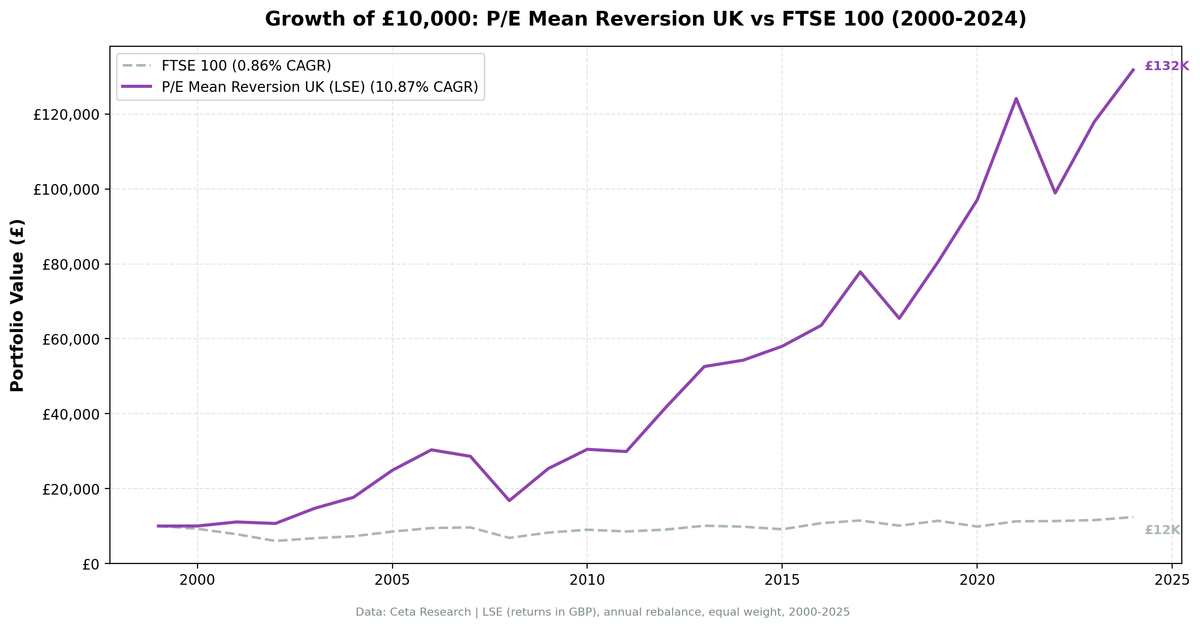
We tested a sector-relative P/E mean reversion screen on 25 years of UK stock data from the London Stock Exchange. The signal buys stocks trading at a deep discount to sector peers: stock P/E below 60% of its sector median, filtered for quality. The strategy returned 10.87% annually vs 0.86% for the FTSE 100, with 10.00% excess return and an 80% win rate.
Contents
- Method
- What Is Sector-Relative P/E Mean Reversion?
- The Screen
- Sector-Relative P/E Screen: UK (LSE)
- What We Found
- 25 years. 10.00% annual alpha vs FTSE 100. Exceptional absolute returns.
- Year-by-year returns
- 2000-2006: where the alpha was built
- 2002 and 2009: the standout defensive years
- 2012 and 2021: value rotation wins
- 2019 and 2024: no growth regime drag against a domestic benchmark
- Backtest Methodology
- Limitations
- Conclusion
Of all 13 exchanges tested, the UK delivered the highest excess return vs its local benchmark. Most of that gap comes from how badly the FTSE 100 did, so read the absolute return alongside it.
Data: FMP financial data warehouse, 2000–2025. Updated August 2026.
Method
Data source: Ceta Research (FMP financial data warehouse) Universe: London Stock Exchange (LSE), market cap > £500M Period: 2000-2024 (25 years, 0 cash periods) Rebalancing: Annual (January), equal weight, top 30 by deepest P/E discount to sector Benchmark: FTSE 100 (^FTSE, price return) Cash rule: Hold cash if fewer than 10 stocks qualify
The backtest reads annual (FY) filings from financial_ratios for P/E and debt ratios and key_metrics for ROE and market cap, with a 45-day lag on every filing to prevent look-ahead bias. Trades execute at the next day's close after the signal date. Returns are in GBP. The FTSE 100 is the local benchmark, and it's price-only in FMP (dividends not included), while individual stock returns use adjClose (dividends included). That gap flatters the excess return and is the single biggest caveat on this page.
What Is Sector-Relative P/E Mean Reversion?
This strategy is different from comparing a stock's P/E to its own history. Instead, it compares each stock's P/E to the current median P/E of its sector peers. A stock trading at a 40%+ discount to where similar companies are priced is what triggers the buy.
If Healthcare stocks on the LSE trade at a median P/E of 18x and a specific company trades at 10x, that's a 44% discount. The bet: if fundamentals are sound (profitable, not overleveraged), the gap will close. Either the stock re-rates upward, or it gets acquired, or earnings growth reduces the denominator.
The cross-sectional framing matters. You're not asking "is this cheap vs its own history?" You're asking "is this cheap vs everything else in its industry right now?" That question is sharper, especially in a market like the UK where sectors are structurally different from each other.
Signal: - P/E range: 3-50 (exclude extreme valuations and negative earnings) - Stock P/E < 60% of sector median P/E (40%+ discount to peers) - Minimum 5 stocks in sector required to compute a valid median
Quality filters:
| Criterion | Metric | Threshold |
|---|---|---|
| Profitable | Return on Equity | > 8% |
| Manageable debt | Debt-to-Equity | < 2.0 |
Size:
| Criterion | Metric | Threshold |
|---|---|---|
| Institutional grade | Market Cap | > £500M |
Stocks must pass all filters. Top 30 by deepest discount (lowest P/E ratio-to-sector) are selected each year, equal weighted.
The Screen
Sector-Relative P/E Screen: UK (LSE)
WITH universe AS (
    SELECT k.symbol, p.companyName, p.exchange, p.sector,
           fr.priceToEarningsRatioTTM AS pe_ttm, k.returnOnEquityTTM AS roe,
           fr.debtToEquityRatioTTM AS de, p.marketCap,
           ROW_NUMBER() OVER (PARTITION BY p.companyName ORDER BY p.averageVolume DESC) AS listing_rank
    FROM key_metrics_ttm k
    JOIN financial_ratios_ttm fr ON k.symbol = fr.symbol
    JOIN profile p ON k.symbol = p.symbol
    WHERE fr.priceToEarningsRatioTTM BETWEEN 3 AND 50
      AND k.returnOnEquityTTM > 0.08
      AND (fr.debtToEquityRatioTTM IS NULL OR (fr.debtToEquityRatioTTM >= 0 AND fr.debtToEquityRatioTTM < 2.0))
      AND p.marketCap > 500000000
      AND p.sector IS NOT NULL
      AND p.exchange IN ('LSE')
),
primary_listing AS (
    SELECT * FROM universe WHERE listing_rank = 1
),
sector_medians AS (
    SELECT exchange, sector,
           PERCENTILE_CONT(0.5) WITHIN GROUP (ORDER BY pe_ttm) AS median_pe,
           COUNT(*) AS n_sector_stocks
    FROM primary_listing GROUP BY exchange, sector HAVING COUNT(*) >= 5
)
SELECT u.symbol, u.companyName, u.sector,
       ROUND(u.pe_ttm, 2) AS pe_ttm, ROUND(sm.median_pe, 2) AS sector_median_pe,
       ROUND(u.pe_ttm / sm.median_pe, 3) AS pe_ratio_to_sector,
       ROUND((1 - u.pe_ttm / sm.median_pe) * 100, 1) AS discount_pct,
       ROUND(u.roe * 100, 1) AS roe_pct, ROUND(u.de, 2) AS debt_to_equity,
       ROUND(u.marketCap / 1e6, 0) AS mktcap_m_gbp
FROM primary_listing u JOIN sector_medians sm ON u.exchange = sm.exchange AND u.sector = sm.sector
WHERE u.pe_ttm / sm.median_pe < 0.60
ORDER BY u.pe_ttm / sm.median_pe ASC LIMIT 30
Run this query on Ceta Research
Live screen note: the query keeps one listing per company (the most liquid share class) and sizes on profile.marketCap, which is denominated in the listing currency. The backtest applied neither adjustment, so its holding counts include separate share classes of the same company.
What We Found
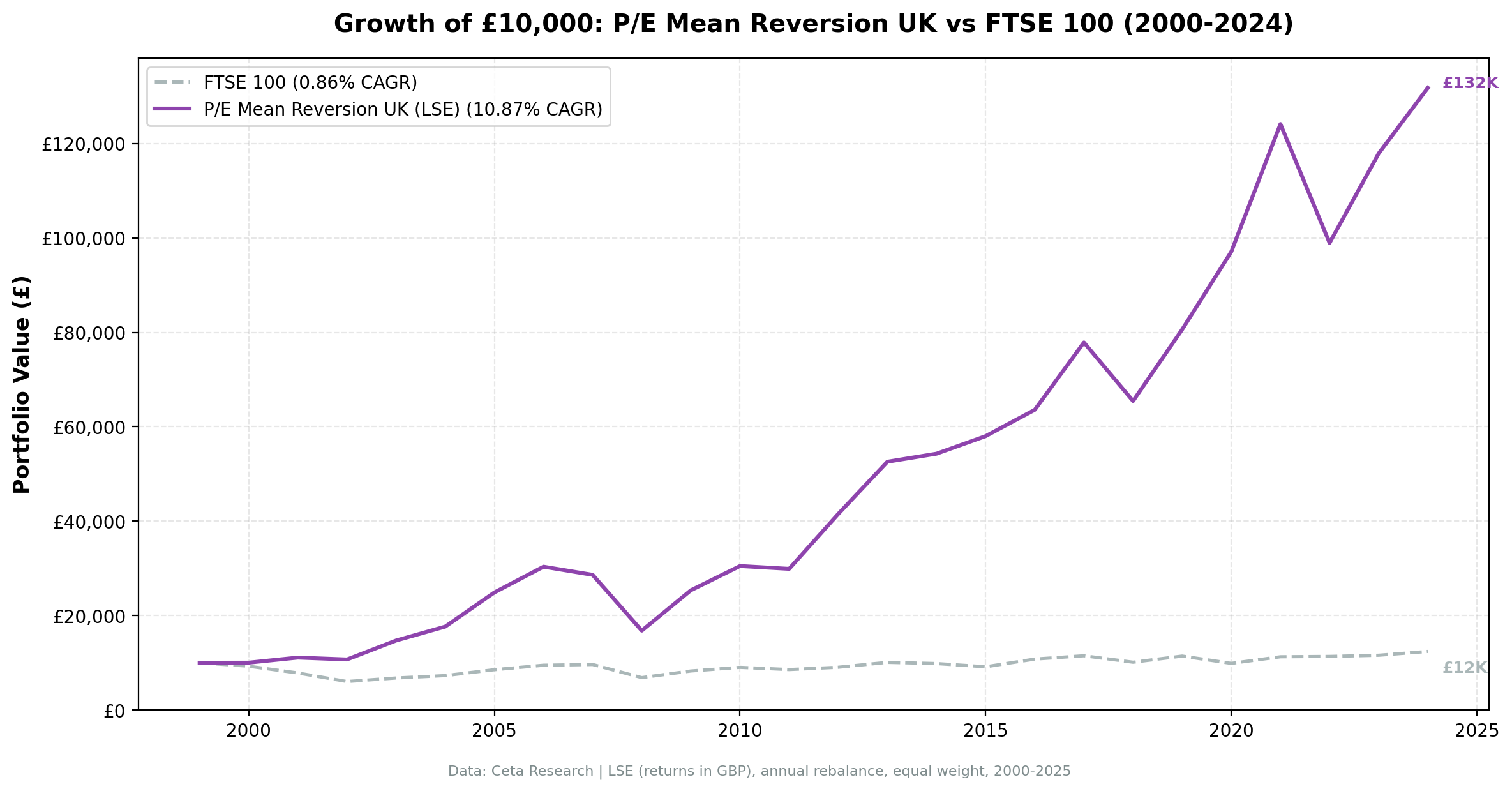
25 years. 10.00% annual alpha vs FTSE 100. Exceptional absolute returns.
| Metric | P/E Mean Reversion (UK) | FTSE 100 |
|---|---|---|
| CAGR | 10.87% | 0.86% |
| Total Return | 1,217.88% | 23.92% |
| Sharpe Ratio | 0.353 | -0.202 |
| Sortino Ratio | 0.658 | -0.241 |
| Max Drawdown | -44.65% | -39.85% |
| Up Capture | 218.09% | 100% |
| Down Capture | 18.60% | 100% |
| Win Rate vs FTSE | 80% | - |
| Avg Stocks per Year | 11.8 | - |
| Cash Periods | 0 of 25 | - |
The result is striking. £10,000 grew to ~£131,788 vs ~£12,392 for the FTSE 100. The FTSE 100 returned just 0.86% CAGR over 25 years (price return, no dividends). Individual stocks include dividends via adjClose, so part of the apparent alpha is structural. Even so, an absolute CAGR of 10.87% with a Sharpe of 0.353 is a genuine result.
The capture ratios are lopsided: 218% up-capture against 19% down-capture. The strategy more than doubled the FTSE's gains in up years while giving back less than a fifth of its losses in down years. Some of that asymmetry is real and some is the dividend gap, since a price-only index looks worse in every year that dividends matter. Treat the direction as meaningful and the exact magnitude as flattered.
Zero cash periods across 25 years. The UK's sector diversity, spanning Financials, Consumer Staples, Healthcare, Materials, and Industrials, means the screen always finds qualifying stocks even in elevated markets. It finds few of them, though: the portfolio averages 11.8 names, barely above the 10-stock minimum.
Year-by-year returns
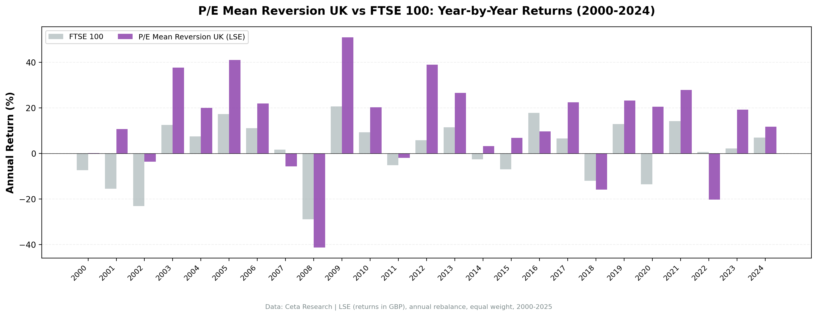
| Year | P/E Mean Reversion (UK) | FTSE 100 | Excess |
|---|---|---|---|
| 2000 | +0.2% | -7.4% | +7.5% |
| 2001 | +10.7% | -15.5% | +26.2% |
| 2002 | -3.6% | -23.2% | +19.6% |
| 2003 | +37.6% | +12.5% | +25.1% |
| 2004 | +20.0% | +7.5% | +12.6% |
| 2005 | +41.0% | +17.2% | +23.8% |
| 2006 | +21.9% | +11.1% | +10.8% |
| 2007 | -5.7% | +1.7% | -7.4% |
| 2008 | -41.3% | -28.9% | -12.4% |
| 2009 | +51.0% | +20.6% | +30.4% |
| 2010 | +20.3% | +9.3% | +10.9% |
| 2011 | -2.0% | -5.2% | +3.3% |
| 2012 | +38.9% | +5.8% | +33.2% |
| 2013 | +26.6% | +11.5% | +15.2% |
| 2014 | +3.2% | -2.5% | +5.8% |
| 2015 | +6.9% | -6.9% | +13.8% |
| 2016 | +9.6% | +17.8% | -8.2% |
| 2017 | +22.4% | +6.5% | +15.9% |
| 2018 | -15.9% | -11.9% | -4.0% |
| 2019 | +23.2% | +12.9% | +10.2% |
| 2020 | +20.4% | -13.6% | +34.0% |
| 2021 | +27.9% | +14.2% | +13.6% |
| 2022 | -20.3% | +0.7% | -21.0% |
| 2023 | +19.2% | +2.2% | +17.0% |
| 2024 | +11.8% | +7.0% | +4.8% |
2000-2006: where the alpha was built
The first seven years were extraordinary. During the dot-com bust, UK value stocks held firm. In 2002, the portfolio fell just -3.6% while the FTSE 100 dropped -23.2%, a 19.6 point gap. Then the recovery (2003-2006) compounded heavily, with the strategy beating the FTSE by an average of +18% per year across those four years.
The reason: the UK entered the 2000s with a structurally value-heavy market. Financials, energy, and defensives made up most of the LSE by weight. These sectors had depressed P/E ratios early in the decade, and the sector-relative signal found the best names within each group.
By the time the credit bubble was fully inflated in 2007-2008, those early gains had built a large buffer.
2002 and 2009: the standout defensive years
| Event | P/E Mean Reversion (UK) | FTSE 100 | Gap |
|---|---|---|---|
| Dot-com bust (2000-2002) | +6.9% cumulative | -39.9% cumulative | +46.7% |
| Financial crisis (2008) | -41.3% | -28.9% | -12.4% |
| Post-crisis recovery (2009-2010) | +81.5% cumulative | +31.8% cumulative | +49.7% |
| Brexit uncertainty (2016) | +9.6% | +17.8% | -8.2% |
| COVID crash (2020) | +20.4% | -13.6% | +34.0% |
2002 stands out. The FTSE 100 fell -23.2%; this portfolio gave up only -3.6%. That's not luck. Stocks already at a deep discount to sector peers had little multiple compression left. They fell less because the pessimism was already priced in.
2008 was the exception, and a worse one than the headline capture ratios suggest. The portfolio fell -41.3% vs the FTSE's -28.9%. Correlated global deleveraging doesn't respect valuation discounts. When banks need to sell everything, the cheapest stocks go too. The strategy underperformed badly in the crisis, then outperformed significantly in the recovery.
The recovery was sharp. 2009 delivered +51.0% vs FTSE +20.6%. Sector-relative discount stocks benefit most from the snapback because the re-rating has further to go.
2012 and 2021: value rotation wins
Two more years are worth flagging: 2012 (+38.9% vs FTSE +5.8%, a +33.2% excess) and 2021 (+27.9% vs FTSE +14.2%, a +13.6% excess).
2012 was a UK-specific value moment. After the European sovereign debt crisis hammered UK Financials, Materials, and Industrials disproportionately, those sectors recovered hard. The sector-relative screen was concentrated in the cheapest names within each group going into 2012. It captured most of the recovery.
2021 was the post-COVID reopening value rotation. Growth stocks had dominated in 2020. By early 2021, UK cyclicals and value stocks were trading at extreme discounts to their sector peers. The rotation into these names was powerful, and the strategy was fully positioned for it.
2019 and 2024: no growth regime drag against a domestic benchmark
| Year | P/E Mean Reversion (UK) | FTSE 100 | Excess |
|---|---|---|---|
| 2019 | +23.2% | +12.9% | +10.2% |
| 2024 | +11.8% | +7.0% | +4.8% |
These are the years that punish the same screen in the US, and in the UK they don't. 2019 beat the FTSE by +10.2% and 2024 by +4.8%, while the US version of this strategy trailed the S&P 500 by -23.0% and -18.3% in those same two years.
The reason is what sits in the benchmark, not what sits in the portfolio. US index returns in 2019 and 2024 were driven by a handful of high-multiple technology names that a sector-relative discount screen will never hold. The FTSE 100 has no equivalent engine. UK stocks competing with UK peers is a different bet than UK stocks competing with US megacaps, and the "structural weakness" of value screens is largely a statement about the S&P 500's composition.
The one genuinely bad recent year is 2022: -20.3% against a FTSE 100 that finished slightly positive, a 21 point miss.
Backtest Methodology
Full methodology documentation: backtests/METHODOLOGY.md
| Parameter | Choice |
|---|---|
| Universe | LSE, Market Cap > £500M |
| Signal | Stock P/E < 60% of sector median P/E, P/E 3-50, ROE > 8%, D/E < 2.0 |
| Portfolio | Top 30 by lowest P/E ratio-to-sector, equal weight |
| Rebalancing | Annual (January) |
| Cash rule | Hold cash if < 10 qualify |
| Benchmark | FTSE 100 (^FTSE, price return) |
| Period | 2000-2024 (25 years) |
| Currency | GBP (local) |
| Data | Point-in-time (45-day lag on FY financial statements) |
| Execution | Next-day close after the signal date |
| Transaction costs | 0.1% one-way (size-tiered by market cap) |
Limitations
The 19% down-capture is flattered by the benchmark. The FTSE 100 series here is price-only while the portfolio's stock returns include dividends, so the index looks worse in every down year than a total-return version would. In the one year that mattered most, the protection wasn't there at all: 2008 saw the portfolio fall -41.3% against the FTSE's -28.9%. Systemic selloffs eliminate valuation-based protection. Read 19% as "usually loses less", not as a floor.
Smaller portfolio than US. The average holding is 11.8 stocks per year, barely clearing the 10-stock minimum and low enough that a single position can move the year. A bad year for two or three sectors can dominate returns. The US version of this strategy ran with 20.4 stocks on average.
Currency exposure. Returns are in GBP. For non-GBP investors, sterling movements against their home currency add a layer of risk not captured in this backtest. GBP/USD has moved ±20% in single years (2016 Brexit shock, for instance).
Win rate is 80%. The strategy beat the FTSE 100 in 20 of 25 years. That's a strong majority and shows consistent outperformance across market cycles. It's also measured against an index that compounded at 0.86% a year, which is a low bar.
2022 was severe. The -21.0% excess gap in 2022 is the worst relative year in the series. The FTSE 100 finished slightly positive on the strength of its energy and commodity weighting while this portfolio fell -20.3%. A concentrated 12-stock value book can miss an index rally that runs through one sector.
A UK-listed universe is not a UK-companies universe. The screen selects every company listed on the LSE, which includes foreign businesses with London listings. Re-running on UK-domiciled companies only gives +6.47% excess with 22 of 25 periods invested, against +10.00% and 25 of 25 for the published figures. The conclusion survives that test, but roughly a third of the measured alpha does not.
Survivorship bias. Exchange membership uses current profiles, not historical. Delistings, bankruptcies, and acquisitions aren't fully tracked, which is a standard limitation of this backtest approach.
Conclusion
Sector-relative P/E mean reversion on UK stocks delivered 10.00% annual alpha vs the FTSE 100 over 25 years, the strongest excess return of any exchange in the 13-market test. £10,000 grew to ~£131,788 vs ~£12,392 for the FTSE 100. The absolute CAGR of 10.87% and 80% win rate show this is a consistent outperformer, though the size of the gap owes as much to a weak, price-only benchmark as to the screen.
The UK's sector diversity is part of the explanation. Financials, Healthcare, Consumer Staples, Materials, and Industrials are all large enough on the LSE to produce meaningful sector medians. When one sector cheapens relative to peers, the signal finds it. That cross-sectional comparison is sharper than comparing a stock to its own history.
The strategy has clear failure modes: correlated crises (2008), single-sector index rallies it isn't positioned for (2022), and sector concentration in a thin universe. But over a full cycle, the asymmetry holds. You capture more of the up and less of the down, and that compounds well over 25 years.
Data: Ceta Research (FMP financial data warehouse). Returns in GBP. FTSE 100 (price return) used as local benchmark. Past performance does not guarantee future results. This is not investment advice. See full methodology at github.com/ceta-research/backtests.