P/E Compression in the UK: 2.48% CAGR, and 9 of 25 Years in Cash
P/E compression on UK stocks returns 2.48% annually (GBP) vs 0.86% for the FTSE 100 price index. Adjust for the FTSE's 3.5% dividend yield and the edge disappears. The strategy also sat in cash for 9 of 25 years.

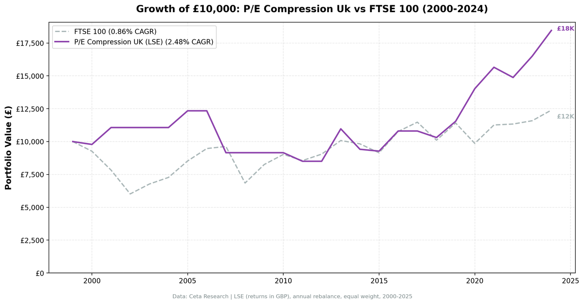
We tested a P/E compression mean reversion screen on 25 years of UK stock data from the London Stock Exchange. The strategy returned 2.48% annually (GBP-denominated) vs 0.86% for the FTSE 100. That looks like +1.62% excess, but the FTSE 100 is a price index that yields roughly 3.5% a year, so on a like-for-like basis the strategy loses. It also sat in cash for 9 of 25 years because the LSE universe couldn't produce 10 priceable names.
Contents
- What Changed From Our Earlier Version
- Method
- What We Found
- 25 years, 16 of them invested. A margin too small to call a win.
- Year-by-year returns
- The invested years look better than the full record
- 2007: the worst year
- Backtest Methodology
- Limitations
- Conclusion
Data: FMP financial data warehouse, 2000-2025. Updated August 2026.
What Changed From Our Earlier Version
An earlier version of this post reported 9.72% CAGR and +8.86% excess return with zero cash periods, and called the UK the strongest regional result in the study. That was wrong, and the reason is worth stating plainly.
The backtest held cash when fewer than 10 stocks passed the screen. It never checked how many of those stocks actually had a price at the rebalance date. FMP's fundamentals history for the LSE reaches back much further than its price history: in 2000, 444 of 7,107 LSE symbols had any end-of-day price data, against 5,308 in 2021. So the screen found 30 qualifying companies, four or five could be priced, and the average of those few shipped as a 30-stock portfolio return. The handful that could be priced skew heavily toward large survivors, which is why the old numbers looked so good. They were measuring the order in which FMP backfilled its data, not the strategy.
The backtest now re-checks the 10-name minimum after pricing. The UK loses most of its pre-2013 record as a result.
Method
Data source: Ceta Research (FMP financial data warehouse) Universe: LSE, market cap > £500M Period: 2000-2025 (25 years, 25 annual periods, 16 invested) Rebalancing: Annual (January), equal weight, top 30 by compression ratio Benchmark: FTSE 100 (^FTSE, GBP, price index) Execution: Next-day close (mark-on-close) Cash rule: Hold cash if fewer than 10 stocks qualify and can be priced
Returns are in GBP.
What We Found
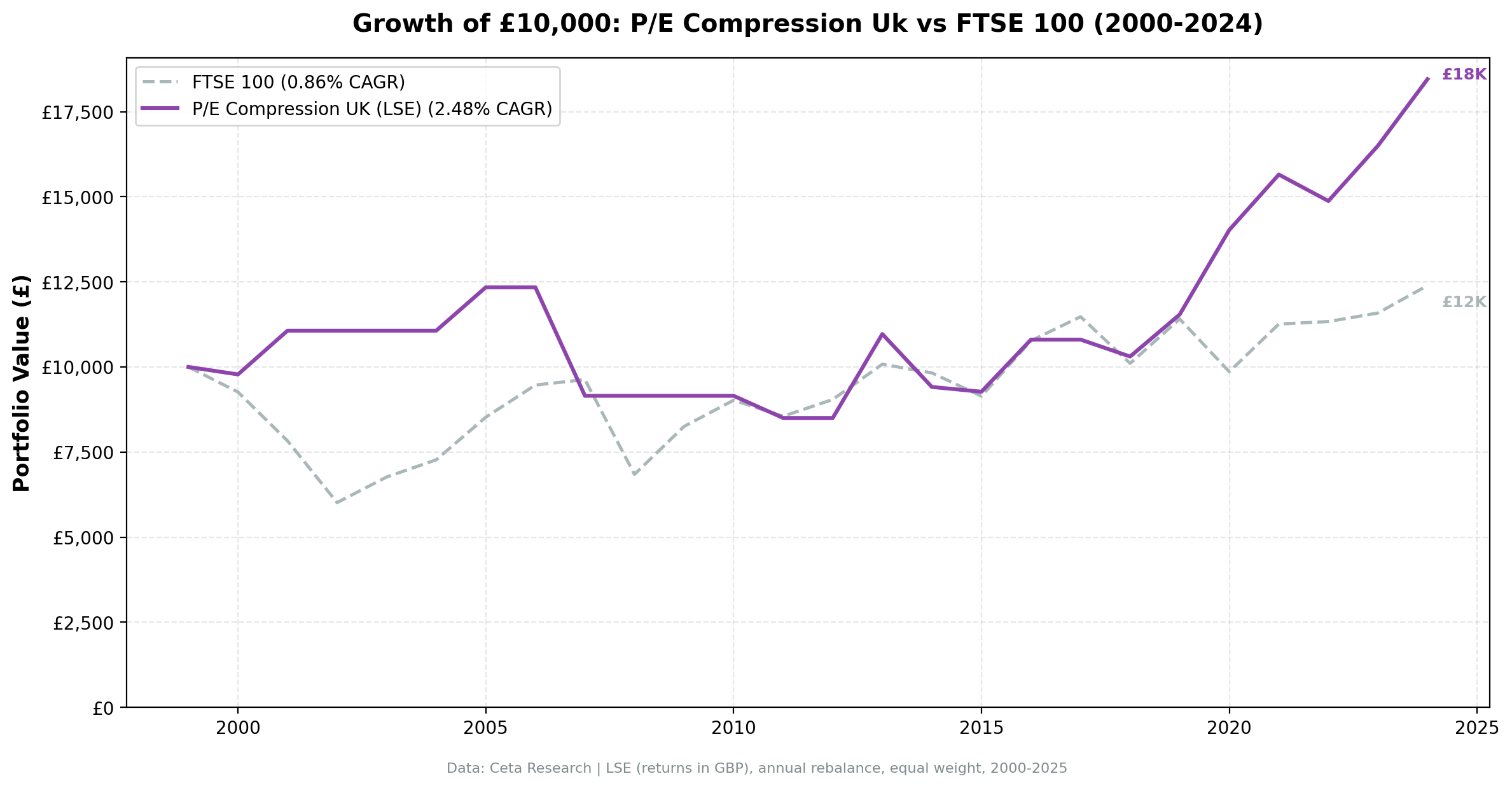
25 years, 16 of them invested. A margin too small to call a win.
| Metric | P/E Compression (UK) | FTSE 100 |
|---|---|---|
| CAGR | 2.48% | 0.86% |
| Total Return | 85% | 24% |
| Sharpe Ratio | -0.089 | - |
| Sortino Ratio | -0.128 | - |
| Max Drawdown | -31.12% | - |
| Volatility | 11.46% | - |
| Avg Stocks per Year | 14.1 | - |
| Cash Periods | 9 of 25 (36%) | - |
| Years Beating the FTSE | 10 of 25 | - |
Two numbers make the headline gap meaningless.
The benchmark excludes dividends. Portfolio returns use dividend-adjusted prices, but ^FTSE is the FTSE 100 price index and does not reinvest dividends. The FTSE 100 is one of the highest-yielding major indices, averaging roughly 3.5% a year over this period. A like-for-like total-return comparison turns the +1.62% headline excess into a deficit of around 2%. The UK is not an outperformer here.
The strategy was in cash more than a third of the time. Nine years with no equity exposure at all: 2002, 2003, 2004, 2006, 2008, 2009, 2010, 2012 and 2017. Some of that helped. The 2008 cash year avoided a 28.9% FTSE decline. Most of it hurt: 2003, 2009 and 2010 were all recovery years the strategy sat out. And a strategy you can only run in 16 of 25 years isn't really a strategy for that market.
The Sharpe and Sortino ratios are both negative, which means the 2.48% CAGR didn't clear the UK risk-free rate over this period. That's a clearer summary of the result than the excess-return figure.
Year-by-year returns
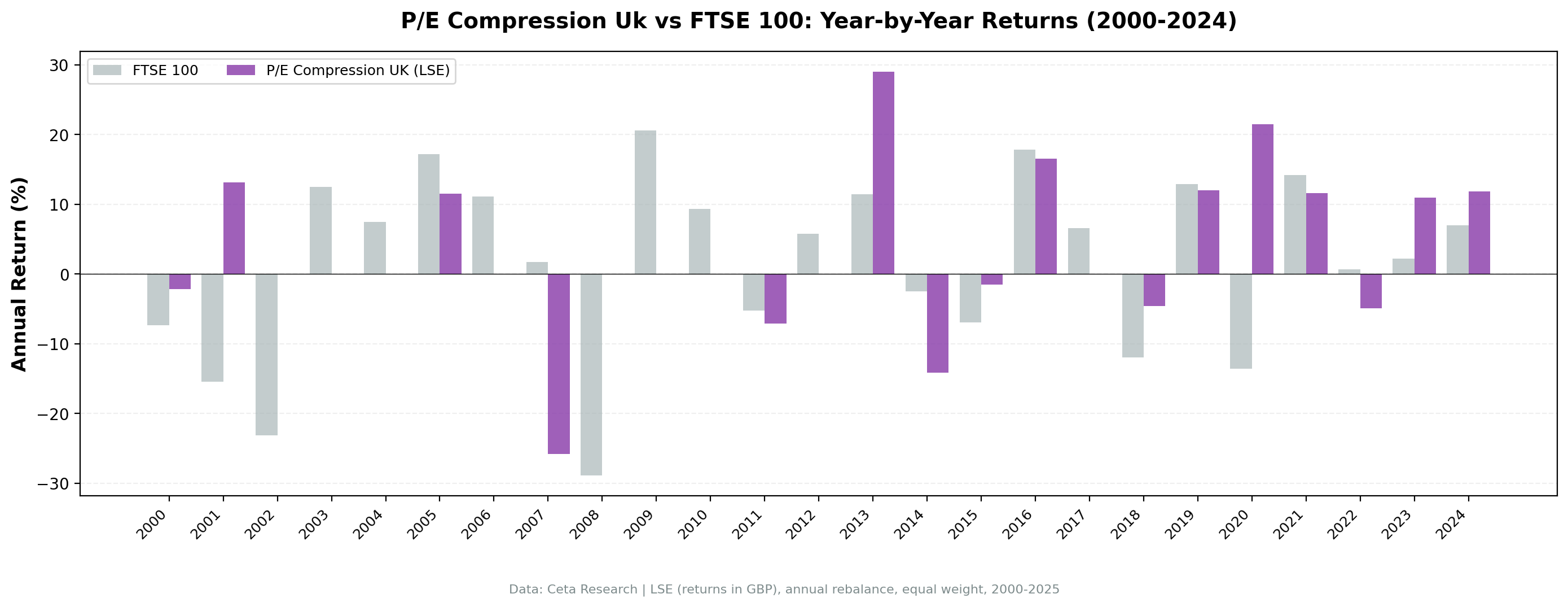
| Year | P/E Compression | FTSE 100 | Excess |
|---|---|---|---|
| 2000 | -2.2% | -7.4% | +5.2% |
| 2001 | +13.2% | -15.5% | +28.6% |
| 2002 | cash | -23.2% | +23.2% |
| 2003 | cash | +12.5% | -12.5% |
| 2004 | cash | +7.5% | -7.5% |
| 2005 | +11.5% | +17.2% | -5.7% |
| 2006 | cash | +11.1% | -11.1% |
| 2007 | -25.8% | +1.7% | -27.5% |
| 2008 | cash | -28.9% | +28.9% |
| 2009 | cash | +20.6% | -20.6% |
| 2010 | cash | +9.3% | -9.3% |
| 2011 | -7.1% | -5.2% | -1.9% |
| 2012 | cash | +5.8% | -5.8% |
| 2013 | +29.0% | +11.5% | +17.6% |
| 2014 | -14.2% | -2.5% | -11.7% |
| 2015 | -1.5% | -6.9% | +5.5% |
| 2016 | +16.5% | +17.8% | -1.3% |
| 2017 | cash | +6.5% | -6.5% |
| 2018 | -4.6% | -11.9% | +7.3% |
| 2019 | +12.0% | +12.9% | -0.9% |
| 2020 | +21.5% | -13.6% | +35.1% |
| 2021 | +11.6% | +14.2% | -2.6% |
| 2022 | -5.0% | +0.7% | -5.6% |
| 2023 | +10.9% | +2.2% | +8.7% |
| 2024 | +11.8% | +7.0% | +4.9% |
The invested years look better than the full record
Strip out the cash years and the picture improves. From 2013 onward, where LSE price coverage is dense enough to run the screen properly, the strategy beat the FTSE in 6 of 12 years, and its two best years in that window are large: +35.1% in 2020 and +17.6% in 2013.
That's the honest version of the UK case. In the period where the data can actually support the test, the strategy is competitive. Over the full 25 years it isn't, because a third of those years have no result at all.
2020 is the standout. The FTSE fell 13.6% on COVID and Brexit uncertainty while the compressed-P/E portfolio gained 21.5%. Quality names that had already absorbed bad news had less further to fall, and the recovery came faster in the mid-caps this screen selects than in the FTSE's banks and oil majors.
2007: the worst year
2007 is the strategy's worst single year: -25.8% against a FTSE gain of 1.7%. The portfolio entered the credit crisis holding names whose multiples had already compressed, and in that case the compression turned out to be justified rather than a sentiment overshoot. Quality filters (ROE > 10%, D/E < 2.0) are backward-looking, so they don't catch a business whose earnings are about to deteriorate. With an average of 14 holdings, one bad cohort moves the whole year.
Backtest Methodology
Full methodology documentation: backtests/METHODOLOGY.md
| Parameter | Choice |
|---|---|
| Universe | LSE, Market Cap > £500M |
| Signal | Current P/E < 85% of 5-year avg, P/E 5-40, ROE > 10%, D/E < 2.0 |
| Portfolio | Top 30 by lowest compression ratio, equal weight |
| Rebalancing | Annual (January) |
| Execution | Next-day close (mark-on-close) |
| Cash rule | Hold cash if fewer than 10 qualify and can be priced |
| Benchmark | FTSE 100 (^FTSE, GBP, price index) |
| Period | 2000-2025 (25 years, 16 invested) |
| Returns | GBP-denominated (portfolio and benchmark) |
| Transaction costs | 0.3% one-way (£500M-£5B market cap tier) |
Limitations
The benchmark excludes dividends, and it decides the result. ^FTSE is a price index. At a roughly 3.5% average yield, the dividend gap is more than twice the headline excess. This is the single most important caveat on the UK number.
Nine years with no result. 36% of the study has no equity exposure. The cause is FMP price coverage, not a market signal, so those years say nothing about whether P/E compression works in the UK. They only say the test can't be run there before roughly 2013.
Small universe when invested. 14.1 stocks on average against a stated top 30. Single-stock moves have outsized portfolio impact, which is visible in the -25.8% in 2007.
Sector concentration. Without sector constraints, the portfolio clusters in whichever sector is being repriced. The 2007 and 2014 drawdowns both came from that.
Survivorship bias. Exchange membership uses current LSE profiles. Delistings over 25 years aren't fully tracked, which compounds the price-coverage problem rather than offsetting it.
Conclusion
P/E compression in UK stocks returned 2.48% annually in GBP against 0.86% for the FTSE 100 price index. Adjust for the FTSE's roughly 3.5% dividend yield and the strategy trails a like-for-like benchmark. It also spent 9 of 25 years in cash because the LSE universe couldn't supply 10 priceable names.
The post-2013 record, where the price data supports the test, is genuinely competitive: 7 wins in 12 years including a +35.1% gap in 2020. That's a real finding, and a much smaller one than the version of this post that preceded it.
For UK investors, the practical read is that this screen needs a data history the LSE only recently developed, and that any excess it produces has to clear one of the highest index dividend yields in the developed world before it counts.
Data: Ceta Research (FMP financial data warehouse). Returns in GBP. Benchmark: FTSE 100 price index, which does not reinvest dividends. Past performance does not guarantee future results. Not investment advice. See full methodology at github.com/ceta-research/backtests.