Low Debt Quality on Japanese Stocks (JPX): 6.00% CAGR Over 25 Years

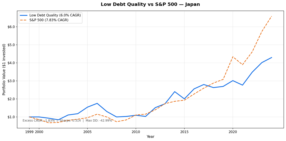
We ran the low-leverage quality screen on JPX-listed Japanese equities across 25 years. D/E < 0.5 and Piotroski F-Score >= 7 as the entry conditions. Annual July rebalance, equal weight, all qualifying stocks held. The result: 6.00% CAGR vs 7.83% for SPY. A deficit of -1.83% annually. The strategy averaged 112 qualifying stocks per rebalance, the largest invested universe of any single exchange we tested globally. It spent just 1 of 25 years in cash (2000).
Contents
- Method
- The Signal
- The Screen (SQL)
- What We Found
- 25 years. Behind SPY. Better downside protection than the other European markets.
- Annual returns (JPY vs SPY USD, July-to-July)
- 2000-2011: The deflation drag
- 2012 and 2014: Abenomics
- 2005: Another standout
- 2015 and 2020: The counterweight years
- Backtest Methodology
- Limitations
- Takeaway
- Part of a Series
- Run This Screen Yourself
Japan's result is shaped by two structural stories: the deflation era that suppressed returns through 2012, and the Abenomics years (2012-2014) that produced two of the largest single-year returns in the dataset. Strip those apart and you understand why the 25-year CAGR landed where it did.
Method
- Data source: Ceta Research (FMP financial data warehouse)
- Universe: JPX (Japan), market cap > ¥50B
- Period: 2000-2025 (25 years, 25 annual periods)
- Rebalancing: Annual (July), equal weight all qualifying
- Benchmark: S&P 500 Total Return (SPY)
- Cash rule: Hold cash if fewer than 10 stocks qualify
- Data lag: 45-day point-in-time lag on financial statements (prevents look-ahead bias)
Annual returns are measured July-to-July. The year label marks the start of each 12-month holding period. Returns are in JPY. SPY is in USD.
The Signal
Two filters. Both must pass.
Filter 1: Low Leverage
D/E < 0.5, measured from annual financial statements (FY data). This is a hard cutoff. Companies with debt-to-equity at or above 0.5 are excluded regardless of other metrics.
Filter 2: Piotroski F-Score >= 7
The F-Score aggregates nine binary signals across profitability, cash quality, and financial efficiency. Each signal scores 1 or 0. Stocks must score 7 or higher to qualify.
| # | Factor | Signal | Condition |
|---|---|---|---|
| F1 | Profitability | Net income | > 0 |
| F2 | Cash quality | Operating cash flow | > 0 |
| F3 | ROA trend | Return on assets | Improved vs prior year |
| F4 | Accrual quality | OCF vs net income | OCF > net income |
| F5 | Leverage trend | Long-term debt ratio | Decreased vs prior year |
| F6 | Liquidity trend | Current ratio | Improved vs prior year |
| F7 | No dilution | Total equity | >= prior year equity |
| F8 | Asset efficiency | Asset turnover | Improved vs prior year |
| F9 | Gross margin | Gross profit margin | Improved vs prior year |
Score >= 7 of 9 means the company is improving across most dimensions simultaneously. Japan produces the widest qualifying universe of any market we tested: 112 stocks on average. The reason is structural. Japanese corporate culture has historically favoured conservative financing. Many manufacturing companies, electronics firms, and precision equipment makers carry minimal debt as a matter of policy. The D/E < 0.5 filter doesn't narrow the Japanese universe the way it does in more leveraged markets. The Piotroski filter does more of the selectivity work.
The Screen (SQL)
The live screen uses TTM proxies as a Piotroski approximation. Full Piotroski requires year-over-year FY comparisons. The TTM screen substitutes ROE, operating margin, and interest coverage as quality proxies. Use this to find candidates, not to replicate the exact backtest signal.
SELECT p.exchange, r.symbol, p.companyName, p.sector,
    ROUND(r.debtToEquityRatioTTM, 3) AS de_ratio,
    ROUND(k.returnOnEquityTTM * 100, 1) AS roe_pct,
    ROUND(r.operatingProfitMarginTTM * 100, 1) AS opm_pct,
    ROUND(r.interestCoverageRatioTTM, 1) AS interest_coverage,
    ROUND(k.freeCashFlowYieldTTM * 100, 2) AS fcf_yield_pct,
    ROUND(k.marketCap / 1e9, 2) AS mktcap_b
FROM financial_ratios_ttm r
JOIN key_metrics_ttm k ON r.symbol = k.symbol
JOIN profile p ON r.symbol = p.symbol
WHERE r.debtToEquityRatioTTM >= 0
  AND r.debtToEquityRatioTTM < 0.50
  AND k.returnOnEquityTTM > 0.08
  AND r.operatingProfitMarginTTM > 0.08
  AND r.interestCoverageRatioTTM > 5.0
  AND p.isActivelyTrading = true
  AND k.marketCap > 50000000000
  AND p.exchange IN ('JPX')
ORDER BY de_ratio ASC
LIMIT 30
Run this query on Ceta Research
What We Found
25 years. Behind SPY. Better downside protection than the other European markets.
| Metric | Low Debt Quality (JPX) | S&P 500 (SPY) |
|---|---|---|
| CAGR | 6.00% | 7.83% |
| Total Return | 329.40% | 558.69% |
| Volatility | 18.79% | 15.00% |
| Max Drawdown | -42.99% | -36.27% |
| Sharpe Ratio | 0.314 | 0.38 |
| Down Capture | 75.1% | 100% |
| Up Capture | 81.23% | 100% |
| Win Rate (annual vs SPY) | 40% | - |
| Avg Stocks per Period | 112 | - |
| Cash Periods | 1 of 25 | - |
The 75.1% down capture stands out. For every dollar SPY loses in a down year, the JPX portfolio loses about 75 cents. That's the best downside protection among the three European and developed-market results in this series (Germany: 89.44%, UK: 96.58%). The trade-off is the up capture of 81.23%, the strategy also lags in strong years.
Annual returns (JPY vs SPY USD, July-to-July)
| Year | Portfolio (JPY) | SPY (USD) | Excess |
|---|---|---|---|
| 2000 | 0.0% (cash) | -14.8% | +14.8% |
| 2001 | -7.0% | -20.8% | +13.8% |
| 2002 | -9.5% | +3.3% | -12.8% |
| 2003 | +31.6% | +16.4% | +15.2% |
| 2004 | +6.6% | +7.9% | -1.4% |
| 2005 | +30.7% | +8.9% | +21.9% |
| 2006 | +13.6% | +20.9% | -7.3% |
| 2007 | -25.9% | -13.7% | -12.2% |
| 2008 | -23.0% | -26.1% | +3.1% |
| 2009 | +2.7% | +13.4% | -10.7% |
| 2010 | +6.5% | +32.9% | -26.5% |
| 2011 | -6.0% | +4.1% | -10.1% |
| 2012 | +47.4% | +20.9% | +26.6% |
| 2013 | +14.1% | +24.5% | -10.4% |
| 2014 | +38.9% | +7.4% | +31.6% |
| 2015 | -16.7% | +3.4% | -20.1% |
| 2016 | +27.6% | +17.7% | +9.9% |
| 2017 | +9.5% | +14.3% | -4.8% |
| 2018 | -6.1% | +10.9% | -17.0% |
| 2019 | +2.4% | +7.1% | -4.7% |
| 2020 | +12.0% | +40.7% | -28.7% |
| 2021 | -8.3% | -10.2% | +1.9% |
| 2022 | +26.0% | +18.3% | +7.7% |
| 2023 | +15.3% | +24.6% | -9.3% |
| 2024 | +6.9% | +14.7% | -7.7% |
2000-2011: The deflation drag
Japan's economy spent most of the 2000s in deflation or near-zero inflation. Nominal growth was suppressed. Corporate revenue growth was sluggish. Even well-run, low-debt companies struggled to show earnings expansion in this environment.
The Piotroski filter requires improvement across multiple dimensions: rising asset turnover, improving gross margin, increasing ROA. In a deflationary environment, these metrics are harder to improve. Companies that made the cut were genuinely improving, but the absolute level of improvement was smaller than in higher-growth markets.
2007 was the clearest illustration: -25.9% vs SPY's -13.7%. Japan's economy had its own pre-crisis vulnerabilities unrelated to US mortgages. Japanese export companies and banks faced a combination of yen appreciation (hurting exports), domestic demand weakness, and spillover from global credit tightening.
2010 was another painful year: +6.5% vs SPY's +32.9%, a -26.5% gap. The US was recovering strongly while Japan struggled with the aftermath of the global financial crisis on its export sector. Equal weighting across 112 Japanese small and mid-cap quality stocks didn't provide the concentration needed to match the US recovery rate.
2012 and 2014: Abenomics
+47.4% in 2012 and +38.9% in 2014. These are the two defining years of the Japan backtest.
Abenomics, launched under Prime Minister Shinzo Abe in late 2012, deployed aggressive monetary easing, fiscal stimulus, and structural reform targets. The Bank of Japan's quantitative easing pushed liquidity into Japanese equities. The yen weakened sharply, boosting earnings for Japan's large export manufacturers.
The quality filter selected precisely the companies that benefited most from Abenomics. Low-debt manufacturers with strong operating cash flow, improving asset efficiency, and conservative balance sheets were the direct beneficiaries when domestic liquidity rose and export margins expanded. Companies with high debt loads were less able to deploy capital opportunistically. Companies with weak Piotroski scores had underlying operational problems that easy money didn't fix.
2012's +47.4% is one of the largest single-year returns in the JPX dataset. 2014's +38.9% came from the same policy tailwind continuing into Japan's second major QE expansion. Together they delivered 26.6 and 31.6 percentage points of excess return over SPY, the two largest outperformance years in the full 25-year history.
2005: Another standout
+30.7% in 2005 vs SPY's +8.9%. Japan's economy was in a genuine recovery cycle during 2004-2006 under the Koizumi government's structural reforms. This period of domestic demand recovery and rising corporate profitability benefited the Piotroski-selected companies disproportionately. The filter was picking up companies with genuinely improving fundamentals during a period when the improvement mattered for valuations.
2015 and 2020: The counterweight years
2015 returned -16.7% vs SPY's +3.4%, a -20.1% deficit. Abenomics' third arrow (structural reform) stalled. Japan's economy contracted briefly. Yen strengthened in certain periods, cutting into exporters' margins. The same quality Japanese companies that had surged during the 2012-2014 easing period pulled back when the policy tailwind faded.
2020 was worse in relative terms: +12.0% vs SPY's +40.7%, a -28.7% gap. The COVID recovery was US-tech led. Japan's quality manufacturing companies had a solid 2020 in JPY terms, but the gap to a US market propped up by FAANG stocks was enormous. Equal weight across 112 JPX stocks simply didn't participate in the US tech boom that year.
Backtest Methodology
| Parameter | Choice |
|---|---|
| Universe | JPX (Japan), Market Cap > ¥50B |
| Signal | D/E < 0.5, Piotroski F-Score >= 7 (computed from FY statements) |
| Portfolio | All qualifying, equal weight |
| Rebalancing | Annual (July) |
| Cash rule | Hold cash if < 10 qualify |
| Benchmark | S&P 500 Total Return (SPY) |
| Period | 2000-2025 (25 years, 25 annual periods) |
| Data lag | Point-in-time, 45-day lag for financial statements |
Limitations
Currency mismatch. Returns are in JPY. SPY is in USD. Japan's monetary policy has created large, sustained JPY/USD movements over this period. Abenomics-era yen weakness boosted JPY returns on export companies. Periods of yen strength created headwinds for USD-based comparisons. The 2012 and 2014 standout years partly reflect favourable JPY dynamics in addition to genuine equity returns.
Policy-sensitive results. More than any other market in this study, Japan's returns are driven by central bank and government policy cycles. The deflationary 2000-2011 period and the Abenomics 2012-2016 period produced dramatically different outcomes from the same strategy. An investor who entered at the start of the deflationary decade would have waited 12 years for the strategy's main payoff years.
Large universe, limited alpha. 112 qualifying stocks is a broad portfolio. With that many positions, the strategy's returns converge toward the market. The quality filter's selectivity is lower when it lets in 112 of Japan's thousands of listed companies. The up capture (81.23%) and down capture (75.1%) confirm that the strategy moves meaningfully with the market rather than independently of it.
Survivorship bias. Exchange membership uses current company profiles. Historical delistings on JPX during 2000-2025 aren't fully captured. Japan had numerous corporate failures during the post-bubble cleanup of the 2000s.
TTM screen vs backtest signal. The live SQL uses TTM ratios as a Piotroski approximation. The backtest computed Piotroski from FY year-over-year changes. Use the screen for candidate identification, not exact replication.
Takeaway
JPX Low Debt Quality delivered 6.00% CAGR vs SPY's 7.83%, a -1.83% annual deficit over 25 years. The max drawdown of -42.99% was worse than SPY's -36.27%. But the 75.1% down capture is the best of any European or developed-market result in this series. Japan offers better downside cushion than Germany or the UK under this strategy, at the cost of trailing SPY in strong market years.
The 2012 (+47.4%) and 2014 (+38.9%) Abenomics years define the Japan result. They were genuine, policy-driven outperformance periods where low-debt quality manufacturing companies outperformed the broader market by wide margins. Without those two years, the 25-year CAGR would look much weaker. With them, Japan's strategy still can't match SPY over the full period, but it demonstrates what the quality filter can capture when macroeconomic conditions align.
Japan's corporate culture naturally fits the strategy's filters. Conservative balance sheets, low debt, strong cash generation, these aren't the result of the screen finding edge cases. They're how a large portion of Japan's industrial base operates. The 112-stock average universe reflects how many Japanese companies genuinely meet conservative balance sheet criteria. The limitation is that this same conservatism suppresses growth in normal times, which is why the deflation era was so costly.
Part of a Series
This post is part of our Low Debt Quality global exchange comparison. We ran the same strategy across 15 exchanges worldwide: - Low Debt Quality on US Stocks (NYSE + NASDAQ + AMEX) - 7.09% CAGR, -0.75% excess, 82.83% down capture - Low Debt Quality on Indian Stocks (BSE + NSE) - 14.05% CAGR, +6.22% excess - Low Debt Quality on Canadian Stocks (TSX) - +1.33% excess - Low Debt Quality on Swedish Stocks - +1.14% excess - Low Debt Quality on Swiss Stocks - best Sharpe in the study (0.429) - Low Debt Quality on German Stocks (XETRA) - 6.72% CAGR, -1.11% excess - Low Debt Quality on UK Stocks (LSE) - 6.14% CAGR, -1.69% excess - Low Debt Quality: Global Exchange Comparison - all 15 exchanges
Run This Screen Yourself
The TTM screen SQL above is runnable directly on Ceta Research. Query the FMP financial data warehouse and filter by exchange = 'JPX'. No setup required.
The full backtest code (Python + DuckDB) is on GitHub.
Part of a Series: Global | US | UK | Thailand | Taiwan | Switzerland | Sweden | India
Run It Yourself
Explore the data behind this analysis on Ceta Research. Query our financial data warehouse with SQL, build custom screens, and run your own backtests across 70,000+ stocks on 20 exchanges.
Data: Ceta Research, FMP financial data warehouse. Returns in JPY. Annual rebalance July, equal weight, 2000-2025.