FCF Yield Screens: Global Comparison Across 10 Markets
We ran the same FCF yield screen across 10 stock exchanges from 2000 to 2025, each measured against its own local index. Seven beat their benchmark, led by the UK at +8.75% over the FTSE 100. Switzerland looked good until we checked which companies were actually in the portfolio.

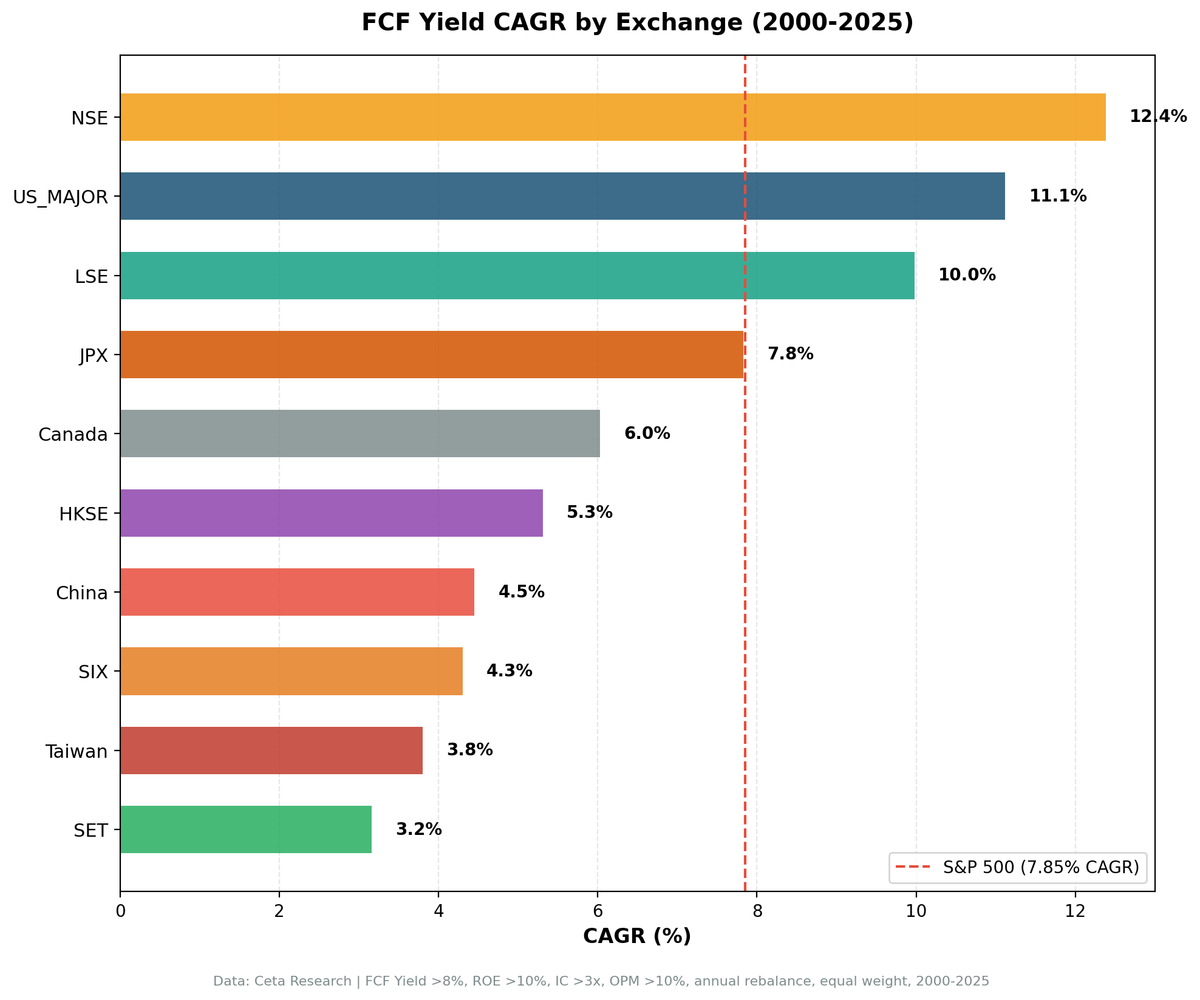
We ran the same FCF yield screen across 10 stock exchanges worldwide, from 2000 to 2025, and measured each one against its own local index in its own currency. Seven of the 10 beat their local benchmark.
Contents
- Method
- Summary Results
- The Three That Work Best
- UK (LSE): +8.75% over the FTSE 100
- Japan (JPX): +4.52% over the Nikkei 225
- US (NYSE + NASDAQ + AMEX): +3.27% over the S&P 500
- The Markets Where It Works, But Barely
- Hong Kong (HKSE): +3.67% over the Hang Seng
- Switzerland (SIX): +2.56% as listed, -1.00% for Swiss companies
- Canada (TSX): +2.08% over the TSX Composite
- China (SHH + SHZ): +2.02% over the SSE Composite
- India (NSE): +0.33% over the Sensex
- The Markets Where It Doesn't Work
- Taiwan: -0.28% vs the TAIEX
- Thailand (SET): -1.97% vs the SET Index
- What Separates Winners from Losers
- What This Study Does Not Cover
- Run It Yourself
- Live Screens
- Backtest Code
- Takeaway
The largest local excess is the UK at +8.75% a year over the FTSE 100, followed by Japan at +4.52% over the Nikkei 225. The US produced +3.27% over the S&P 500.
Two caveats before the table. First, these excesses aren't comparable to each other. A market whose index returned 1.23% a year is a much easier benchmark to beat than one that returned 7.85%, so the UK's +8.75% and the US's +3.27% describe different achievements against very different bars.
Second, and more important: a stock screen picks from everything listed on an exchange, which is not the same as the companies of that country. That distinction removed one market from this study entirely and put an asterisk on another. The detail is in what this study does not cover.
Data: FMP financial data warehouse, 2000-2025. Rerun August 2026 with next-day execution and price-artifact guards.
Method
Same screen, same parameters across all markets:
Filters: FCF Yield 8-50%, ROE > 10%, Interest Coverage > 3x, Operating Margin > 10% Rebalancing: Annual (July), top 30 by highest FCF yield, equal weight Period: 2000-2025 (25 annual periods) Benchmark: Each market's own local index, in that market's currency Execution: Entry and exit at the next day's close after each rebalance date Market cap thresholds: Exchange-specific Data quality: FCF yield cap at 50%, entry price floor, and single-period returns above 200% excluded as price artifacts
Benchmarking each market locally is the only way this comparison means anything. An Indian portfolio's rupee returns measured against a dollar-denominated S&P 500 would mostly be measuring the exchange rate.
Full methodology: backtests/METHODOLOGY.md
These benchmarks leave dividends out. Portfolio returns here use dividend-adjusted prices, so they include dividends. Most of the indices we measure against do not. The FTSE 100, Hang Seng, Nikkei 225, SET Index, SMI, SSE Composite, Sensex, TAIEX and TSX Composite are price indices, so excess return against them is overstated by roughly the local dividend yield, which has run between about 1.3% and 3.5% in these markets. One comparison is like for like: the S&P 500 figure runs through SPY, which is dividend-adjusted. Treat any edge thinner than the local yield as a tie rather than a win.
Summary Results
| Exchange | CAGR | Local benchmark | Bench CAGR | Excess vs local | Sharpe | MaxDD | Cash | Avg Stk |
|---|---|---|---|---|---|---|---|---|
| India (NSE) | 12.38% | Sensex | 12.06% | +0.33% | 0.238 | -17.0% | 9/25 | 17.7 |
| US | 11.12% | S&P 500 | 7.85% | +3.27% | 0.393 | -50.8% | 0/25 | 21.4 |
| UK | 9.98% | FTSE 100 | 1.23% | +8.75% | 0.311 | -25.0% | 3/25 | 15.4 |
| Japan | 7.83% | Nikkei 225 | 3.31% | +4.52% | 0.360 | -28.6% | 7/25 | 17.8 |
| Canada | 6.03% | TSX Composite | 3.95% | +2.08% | 0.201 | -27.8% | 5/25 | 15.5 |
| Hong Kong | 5.31% | Hang Seng | 1.64% | +3.67% | 0.119 | -35.5% | 5/25 | 19.6 |
| China | 4.45% | SSE Composite | 2.43% | +2.02% | 0.054 | -41.3% | 4/25 | 21.7 |
| Switzerland * | 4.30% | SMI | 1.74% | +2.56% | 0.269 | -45.0% | 9/25 | 6.8 |
| Taiwan | 3.80% | TAIEX | 4.09% | -0.28% | 0.180 | -24.6% | 7/25 | 21.3 |
| Thailand | 3.16% | SET Index | 5.13% | -1.97% | 0.036 | -33.8% | 6/25 | 12.8 |
* Switzerland does not survive a domicile check. Restricted to Swiss-domiciled companies its excess goes to -1.00%, so treat that row as a property of the listing venue rather than of Swiss companies. Germany failed the same check badly enough that it is excluded from this study.
Sorted by portfolio CAGR, which is not the same as sorted by skill. India tops the return column while adding almost nothing over the Sensex. The US tops the Sharpe column among the markets that survive the domicile check.
The Three That Work Best
UK (LSE): +8.75% over the FTSE 100
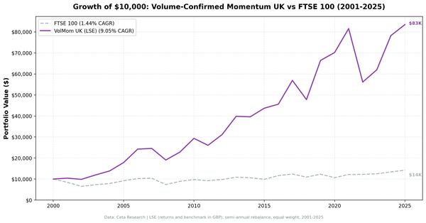
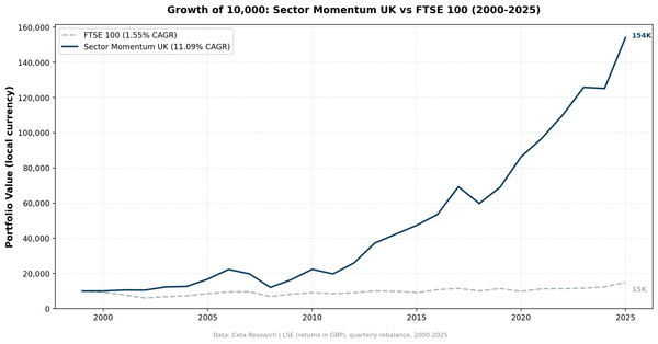
The largest local excess in the study, and the easiest benchmark to beat. The FTSE 100 returned 1.23% annually over 25 years. Win rate: 84%, 21 of 25 years.
The 2008 protection was strong: -4.4% for the LSE portfolio vs -22.0% for the FTSE 100. 2020 was more dramatic still: +66.8% vs +14.2%, a +52.7% excess.
The LSE screen runs a thin universe, averaging 15.4 qualifying stocks. Returns are in GBP and the FTSE 100 benchmark is also in GBP, so the comparison is currency-matched.
See the UK blog for the full year-by-year table.
Japan (JPX): +4.52% over the Nikkei 225
Sharpe of 0.360, second-best in the study behind the US. The Nikkei returned 3.31% annually over 25 years while Japanese equities stagnated, and the screen found quality companies that outperformed meaningfully. Down capture vs the Nikkei: 39.3%.
Cash periods: 7 of 25, so the screen sat out more than a quarter of the study when fewer than 10 stocks qualified.
US (NYSE + NASDAQ + AMEX): +3.27% over the S&P 500
The only market with zero cash periods across 25 years: the screen always found at least 10 qualifying stocks. This is also the hardest benchmark in the study, since the S&P 500 compounded at 7.85%.
2020 was the best year: +66.4% against SPY's +41.0%. The worst was 2019 (-28.1% vs +7.4%, a -35.6% excess), when growth premiums expanded and value had one of its worst years globally. Anyone starting in 2017 waited three years for the 2020 payoff.
See the US blog for the full year-by-year table.
The Markets Where It Works, But Barely
Hong Kong (HKSE): +3.67% over the Hang Seng
Hong Kong used to be the headline result in this comparison. Under the current guards it isn't: 5.31% CAGR against a Hang Seng that returned 1.64%, with a Sharpe of 0.119 and 46.2% down capture. The old claim that the portfolio lost only 5.5% in 2008 while the index fell 16.2% no longer holds. The corrected 2008 is -16.9% against -16.2%, essentially in line.
Most of the remaining excess sits in two clusters: 2006 (+34.9%) and 2021-2023, when Chinese property and leveraged conglomerates dragged the index down 37% cumulatively while the portfolio gained 7%.
See the Hong Kong blog for the full year-by-year table.
Switzerland (SIX): +2.56% as listed, -1.00% for Swiss companies
The thinnest universe in the study. The portfolio averaged 6.8 holdings and sat in cash for 9 of 25 years, which is a concentrated bet rather than a factor strategy. Restricting it to Swiss-domiciled companies pushes it into cash for 24 of 25 years and the excess to -1.00%. Whatever the SIX screen was measuring, it wasn't Swiss companies.
Canada (TSX): +2.08% over the TSX Composite
Canadian equities carry heavy energy and financials exposure. The FCF yield screen underweights energy (heavy capex) and overweights financials, which drives most of the difference. Down capture is 71.3%, the second-worst here, so the excess comes from the up years.
China (SHH + SHZ): +2.02% over the SSE Composite
Lumpy. Sharpe of 0.054 and a -41.3% max drawdown. The SSE Composite returned 2.43% annually over 25 years and the screen improved on that modestly, but the path was violent enough that few investors would have held it.
India (NSE): +0.33% over the Sensex
The highest raw CAGR in the study at 12.38%, and almost none of it is attributable to the screen. The Sensex returned 12.06% over the same period. India also sat in cash for 9 of 25 years. Earlier versions of this comparison excluded India as too thin; it runs now, but as a demonstration that a high return number and a good strategy are different things.
The Markets Where It Doesn't Work
Taiwan: -0.28% vs the TAIEX
Taiwan essentially matched its index (3.80% vs 4.09%) across 18 invested years. Down capture of 55.1% with up capture of only 70.7% is the wrong shape: the portfolio gives up more on the way down than it captures on the way up.
Thailand (SET): -1.97% vs the SET Index
The clearest failure. 3.16% CAGR vs the SET Index's 5.13%, with a down capture of 112.7%, meaning the portfolio falls harder than the index. The SET has 500+ listed companies but a large share fail the quality filters. The FCF yield signal doesn't work in Thailand.
What Separates Winners from Losers
Seven of 10 markets beat their local benchmark. The two that failed outright, Taiwan and Thailand, share a signature.
1. Capture asymmetry, not down capture alone. The old version of this analysis said down capture was the separator. That no longer survives the data: Canada has 71.3% down capture and still beats the TSX by 2.08%. What actually matters is the gap between up capture and down capture. The UK (196% up, 23% down) and Japan (104% up, 39% down) have wide positive gaps. Thailand (87% up, 113% down) has it backwards, and Taiwan (71% up, 55% down) is nearly flat.
2. Universe depth. Markets with few cash periods can deploy capital consistently. Switzerland (9 cash years, 6.8 average holdings), India (9), Taiwan (7) and Japan (7) all spent significant stretches uninvested or barely diversified. Korea was unusable at 13 cash years.
3. How hard the local benchmark is. The FTSE 100 returned 1.23% a year and the Hang Seng 1.64%. Beating those is a lower bar than beating the S&P 500's 7.85%. The UK's +8.75% and the US's +3.27% are not the same accomplishment, and reading the excess column without the benchmark column will mislead you.
What This Study Does Not Cover
The universe is exchange-listed, not domicile-based, and for two markets that changes the answer. The screen selects from every company listed on a given exchange, and outside the US and Hong Kong a large share of those are foreign companies' secondary listings. The 2015 XETRA screen was 32 US-domiciled companies out of 36. The 2020 LSE screen was 46 US to 20 UK. Those secondary lines are also frequently illiquid: about one in five daily rows on both XETRA and the LSE carries zero volume, so quoted prices go stale and real fills would differ from backtested ones.
We re-ran seven markets with the universe restricted to locally domiciled companies:
| Market | As listed | Locally domiciled | Cash periods |
|---|---|---|---|
| Germany (XETRA) | +4.01% | -3.60% | 5 → 20 of 25 |
| Switzerland (SIX) | +2.56% | -1.00% | 9 → 24 of 25 |
| UK (LSE) | +8.75% | +7.70% | 3 → 6 |
| Hong Kong | +3.67% | +3.43% | unchanged |
| Japan | +4.52% | +4.52% | unchanged |
| Canada | +2.08% | +2.07% | unchanged |
| India | +0.33% | +0.33% | unchanged |
The damage is concentrated in small and mid-sized European markets. Germany and Switzerland don't have enough domestic companies to fill a 30-stock quality screen, so the screen fills with foreign listings and the apparent alpha belongs to the venue. Germany failed so completely that we dropped it from this study rather than publish a German result built from Frankfurt-listed American companies. Deep domestic markets and genuinely regional exchanges are unaffected: Japan, Canada and India don't move at all, and Hong Kong loses a quarter of a point.
The practical reading: the UK, US, Japan, Canada, Hong Kong, China and India results describe what they claim to describe. Germany and Switzerland don't.
Markets too thin to test. Korea (13 of 25 years in cash), Israel (15), Sweden (20), Saudi Arabia (20) and Norway (23, and its local index has no pre-2013 data) all spent too much of the study uninvested to produce a meaningful result. They were run and set aside, not omitted.
Markets excluded for data quality. Australia (ASX) and Brazil (SAO) have adjClose split-adjustment errors severe enough to make multi-year price returns unreliable. Singapore (SGX) has no usable symbol coverage. France (PAR) has a pipeline gap with almost no annual filings in the warehouse.
Run It Yourself
Live Screens
Backtest Code
git clone https://github.com/ceta-research/backtests.git
cd backtests

# Run specific market
python3 fcf-yield/backtest.py --preset us
python3 fcf-yield/backtest.py --preset uk
python3 fcf-yield/backtest.py --preset japan
python3 fcf-yield/backtest.py --preset hongkong
python3 fcf-yield/backtest.py --preset india

# Run all supported markets
python3 fcf-yield/backtest.py --global
Takeaway
FCF yield travels, but less far than the raw table suggests. Seven of 10 markets beat their local index in a way that survives scrutiny: UK (+8.75%), Japan (+4.52%), Hong Kong (+3.67%), US (+3.27%), Canada (+2.08%), China (+2.02%) and India (+0.33%). Taiwan (-0.28%) and Thailand (-1.97%) failed outright. Switzerland looked like a winner and turned out to be measuring its listing venue rather than its economy. Germany failed the same check and is excluded.
Read the survivors with the benchmark column open. Beating a FTSE 100 that returned 1.23% a year is not the same accomplishment as beating an S&P 500 that returned 7.85%, and the biggest excess numbers sit in the markets with the weakest indices. On a risk-adjusted basis the US leads on Sharpe at 0.393, while the UK's headline +8.75% comes with a 0.311.
The outright failures share a shape. Thailand captures 113% of its index's declines and Taiwan gives up more on the way down than it takes on the way up. Where the screen works, it works by not owning the things that blow up.
The broader lesson is about universes rather than about free cash flow. A screen answers the question you actually asked it, and "every company listed in Frankfurt" is a different question from "German companies." We had that wrong for two markets and it inverted both answers.
Data: Ceta Research (FMP financial data warehouse), 2000-2025. Each market benchmarked against its own local index in local currency. Full methodology: METHODOLOGY.md. Past performance does not guarantee future results. This is educational content, not investment advice.