FCF Growth Across 13 Global Exchanges: Where It Works and Where It Fails
We ran the same FCF growth screen across 13 exchanges over 25 years. Nine of 13 beat their local benchmark, but the real story is data coverage: once periods without usable prices are held in cash, the UK collapses from best market to barely positive.

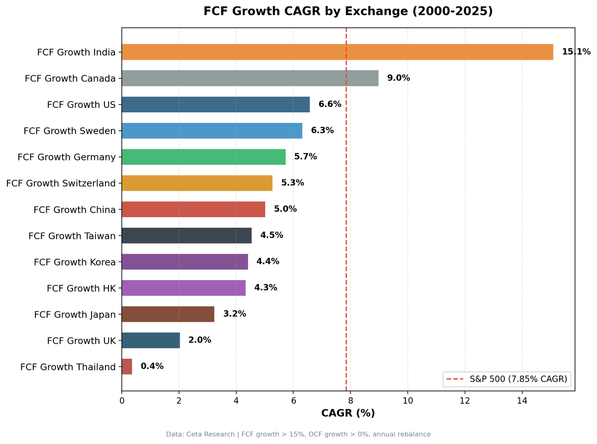
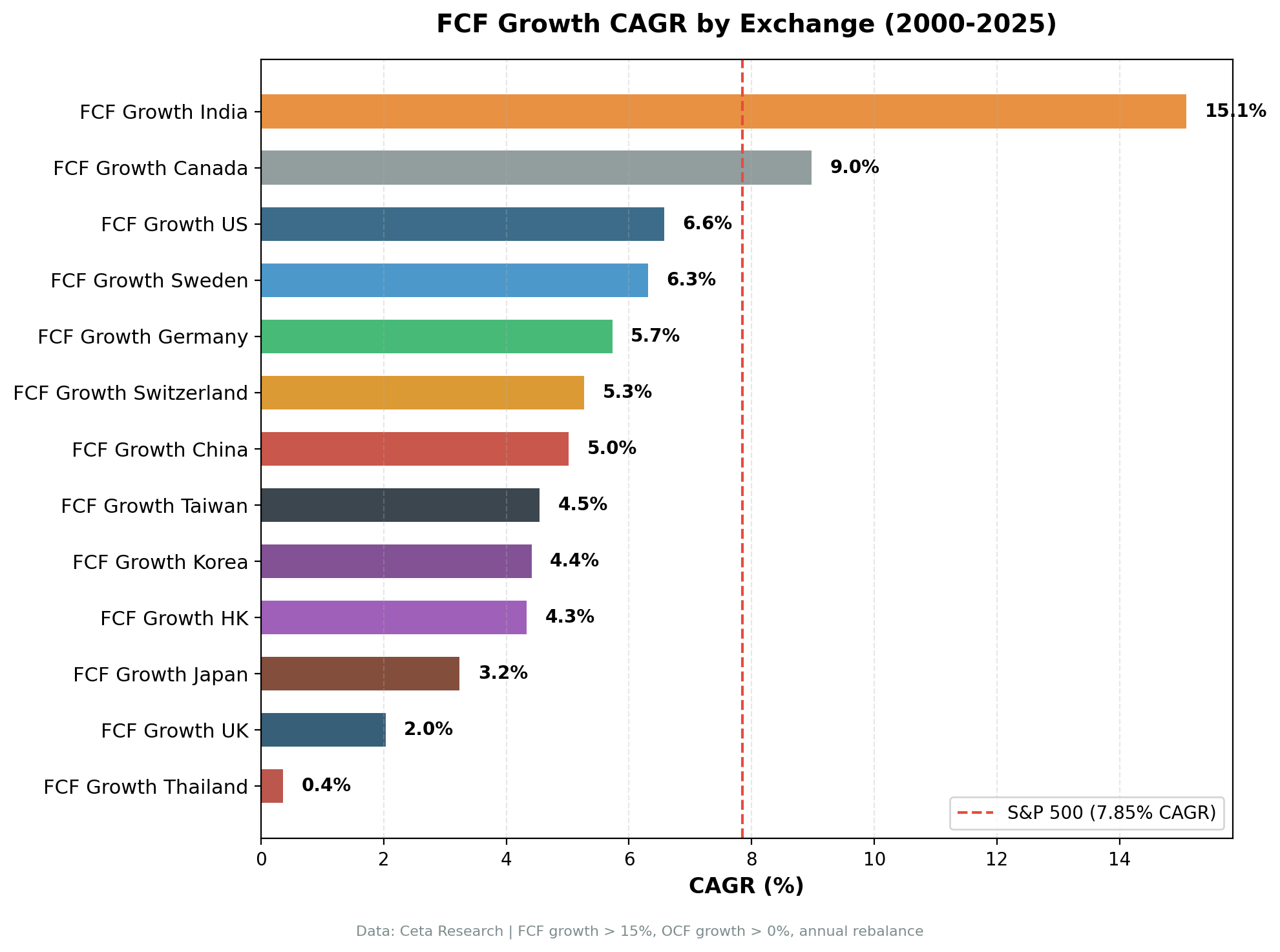
We ran the same FCF growth screen across 13 global exchanges from 2000 to 2025. Same signal, same quality filters, same portfolio construction rules. Nine of thirteen beat their local benchmark. The gap between the best and worst outcome is 9.8 percentage points of annual excess return, and the pattern tells you more about market structure and data coverage than about cash flow quality.
Contents
- Method
- Full Results: 13 Exchanges
- Data Coverage Is Half the Story
- Key Findings
- Down Capture: The Main Story
- Exchange Notes
- Why Local Benchmarks Change the Story
- Limitations
- Run It Yourself
Data: FMP financial data warehouse, 2000–2025. Updated August 2026.
Method
The same screen ran on every exchange: FCF growth YoY above 15%, operating cash flow growth above 0%, ROE above 10%, debt-to-equity below 1.5. Exchange-specific market cap thresholds, set in each market's own currency and ranging from about $240M to $1B in USD equivalent. Top 30 stocks by FCF growth rate, equal-weighted, rebalanced annually each July. The 45-day data lag after fiscal year-end prevents lookahead bias from late filers.
| Parameter | Value |
|---|---|
| Signal | FCF growth YoY >15%, OCF growth YoY >0% |
| Quality | ROE >10%, D/E <1.5 |
| Selection | Top 30 by FCF growth, equal weight |
| Rebalancing | Annual (July), 45-day data lag |
| Benchmark | Local market index (Sensex for India, DAX for Germany, TSX Composite for Canada, etc.) |
| Benchmark dividends | Reinvested for the US (SPY) and Germany (DAX). The other 11 indices are price-only. See Limitations. |
| Period | 2000-2025 |
| Code | github.com/ceta-research/backtests |
Returns are in local currency for each exchange. Benchmarks are local indices, not SPY. This provides an apples-to-apples comparison: how does the FCF growth screen perform against its own market?
The portfolio holds cash in any period where fewer than 10 names both pass the screen and have a usable price at the rebalance date. That second condition does real work outside the US, and the "Periods Invested" column below is the single most important column in the table. See the coverage section.
Excluded from the study: South Africa (only 8 of 25 periods investable, too sparse to report), Singapore (average 8.4 qualifying stocks, below the 10-stock minimum), Australia (adjClose data artifacts from corporate actions), and Brazil (same adjClose issue).
Each period runs July to July and is labelled by the year it begins, so "2008" means July 2008 through July 2009 rather than the calendar year. Portfolio and benchmark are measured over identical windows.
Full methodology: METHODOLOGY.md
These benchmarks leave dividends out. Portfolio returns here use dividend-adjusted prices, so they include dividends. Most of the indices we measure against do not. The FTSE 100, Hang Seng, KOSPI, Nikkei 225, OMX Stockholm 30, SET Index, SMI, SSE Composite, Sensex, TAIEX and TSX Composite are price indices, so excess return against them is overstated by roughly the local dividend yield, which has run between about 1.3% and 3.5% in these markets. Those comparisons are like for like: the S&P 500 figure runs through SPY, which is dividend-adjusted; the DAX is a performance index. Subtract the yield and only 6 of those 9 keep a positive edge. The ones that do not survive it are Hong Kong, the UK and Taiwan. Sweden survives by less than half a point, which is inside the noise.
Full Results: 13 Exchanges
| Exchange | CAGR | Local Benchmark | Bench CAGR | Excess | Down Capture | Sharpe | MaxDD | Win Rate | Periods Invested |
|---|---|---|---|---|---|---|---|---|---|
| India (NSE) | 15.09% | Sensex | 12.06% | +3.03% | 36.9% | 0.351 | -21.16% | 64% | 20/25 |
| Canada (TSX) | 8.98% | TSX Composite | 3.95% | +5.03% | 21.2% | 0.336 | -29.11% | 68% | 25/25 |
| US (NYSE+NASDAQ+AMEX) | 6.57% | S&P 500 | 7.85% | -1.28% | 51.3% | 0.245 | -31.80% | 32% | 25/25 |
| Sweden (STO) | 6.31% | OMX Stockholm 30 | 2.55% | +3.75% | 40.9% | 0.229 | -39.55% | 64% | 18/25 |
| Germany (XETRA) | 5.73% | DAX | 5.04% | +0.69% | 42.9% | 0.223 | -28.62% | 52% | 19/25 |
| Switzerland (SIX) | 5.27% | SMI | 1.74% | +3.53% | 21.7% | 0.316 | -22.47% | 64% | 17/25 |
| China (SHZ+SHH) | 5.02% | SSE Composite | 2.43% | +2.59% | 69.6% | 0.073 | -47.49% | 44% | 25/25 |
| Taiwan (TAI+TWO) | 4.54% | TAIEX | 4.09% | +0.46% | 48.1% | 0.270 | -13.27% | 44% | 18/25 |
| Korea (KSC) | 4.41% | KOSPI | 5.35% | -0.94% | 49.9% | 0.079 | -28.87% | 48% | 16/25 |
| Hong Kong (HKSE) | 4.33% | Hang Seng | 1.64% | +2.69% | 77.3% | 0.058 | -40.64% | 56% | 22/25 |
| Japan (JPX) | 3.24% | Nikkei 225 | 3.31% | -0.08% | 64.7% | 0.160 | -49.57% | 48% | 21/25 |
| UK (LSE) | 2.03% | FTSE 100 | 1.23% | +0.80% | 14.4% | -0.100 | -32.09% | 56% | 13/25 |
| Thailand (SET) | 0.36% | SET Index | 5.13% | -4.77% | 165.2% | -0.112 | -64.14% | 36% | 20/25 |
Note: Most local benchmarks significantly underperformed the S&P 500 (7.85% CAGR) over this 25-year period. The FTSE 100 returned 1.23%, the SMI 1.74%, the SSE Composite 2.43%, the OMX Stockholm 30 2.55%. Beating a local benchmark is easier than beating SPY when the local market itself trails SPY by 2 to 6 percentage points a year.
Data Coverage Is Half the Story
Look at the last column before you read anything else into this table.
FMP's fundamentals history reaches further back than its end-of-day price history, and the gap is severe outside the US. On XETRA, only 233 of 2,665 listed symbols have any price data by 2001, rising to 2,295 by 2022. The pattern repeats across Europe and Asia.
That produces a specific trap. The screen identifies 30 qualifying companies in July 2001, but only three of them have a tradeable price. Averaging those three doesn't measure the strategy. It measures whichever companies the data vendor backfilled first, which skews hard toward large survivors. The result looks like alpha and is actually selection bias.
This study holds cash whenever fewer than 10 screened names have usable prices. The consequences:
- Fully covered (25/25): US, Canada, China. Read these results at face value.
- Well covered (20-22/25): India, Hong Kong, Japan, Thailand. India's five missing periods are the one case in this table where the screen, not the price data, came up short.
- Partially covered (16-19/25): Sweden, Germany, Taiwan, Switzerland, Korea. A quarter to a third of the window is missing. Treat the CAGR as indicative.
- Poorly covered (13/25): UK. Roughly half the period isn't investable in this dataset.
An earlier version of this analysis did not apply that price check. It reported the UK at +5.52% excess with an 84% win rate, which made Britain look like the best market in the study. With the check applied, the UK is +0.80% on 13 investable periods. That earlier number was an artifact, and it's worth stating plainly rather than quietly restating.
Key Findings
1. Nine of thirteen exchanges beat their local benchmark. Only 6 of those 9 keep the edge once you allow for the dividends those price indices leave out.
That's the headline, and it's a weaker one than the previous version of this study claimed. Four markets trail their local index: the US, Korea, Japan and Thailand.
The magnitude varies. Canada leads at +5.03% excess. Sweden +3.75%. Switzerland +3.53%. India +3.03%. Hong Kong +2.69%. China +2.59%. These are meaningful, compounding excess returns.
Germany (+0.69%), the UK (+0.80%) and Taiwan (+0.46%) are positive but thin enough that data coverage and universe definition move them around more than the signal does. Germany's edge inverts to -1.33% if you restrict the universe to German-domiciled companies rather than everything listed on XETRA.
The US (-1.28%), Korea (-0.94%), Japan (-0.08%) and Thailand (-4.77%) trail. The US case makes sense: the S&P 500 is dominated by mega-cap tech companies whose cash flows are enormous but no longer growing at 15% off a base that size. Across all 25 US periods, Apple, Microsoft, Amazon and Meta never once made the top 30 by FCF growth rate, and Nvidia appeared only in 2001 and 2006. The screen ranks on growth rate, so it structurally misses the companies that carried the index. The S&P 500 is an outlier benchmark globally.
2. FCF growth is a downside shield in most markets, not an alpha generator relative to SPY.
When benchmarked against SPY (7.85% CAGR), only two exchanges outperformed: India and Canada. Eleven trail SPY. That comparison sets local-currency returns against a USD one and ignores currency moves, so treat it as indicative rather than as a return a dollar investor would have earned.
Against their own local index, nine outperformed. The difference is that most local indices badly underperformed SPY. The FTSE 100 returned 1.23%, the SMI 1.74%, the SSE Composite 2.43%. Beating those is a lower bar than beating SPY.
The signal is primarily a quality filter that tilts portfolios toward cash-generating companies. Where the broad index is weak and diversified, the tilt adds value. Where the index is strong and concentrated in high-multiple growth (the US), it doesn't keep up.
3. India and Canada are the only unambiguous wins.
Both clear their local benchmark by a wide margin, and both do it with the coverage to back it up. Canada is invested in all 25 periods, India in 20.
- Canada: +5.03% excess, 21.2% down capture, 133.9% up capture. The best asymmetry in the study. The TSX Composite is commodity-heavy and returned only 3.95%; the FCF screen finds the cash-generating layer inside that market.
- India: 15.09% CAGR, the highest absolute return by a factor of 1.7. Canada is second at 8.98%. India's down capture of 36.9% is higher than earlier reported but still strong.
Everything else in the positive column is either thin, thinly covered, or both.
4. Taiwan still has the best drawdown number, and it's partly an artifact.
Max drawdown of -13.27% is the best in the study. But Taiwan sat in cash for 7 of 25 periods, and cash periods flatter drawdown statistics because cash doesn't fall. Taiwan also barely beats the TAIEX (+0.46%). Switzerland is the more interesting risk story: -22.47% max drawdown, 21.7% down capture, and a genuine +3.53% excess, though on only 17 invested periods.
5. The UK reversal is the cautionary tale.
The previous version of this study reported the UK as the best market in the world for this strategy: +5.52% excess against a weak FTSE 100, with an 84% win rate. It was the single most quotable result here.
It was an artifact. Once periods without usable prices for 10 screened names are held in cash, the UK has 13 investable periods out of 25, a 2.03% CAGR and +0.80% excess. The old figure was measuring a handful of large survivors that FMP had backfilled, not a UK FCF portfolio.
The lesson generalizes past this study: when a backtest reports an unusually strong result in a market with thin historical data, check how many names were actually priced before you believe it.
Down Capture: The Main Story
The down capture column shows how much of the local benchmark's downside the portfolio absorbed in down years.
Here's the distribution:
- Below 25% (exceptional protection): Canada (21.2%), Switzerland (21.7%)
- 25-50% (strong protection): India (36.9%), Sweden (40.9%), Germany (42.9%), Taiwan (48.1%), Korea (49.9%)
- 50-70% (moderate protection): US (51.3%), Japan (64.7%), China (69.6%)
- Above 70% (minimal protection): Hong Kong (77.3%)
- Above 100% (amplifies losses): Thailand (165.2%)
The UK's 14.4% looks like the best number in the table and isn't comparable to the rest. Twelve of its 25 periods are cash, and cash has a down capture of zero, so the figure mostly measures absence rather than protection.
The markets with genuinely low down capture are ones where FCF-generating companies have structural insulation from the local benchmark's worst years.
Canada (21.2%): Resource and energy companies. The TSX Composite is commodity-heavy. FCF-growing energy producers often have pricing power or low production costs. When the TSX falls on oil price declines, the companies still growing FCF are the ones with cost advantages.
Switzerland (21.7%): Pharmaceutical exporters and specialty industrials with global revenue bases and defensive end markets. The SMI itself is narrow and returned only 1.74%.
India (36.9%): IT exporters with dollar revenues, FMCG companies serving domestic consumers, and private financials with tight credit discipline. These businesses keep generating cash through rupee volatility and domestic slowdowns.
Germany (42.9%) and Sweden (40.9%): Export-oriented industrials with global customer bases. When the DAX or OMX30 falls on European-specific stress, these companies still serve global demand.
At the other end, Thailand's 165.2% is the clearest failure in the study. The SET portfolio amplified the index's losses by more than half again, took a -64.14% max drawdown, and returned 0.36% a year against a benchmark that returned 5.13%. Hong Kong at 77.3% is the second-worst: the FCF screen selected a set of Hong Kong-listed companies nearly as exposed to local downside as the Hang Seng itself, though it still cleared the index on return.
Exchange Notes
Canada (TSX): The strongest result in the study. +5.03% excess vs the TSX Composite, 21.2% down capture, 133.9% up capture, invested in all 25 periods. The asymmetry profile is the best here, and it's the only top result with complete data coverage. Win rate 68% (17 of 25). The TSX Composite itself is weak (3.95% CAGR), heavily tilted toward resources, and the FCF screen finds the cash-generating layer within that commodity-heavy market.
India (NSE): +3.03% excess vs the Sensex, 36.9% down capture, 113.7% up capture. Absolute CAGR of 15.09% is the highest in the dataset by a wide margin. Five cash periods, all in 2000-2004, and unlike the other exchanges these were driven by the screen rather than by price coverage: between zero and four NSE companies cleared all four conditions in each of those years. Win rate 64%. India combines the best absolute returns with strong downside protection.
US (NYSE+NASDAQ+AMEX): -1.28% excess vs the S&P 500. The index returned 7.85%, driven by mega-cap tech that the screen systematically excludes during high-growth, low-FCF phases. Down capture of 51.3% shows the portfolio absorbed about half the index's downside. Win rate of only 32% (8 of 25 years). Invested in all 25 periods, so this is one of the most trustworthy rows in the table.
Sweden (STO): +3.75% excess vs the OMX Stockholm 30, which returned only 2.55%. Down capture of 40.9% is strong. Seven cash periods, so 18 investable years. The portfolio captured Swedish quality compounders in industrials and pharmaceuticals.
Germany (XETRA): +0.69% excess vs the DAX, down from +3.30% in the previous version once price-coverage gaps were held in cash. Six cash periods. The risk side holds up: 42.9% down capture and a -28.62% max drawdown against the DAX's -53.43%. But restricting to German-domiciled companies flips the excess to -1.33%, so the alpha claim is not robust.
Switzerland (SIX): +3.53% excess vs the SMI, with the second-lowest down capture (21.7%) and a shallow -22.47% max drawdown. Eight cash periods and an average of 16.0 stocks when invested, the thinnest book in the study, so concentration risk is real. The SMI returned only 1.74%, making this a low bar cleared convincingly.
China (SHZ+SHH): +2.59% excess vs the SSE Composite, and invested in all 25 periods. Down capture of 69.6% is poor and the -47.49% max drawdown is among the worst. The SSE Composite returned only 2.43%. Chinese financial reporting quality introduces noise: the signal may be selecting genuine cash generators, or companies whose statements pass the filters. Win rate 44%.
Taiwan (TAI+TWO): +0.46% excess vs the TAIEX, essentially flat. Max drawdown of -13.27% is the best in the study, but 7 cash periods flatter that number. A capital preservation profile, not an alpha generator.
Korea (KSC): -0.94% excess vs the KOSPI. The KOSPI returned 5.35%, the portfolio 4.41%. Nine cash periods leave only 16 investable years. Korea's FCF growers exist, but the market's upside doesn't flow through to them.
Hong Kong (HKSE): +2.69% excess vs the Hang Seng, better than previously reported. But down capture of 77.3% is the worst among markets that made money, and the -40.64% max drawdown is deep. Hong Kong's market is dominated by mainland China-linked names and property developers, and the screen doesn't provide the insulation it does elsewhere.
Japan (JPX): -0.08% excess vs the Nikkei 225, a sign flip from the +2.31% previously reported. Max drawdown of -49.57% is the worst in the study. Japan's FCF companies are often mature industrials with cyclical cash flows. The screen provides no alpha here and doesn't meaningfully reduce drawdown.
UK (LSE): +0.80% excess vs the FTSE 100, down from a previously reported +5.52%. Only 13 of 25 periods are investable, the worst coverage of any exchange still in the study. The 2.03% CAGR and negative Sharpe (-0.100) mean the strategy did not clear the UK cost of capital. Treat this row as a data-coverage report rather than a strategy result.
Thailand (SET): -4.77% excess vs the SET Index, the worst outcome in the study. The portfolio returned 0.36% a year against a benchmark that returned 5.13%, took a -64.14% max drawdown, and amplified index losses with a 165.2% down capture. This is what the screen looks like when it fails outright.
Why Local Benchmarks Change the Story
Comparing global strategies against SPY creates a false impression that most markets fail. The reality: most local indices significantly underperformed SPY over this 25-year period.
The FTSE 100 returned 1.23%. The TSX Composite returned 3.95%. The DAX returned 5.04%. These are all developed-market indices with deep liquidity and strong corporate governance. They still trailed SPY by 2-6 percentage points per year.
The S&P 500 is an exceptional benchmark. It's dominated by the world's largest, most profitable tech companies with global revenue streams and network effects. No other country has an index with that concentration of high-margin, capital-light, winner-take-most businesses.
When you benchmark a global FCF growth strategy against local indices, the story changes. Nine of thirteen markets show positive excess. After the dividend adjustment, 6 of those 9 hold. The FCF growth signal works in most markets, it just doesn't beat the S&P 500's exceptional returns.
The honest version of that claim is narrower than it looks, though. Strip out the markets where the edge is under one percentage point or where a third of the window isn't investable, and what's left is Canada, India, Sweden, Switzerland, Hong Kong and China. Six clear positives, four clear negatives, three too thin to call.
Limitations
Price coverage is the binding constraint. FMP's fundamentals history reaches further back than its price history outside the US, so the screen finds qualifying companies in years where few of them can be priced. The study holds cash in those periods rather than averaging the handful that survive, but that means several exchanges are measured over fewer than 25 years. The UK (13 investable periods), Korea (16) and Switzerland (17) are the most affected.
Cash periods distort certain metrics. Cash doesn't fall when markets do, so cash periods flatter down capture and max drawdown. The UK's 14.4% down capture and Taiwan's -13.27% max drawdown are both partly artifacts of sitting out. Genuine downside protection is better judged on the fully covered markets: Canada, the US and China.
Exchange-listed is not domicile. Screening everything listed on an exchange picks up foreign secondary listings, which outside the US can carry the result. Germany is the worked example here: +0.69% excess on the XETRA-listed universe, -1.33% on German-domiciled companies only. Every number in this study uses the listed universe, consistently across all 13 exchanges.
Eleven of the 13 benchmarks exclude dividends. Portfolio returns are computed from dividend-adjusted prices, so they include dividends. Only two benchmarks do the same: SPY, which is a dividend-adjusted ETF, and the DAX, which is a performance index that reinvests dividends by construction. The other 11 indices in this table are price indices. Typical dividend yields over this period run from roughly 1% to 1.5% in India up to 3% or more in Canada, Switzerland, Taiwan, the UK and Hong Kong, so those excess-return figures are overstated by approximately the local yield. The ranking is broadly unaffected, but several of the thinner positives, Taiwan at +0.46%, Germany at +0.69% and the UK at +0.80%, would not survive the adjustment, and Canada's +5.03% is closer to +2% on a like-for-like basis. The US and German rows need no adjustment. This is a limitation of the benchmark series available in the warehouse, not of the strategy.
Universes are built from listings, not companies. A business with a common share plus a preferred series or a second share class can occupy more than one of the 30 slots, and a small number of fund vehicles pass the fundamental filters. In the US run these account for about 7% and 3% of positions respectively, so effective diversification is nearer 27 names than 30. The effect on returns is not modelled here.
Local currency vs cross-market comparison. Returns are in local currency. An Indian investor running this strategy earns 15.09% in INR. A US investor would need to account for INR/USD depreciation (roughly 3-4% annually over this period). Currency effects are not modeled.
Data quality varies by exchange. Chinese financial statements and historical Taiwanese filings carry more noise than US or German data. The filter may behave differently where accounting standards are less rigorous.
Thin universes create concentration risk. Switzerland averaged 16.0 stocks when invested, the UK 15.1. Equal weighting a 16-stock portfolio creates idiosyncratic risk, and a single sector rotation can drive outsized single-year swings.
Transaction costs are estimated. Size-tiered one-way rates: 0.1% above $10B market cap, 0.3% from $2B to $10B, 0.5% below, charged on entry and exit. Real execution costs depend on market microstructure, liquidity and position sizing. Emerging market exchanges typically have wider effective spreads.
25-year window. Market structure, reporting quality and economic regimes shift over that horizon. Any exchange-level conclusion carries the caveat that regime change could alter the result.
Benchmark availability. Every exchange in this study is measured against a local index in its own currency. South Africa was dropped from the study partly because FMP's stock_eod table contains no JSE index, leaving SPY as the only fallback, and partly because only 8 of 25 periods were investable.
Run It Yourself
The full backtest code is open source at github.com/ceta-research/backtests.
To run the FCF growth strategy on all exchanges:
python3 fcf-growth/backtest.py --global --output results/exchange_comparison.json
Individual exchanges:
python3 fcf-growth/backtest.py --preset india --output results/returns_NSE.json
python3 fcf-growth/backtest.py --preset canada --output results/returns_TSX.json
python3 fcf-growth/backtest.py --preset germany --output results/returns_XETRA.json
To reproduce the domicile test on any European market:
python3 fcf-growth/backtest.py --preset germany --domicile-filter --output results/dom_XETRA.json
The data runs through Ceta Research's data platform, which covers 70,000+ global securities with FMP fundamentals, EOD prices, and a DuckDB query layer.
Data: Ceta Research (FMP warehouse), TTM metrics. Backtest period: 2000–2025. Execution: MOC (next-day close). Benchmarks are local indices in local currency. Not investment advice.