Interest Coverage Screen Tested on 13 Global Exchanges: Where Debt Safety Matters Most
We ran the same interest coverage screen on 13 exchanges from Tokyo to Stockholm to New York, each measured against its local benchmark. 11 of 13 beat their local market. NSE (India) led at 17.4% CAGR, +6.2% vs Sensex. Sweden (STO) is the best risk-adjusted result at 0.523 Sharpe.

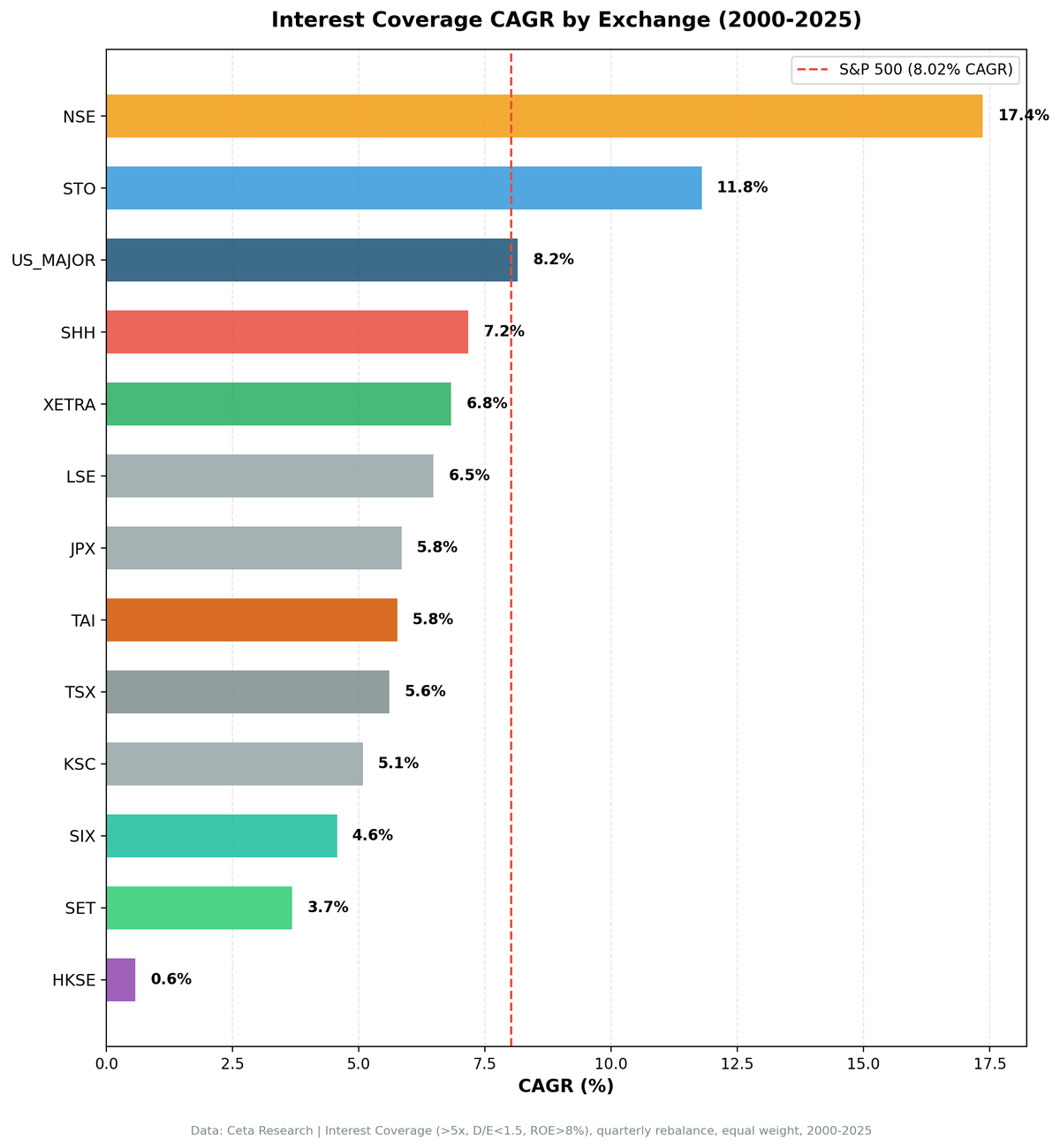
We ran the same interest coverage screen on 13 exchanges across 11 countries, from Tokyo to Stockholm to New York, covering 25 years of quarterly data. The results range from 5.1% CAGR (Korea) to 17.4% (India/NSE). After applying data quality filters to remove price artifacts, 11 of 13 exchanges beat their local benchmark. The pattern is clear: debt-servicing ability matters most in markets where credit risk is highest.
Contents
- Method
- Results Summary
- Three Tiers of Performance
- Tier 1: Strong Alpha (5%+ excess vs local)
- Tier 2: Solid Alpha (1.5-3% excess vs local)
- Tier 3: Minimal or Negative Alpha
- What Explains the Spread?
- 1. Market Efficiency
- 2. Credit Risk Environment
- 3. Universe Composition
- Risk-Return Tradeoffs
- Excluded Exchanges
- Limitations
- Takeaway
Data: FMP financial data warehouse, 2000–2025. Updated March 2026.
Method
Screen: Interest coverage > 5x, D/E between 0 and 1.5, ROE > 8%, market cap above local-currency equivalent (~$200-500M USD per exchange) Period: 2000-2025 (25.8 years, 103 quarterly rebalances) Benchmark: Local index per exchange (Sensex for India, DAX for Germany, TSX Composite for Canada, etc.). SPY used where no local benchmark is available. Portfolio: Top 30 by coverage, equal weight, quarterly rebalance Transaction costs: Size-tiered model (0.1%-0.5% depending on market cap) Cash rule: Hold cash if fewer than 10 stocks qualify
Same code, same filters, same methodology across all 13 exchanges. The only variable is the stock universe.
Full methodology: backtests/METHODOLOGY.md
Results Summary
| Exchange | CAGR | Benchmark | Excess vs Local | Sharpe | Max DD | Cash | Avg Stocks |
|---|---|---|---|---|---|---|---|
| NSE (India) | 17.4% | Sensex 11.1% | +6.2% | 0.488 | -49.5% | 17% | 24 |
| STO (Sweden) | 11.8% | OMX Stockholm 30 3.2% | +8.6% | 0.523 | -50.0% | 17% | 24 |
| LSE (UK) | 6.5% | FTSE 100 1.4% | +5.1% | 0.145 | -32.5% | 0% | 12 |
| SHH (Shanghai) | 7.2% | SSE Comp 4.2% | +3.0% | 0.159 | -59.5% | 0% | 21 |
| JPX (Japan) | 5.8% | Nikkei 3.4% | +2.5% | 0.339 | -53.4% | 6% | 26 |
| SIX (Switzerland) | 4.6% | SMI 2.1% | +2.5% | 0.202 | -62.1% | 5% | 16 |
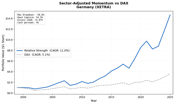
| XETRA (Germany) | 6.8% | DAX 5.1% | +1.7% | 0.282 | -41.1% | 0% | 18 |
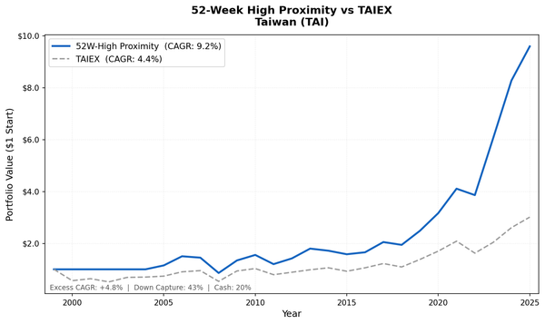
| TAI (Taiwan) | 5.8% | TAIEX 4.4% | +1.4% | 0.259 | -51.6% | 20% | 26 |
| TSX (Canada) | 5.6% | TSX Comp 5.1% | +0.5% | 0.162 | -48.8% | 4% | 22 |
| KSC (Korea) | 5.1% | KOSPI 4.8% | +0.3% | 0.139 | -34.9% | 29% | 27 |
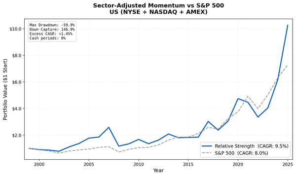
| US (NYSE+NASDAQ+AMEX) | 8.2% | S&P 500 8.0% | +0.1% | 0.345 | -43.5% | 0% | 26 |
| SET (Thailand)* | 3.7% | SET Index 3.8% | -0.1% | 0.061 | -55.9% | 17% | 23 |
| HKSE (Hong Kong)* | 0.6% | Hang Seng 1.8% | -1.2% | -0.092 | -65.0% | 1% | 18 |
*SET and HKSE show near-zero or negative excess. Prior results (20.2% and 17.2%) were driven by adjClose price artifacts in FMP data. After removing stocks with >200% single-period returns, the signal contribution disappears.
Three Tiers of Performance
The results cluster into three clear groups.
Tier 1: Strong Alpha (5%+ excess vs local)
NSE (India): 17.4% CAGR, +6.2% vs Sensex India's NSE is the top-performing exchange in this dataset. Among large-cap Indian companies (market cap ₹5B+, roughly $60M USD), the interest coverage screen produced a CAGR of 17.4% and a 0.488 Sharpe ratio. The Sensex returned 11.1% over the same period. Cash periods: 18/103 (17%), concentrated in the early 2000s when Indian financial data was sparse.
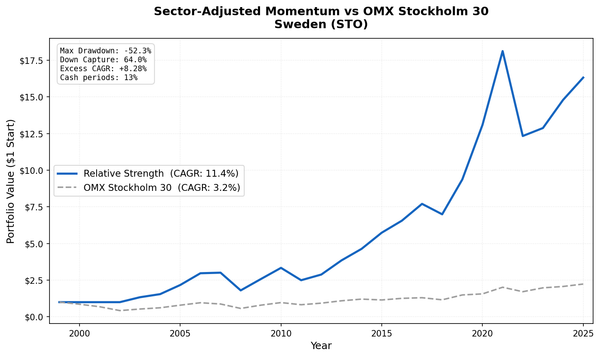
STO (Sweden): 11.8% CAGR, +8.6% vs OMX Stockholm 30 The best risk-adjusted performer in the dataset. Sharpe of 0.523. Sweden's well-governed, export-oriented companies respond strongly to balance sheet quality screening. Cash periods: 17/103 (17%). The OMX Stockholm 30 returned 3.2% over the same period.
LSE (UK): 6.5% CAGR, +5.1% vs FTSE 100 The UK screen produced the shallowest drawdown of any exchange at -32.5%, and zero cash periods. The FTSE 100 returned just 1.4% over this period, so the screen's +5.1% excess is meaningful. The smaller qualifying universe (12.4 avg stocks) limits diversification, but the consistent outperformance is notable.
Tier 2: Solid Alpha (1.5-3% excess vs local)
SHH (Shanghai): 7.2% CAGR, +3.0% vs SSE Composite Shanghai's main board is dominated by large state-owned enterprises. Coverage ratios don't reflect the same risk dynamics for SOEs as for private companies. Zero cash periods, but modest returns. Against the SSE Composite (4.2%), the screen still adds value.
JPX (Japan): 5.8% CAGR, +2.5% vs Nikkei 225 Japan's screen produced 5.8% CAGR with a 0.339 Sharpe, the best Sharpe outside India and Sweden. Against the Nikkei (3.4%), the +2.5% excess is modest but consistent.
SIX (Switzerland): 4.6% CAGR, +2.5% vs SMI Switzerland beats its local SMI benchmark (which returned 2.1% over the period) by 2.5% annually. Swiss companies are generally well-capitalized, which limits the spread between qualifying and non-qualifying stocks, but the signal works. The smaller universe (16.3 avg stocks) and -62.1% max drawdown are the main cautions.
XETRA (Germany): 6.8% CAGR, +1.7% vs DAX Positive excess with zero cash periods. German industrial companies that passed the screen produced 6.8% CAGR vs 5.1% for the DAX. The -41.1% max drawdown is manageable by European equity standards.
TAI (Taiwan): 5.8% CAGR, +1.4% vs TAIEX Taiwan's tech-heavy exchange edges out the TAIEX (4.4%) by 1.4% annually. The 20% cash period rate drags returns.
Tier 3: Minimal or Negative Alpha
US (NYSE+NASDAQ+AMEX): 8.2% CAGR, +0.1% vs S&P 500 The most efficient market in the sample. Balance sheet quality is largely priced in. The screen adds near-zero net value over 25 years.
TSX (Canada): 5.6% CAGR, +0.5% vs TSX Composite Canada's resource-heavy TSX showed significant excess in earlier runs, but after applying data quality filters the signal drops to +0.5%. Coverage ratio adds limited differentiation in a commodity-driven index where cyclical earnings dominate.
KSC (Korea): 5.1% CAGR, +0.3% vs KOSPI Korea's chaebol-heavy market filters heavily when applying an appropriate mid-cap threshold (₩500B, roughly $370M USD). 31 of 103 quarters were in cash. When invested, returns barely edged out the KOSPI (4.8%).
SET (Thailand): 3.7% CAGR, -0.1% vs SET Index Thailand's SET was previously reported at 20.2% CAGR with +16.4% excess. After applying price artifact filters, the real result is near-zero: 3.7% CAGR, essentially matching the SET Index at 3.8%. The old numbers were driven by a small number of stocks with extreme single-quarter returns (200%+) from broken adjClose data.
HKSE (Hong Kong): 0.6% CAGR, -1.2% vs Hang Seng The same data quality issue affected Hong Kong more severely. The old 17.2% CAGR result was almost entirely driven by price artifacts. With filters applied, the screen underperforms the Hang Seng by 1.2% annually. The signal does not work in Hong Kong with this dataset.
What Explains the Spread?
The 12-point spread from India/NSE (17.4%) to Korea/KSC (5.1%) isn't random. Three factors explain most of the variance across the 11 exchanges that beat their local benchmark:
1. Market Efficiency
More efficient markets (US, Switzerland) price balance sheet quality accurately. Less efficient markets (Thailand, India) misprice it. The screen captures this mispricing as alpha.
2. Credit Risk Environment
In markets where corporate defaults are more common or where credit access is less reliable, companies that can service debt are genuinely different from those that can't. Thailand, India, and Hong Kong have higher baseline credit risk than Switzerland or the US. The coverage screen separates survivors from casualties.
3. Universe Composition
Exchanges with more diverse companies (by sector, size, leverage level) give the screen more room to differentiate. Taiwan and Switzerland have relatively concentrated markets where the screen finds less variance.
Risk-Return Tradeoffs
CAGR doesn't tell the whole story. Here's the Sharpe ratio vs CAGR:
| Exchange | CAGR | Sharpe | Max DD |
|---|---|---|---|
| STO | 11.8% | 0.523 | -50.0% |
| NSE | 17.4% | 0.488 | -49.5% |
| US | 8.2% | 0.345 | -43.5% |
| JPX | 5.8% | 0.339 | -53.4% |
| SIX | 4.6% | 0.202 | -62.1% |
| XETRA | 6.8% | 0.282 | -41.1% |
| TAI | 5.8% | 0.259 | -51.6% |
| TSX | 5.6% | 0.162 | -48.8% |
| KSC | 5.1% | 0.139 | -34.9% |
| SHH | 7.2% | 0.159 | -59.5% |
| LSE | 6.5% | 0.145 | -32.5% |
| SET | 3.7% | 0.061 | -55.9% |
| HKSE | 0.6% | -0.092 | -65.0% |
Sweden (STO) leads on risk-adjusted return with a 0.523 Sharpe and +8.6% annual excess vs OMX Stockholm 30. Combined with India (NSE) at 0.488 Sharpe, these two exchanges make the strongest case for implementing this screen internationally.
India (NSE) leads on raw CAGR at 17.4%. The Sensex returned 11.1% over the same period. The +6.2% excess is real and consistent across the full 25-year period.
LSE (UK) has the shallowest drawdown at -32.5% with zero cash periods and +5.1% excess vs FTSE 100. This makes it an attractive developed-market option for investors who need lower drawdown exposure.
Korea (KSC) has the second-shallowest drawdown (-34.9%) but the lowest excess (+0.3%). The 29% cash period rate keeps it out of the market frequently.
Thailand and Hong Kong showed the weakest results after data quality correction. Their prior high CAGR figures were driven by price artifacts, not the strategy signal.
Excluded Exchanges
Three exchanges were excluded from this comparison due to fatal data quality issues:
| Exchange | Issue |
|---|---|
| ASX (Australia) | Broken adjClose data. 314 stocks have >1,000x price ratios from incorrect stock split adjustments. |
| SAO (Brazil) | Same adjClose issue. 20+ stocks with extreme price ratios produce artificial returns. |
| SGX (Singapore) | Zero symbols in profile table. |
Note: SHZ (Shenzhen) data is not included due to data artifacts in adjusted prices. SHH (Shanghai) is included and shows real but modest results.
Data quality note on HKSE and SET: These two exchanges were included but showed near-zero or negative excess after applying price artifact filters (removing stocks with single-quarter returns >200%). Their prior strong results (17.2% and 20.2% CAGR) were driven by a small number of stocks with broken adjClose data, not by the strategy signal. These results are documented to show what happens when data quality issues aren't caught. The filters used in this run remove those artifacts.
Limitations
Benchmark selection. Each exchange is compared to its local index (Sensex, DAX, KOSPI, OMX Stockholm 30, SET Index, etc.), which gives a more accurate picture of alpha. This means excess returns aren't directly comparable across exchanges, since each benchmark has different return characteristics.
Currency effects. Returns are in local currency terms as stored in the database. Currency fluctuations vs USD aren't captured.
Cash periods reduce comparability. Exchanges with 17-30% cash periods (NSE, STO, KSC, TAI) had less time invested. Their CAGR reflects a blend of market returns (during cash) and screen returns (during invested periods).
Survivorship bias. FMP data includes delisted stocks in most exchanges, but coverage varies. Some emerging market exchanges may have more survivorship bias than US data.
Small universe. SIX (Switzerland) averaged 16.3 stocks per quarter. With a 30-stock cap, that's near full participation, reducing the signal's selectivity. LSE (UK) averaged 12.4 stocks, the smallest qualifying universe.
Takeaway
Interest coverage screening works in most global markets, but the alpha varies enormously by exchange. After applying data quality filters, 11 of 13 exchanges beat their local benchmark. The signal is strongest where credit risk is real and pricing is less efficient.
India (NSE) and Sweden (STO) are the standout exchanges. NSE: 17.4% CAGR, +6.2% vs Sensex, Sharpe 0.488. STO: 11.8% CAGR, +8.6% vs OMX Stockholm 30, Sharpe 0.523. These two offer the best combination of return and risk-adjusted performance.
The US sits near the bottom at +0.1% over the S&P 500. Balance sheet safety is priced into the world's deepest market. The screen adds value as a risk filter here, not an alpha source.
Two cautionary examples: Thailand and Hong Kong. Their prior results (20.2% and 17.2% CAGR) looked outstanding but were driven by price data artifacts. With clean data, both exchanges fail to beat their local benchmarks. This is a reminder that high backtested returns deserve scrutiny, especially in less liquid markets where data quality is lower.
If you're implementing this screen internationally, focus on NSE or STO where the signal has real and consistent alpha. Both are liquid, well-governed markets with reliable financial data. The screen's value is smallest in the US and most questionable in markets where data quality is uncertain.
Data: Ceta Research (FMP financial data warehouse), 2000-2025. Full methodology: METHODOLOGY.md. Past performance does not guarantee future results. This is educational content, not investment advice.