DCF Threshold: 11.25% CAGR and 38% Down Capture Over 25 Years of US Stock Data
We added ROE, D/E, and OCF quality filters to a Gordon Growth DCF screen and tested it on 25 years of US stocks. The result was 11.25% CAGR vs 7.64% SPY, 3.60% annual excess return, and 38% down capture — the strategy captures only 38 cents of every dollar the market loses.

We added three quality filters to a classic FCF yield screen and tested it on 25 years of US stocks from NYSE, NASDAQ, and AMEX. The signal: buy the 30 most undervalued stocks by DCF discount that also have ROE above 8%, debt-to-equity below 1.5, and positive operating cash flow. The result was 11.25% annually vs 7.64% for the S&P 500, with 3.60% excess return, 38% down capture, and 68% win rate over 25 years.
Contents
- Method
- The Signal
- What We Found
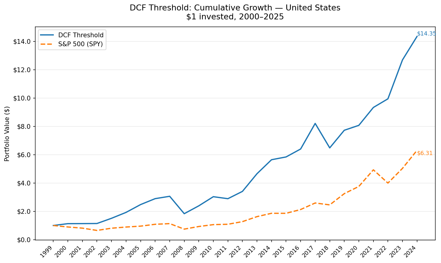
- The headline number: 38% down capture.
- Year-by-year returns
- 2000–2007: where the compounding gap opened
- Crisis comparisons
- 2018–2021: the growth regime drag
- Quality Filters Make the Difference
- Backtest Methodology
- Limitations
- Conclusion
Data: FMP financial data warehouse, 2000–2025. Updated March 2026.
Method
Data source: Ceta Research (FMP financial data warehouse) Universe: NYSE + NASDAQ + AMEX, market cap > $1B USD Period: 2000–2025 (25 annual periods) Rebalancing: Annual (January), equal weight, top 30 by highest FCF yield Benchmark: S&P 500 Total Return (SPY) Cash rule: Hold cash if fewer than 10 stocks qualify
Financial data sourced from cash_flow_statement, key_metrics, and financial_ratios (all FY annual filings). 45-day filing lag applied at each rebalance date to prevent look-ahead bias. Staleness limit: 18 months (only uses most recent annual filing within the window).
The Signal
The Gordon Growth Model gives each stock a theoretical intrinsic value:
DCF_value = FCF × (1 + g) / (r - g)
With a conservative 2.5% terminal growth rate and 10% discount rate, the multiplier is 13.67x. A stock trading at 20% below that intrinsic value means:
MarketCap < FCF × 13.67 × 0.80
→ FCF / MarketCap ≥ 8.78%
This is a price-independent condition. It only depends on the company's free cash flow and its market cap. There's no P/E history to compute, no sector comparison. If FCF/MCap crosses 8.78%, the stock is trading at a 20%+ discount to its Gordon Growth intrinsic value.
Quality filters prevent value traps:
| Filter | Threshold | What it screens out |
|---|---|---|
| ROE | > 8% | Liquidation plays, non-earning companies |
| D/E | < 1.5 (or null) | Over-leveraged balance sheets |
| OCF | > 0 | Companies with accounting FCF but no real cash generation |
These three filters eliminate the most common false positives in FCF yield screens: companies generating high FCF from asset sales, unsustainable capex cuts, or balance-sheet leverage rather than operating strength.
The screen (SQL):
WITH latest_cf AS (
    SELECT symbol, freeCashFlow, operatingCashFlow,
        ROW_NUMBER() OVER (PARTITION BY symbol ORDER BY dateEpoch DESC) AS rn
    FROM cash_flow_statement
    WHERE period = 'FY' AND freeCashFlow > 0 AND operatingCashFlow > 0
),
latest_km AS (
    SELECT symbol, marketCap, returnOnEquity,
        ROW_NUMBER() OVER (PARTITION BY symbol ORDER BY dateEpoch DESC) AS rn
    FROM key_metrics
    WHERE period = 'FY' AND marketCap > 1000000000
),
latest_ra AS (
    SELECT symbol, debtToEquityRatio,
        ROW_NUMBER() OVER (PARTITION BY symbol ORDER BY dateEpoch DESC) AS rn
    FROM financial_ratios
    WHERE period = 'FY'
)
SELECT
    cf.symbol, p.companyName, p.exchange, p.sector,
    ROUND(cf.freeCashFlow / km.marketCap * 100, 2) AS fcf_yield_pct,
    ROUND((1 - km.marketCap / (cf.freeCashFlow * 13.67)) * 100, 1) AS discount_pct,
    ROUND(km.returnOnEquity * 100, 1) AS roe_pct,
    ROUND(km.marketCap / 1e9, 2) AS mktcap_bn
FROM latest_cf cf
JOIN latest_km km ON cf.symbol = km.symbol AND km.rn = 1
JOIN profile p ON cf.symbol = p.symbol
LEFT JOIN latest_ra ra ON cf.symbol = ra.symbol AND ra.rn = 1
WHERE cf.rn = 1
  AND cf.freeCashFlow / km.marketCap >= 0.0878
  AND km.returnOnEquity >= 0.08
  AND (ra.debtToEquityRatio IS NULL
       OR (ra.debtToEquityRatio >= 0 AND ra.debtToEquityRatio < 1.5))
  AND p.exchange IN ('NYSE', 'NASDAQ', 'AMEX')
ORDER BY fcf_yield_pct DESC
LIMIT 30
Run this screen on Ceta Research
What We Found

The headline number: 38% down capture.
When the S&P 500 falls, this strategy captures only 38% of the downside on average. That number is the reason the compound return ends up so far ahead.
| Metric | DCF Threshold (US) | S&P 500 |
|---|---|---|
| CAGR | 11.25% | 7.64% |
| Total Return | 1,335% | 531% |
| Sharpe Ratio | 0.528 | 0.322 |
| Sortino Ratio | 0.953 | 0.556 |
| Max Drawdown | -40.13% | -34.90% |
| Up Capture | 109.3% | 100% |
| Down Capture | 37.97% | 100% |
| Win Rate vs SPY | 68% | — |
| Cash Periods | 0 of 25 | — |
| Avg Stocks | 21 | — |
$1 grew to $14.36 vs $6.31 for the S&P 500. The Sharpe ratio improved from 0.322 to 0.528. The Sortino ratio, which penalizes only downside volatility, nearly doubled from 0.556 to 0.953.
The 38% down capture is the structural story. The strategy participates in bull markets (109% up capture) and avoids most of the market's downside. Combined with 68% win rate, this signal was right more often than it was wrong in 17 of 25 calendar years.
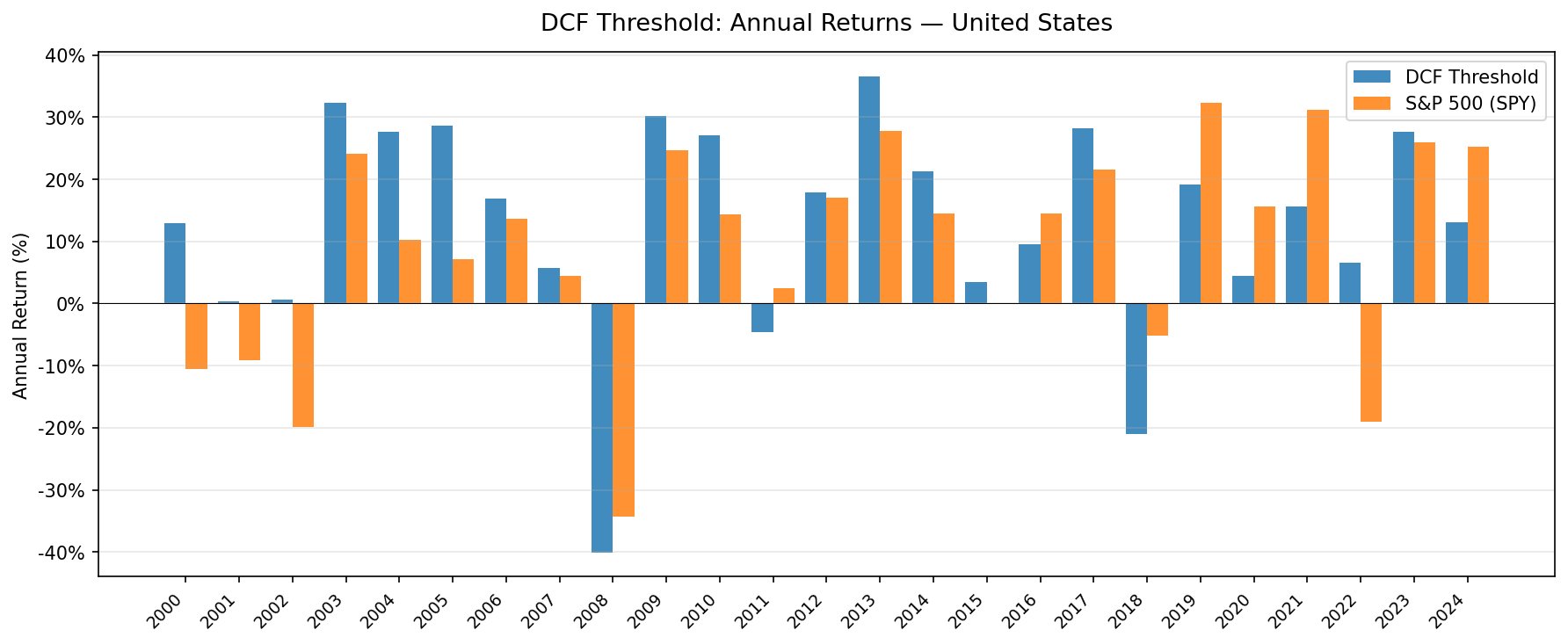
Year-by-year returns
| Year | DCF Threshold | S&P 500 | Excess |
|---|---|---|---|
| 2000 | +12.9% | -10.5% | +23.4% |
| 2001 | +0.3% | -9.2% | +9.5% |
| 2002 | +0.6% | -19.9% | +20.5% |
| 2003 | +32.3% | +24.1% | +8.1% |
| 2004 | +27.7% | +10.2% | +17.4% |
| 2005 | +28.7% | +7.2% | +21.5% |
| 2006 | +16.9% | +13.7% | +3.2% |
| 2007 | +5.8% | +4.4% | +1.4% |
| 2008 | -40.1% | -34.3% | -5.8% |
| 2009 | +30.3% | +24.7% | +5.5% |
| 2010 | +27.0% | +14.3% | +12.7% |
| 2011 | -4.7% | +2.5% | -7.1% |
| 2012 | +17.8% | +17.1% | +0.7% |
| 2013 | +36.6% | +27.8% | +8.8% |
| 2014 | +21.2% | +14.5% | +6.7% |
| 2015 | +3.5% | -0.1% | +3.6% |
| 2016 | +9.6% | +14.4% | -4.8% |
| 2017 | +28.2% | +21.6% | +6.6% |
| 2018 | -21.0% | -5.2% | -15.9% |
| 2019 | +19.2% | +32.3% | -13.1% |
| 2020 | +4.5% | +15.6% | -11.1% |
| 2021 | +15.7% | +31.3% | -15.6% |
| 2022 | +6.5% | -19.0% | +25.5% |
| 2023 | +27.6% | +26.0% | +1.6% |
| 2024 | +13.1% | +25.3% | -12.2% |
2000–2007: where the compounding gap opened
The first eight years built the structural lead. When the dot-com bubble collapsed, quality FCF companies held up while the market re-priced speculative valuations. Companies already trading at 20%+ discounts to intrinsic value were precisely the ones that hadn't been swept up in the growth narrative.
The three years immediately post-crash (2003–2005) show double-digit excess returns as the market recognized actual cash generation. 2004 (+27.7%) and 2005 (+28.7%) are the kind of recovery years that FCF signals are built for.
Crisis comparisons
| Event | DCF Threshold | S&P 500 | Gap |
|---|---|---|---|
| Dot-com bust (2000–2002) | +14.1% cumulative | -35.1% | +49.2% |
| Financial crisis (2008) | -40.1% | -34.3% | -5.8% |
| COVID (2020) | +4.5% | +15.6% | -11.1% |
| 2022 bear market | +6.5% | -19.0% | +25.5% |
2008 is the exception. The quality filters don't prevent losses in a systematic financial crisis. When credit markets seize and company survival is at stake, even positive-OCF companies with low debt sell off. The -40.1% in 2008 slightly underperformed SPY's -34.3%.
2022 was the opposite. Rising rates hit growth stocks hardest. FCF-generating companies with low leverage held their value while high-multiple names collapsed. The +25.5% excess in 2022 is the signal working exactly as designed.
2018–2021: the growth regime drag
Four consecutive years of underperformance: -15.9% (2018), -13.1% (2019), -11.1% (2020), -15.6% (2021). The FANG era. Narrow market leadership from mega-cap tech drove index returns while value stocks lagged.
This is the standard weakness of any FCF-yield approach. A company trading at 40x revenue with negative FCF doesn't qualify at any price. When those companies dominate index returns, a fundamentals-based screen lags. The strategy recovered in 2022 (+25.5% excess) when the growth bubble unwound, but the four-year drag required real patience.
Quality Filters Make the Difference
The existing dcf-discount strategy uses the same FCF signal with no quality filters and 50 holdings. Comparing the two on US data over the same period shows how much the filters contribute:
| Strategy | CAGR | Sharpe | Excess CAGR |
|---|---|---|---|
| DCF Discount (no filters) | 8.79% | 0.232 | +1.49% |
| DCF Threshold (with filters) | 11.25% | 0.528 | +3.60% |
The Sharpe ratio more than doubled. The excess return more than doubled. This isn't a small tweak — the quality filters are doing significant work. The stocks that fail ROE > 8% or OCF > 0 while showing high FCF yield are often companies in distress: asset sales inflating free cash flow, capex cuts masking revenue decay, or leverage driving up apparent yield before a collapse.
Removing those names costs some breadth (30 stocks vs 50), but the quality of signal improves substantially.
Backtest Methodology
Full methodology: github.com/ceta-research/backtests/blob/main/METHODOLOGY.md
| Parameter | Choice |
|---|---|
| Universe | NYSE + NASDAQ + AMEX, Market Cap > $1B USD |
| Signal | FCF/MCap ≥ 8.78%, ROE > 8%, D/E < 1.5, OCF > 0 |
| Portfolio | Top 30 by FCF yield, equal weight |
| Rebalancing | Annual (January) |
| Cash rule | Hold cash if < 10 qualify |
| Benchmark | S&P 500 Total Return (SPY) |
| Period | 2000–2025 (25 years) |
| Data | Point-in-time (45-day lag on FY financial statements) |
| Transaction costs | Size-tiered (0.1%–0.5% one-way) |
Limitations
Max drawdown of -40%. The quality filters don't prevent large drawdowns in correlated selloffs. 2008 was nearly as bad as the index. Investors holding this strategy need to tolerate significant peak-to-trough declines.
Four-year underperformance stretch (2018–2021). A run of 15.9%, 13.1%, 11.1%, and 15.6% annual underperformance is genuinely difficult to sit through. The strategy recovered sharply in 2022, but the cumulative gap during growth eras is real.
Single-factor concentration. FCF yield is the primary selection criterion. Years when the screened portfolio is concentrated in a single sector (e.g., Energy or Financials) can produce return patterns that look more like sector exposure than stock-picking alpha.
Survivorship bias. Exchange membership is based on current profiles. Delistings during the backtest period may reduce the apparent frequency of bad outcomes in screened portfolios.
January rebalance concentration. All positions are set once per year. The portfolio is not rebalanced mid-year if a holding's FCF deteriorates significantly after the rebalance date.
Conclusion
Adding ROE, D/E, and OCF quality filters to a Gordon Growth DCF screen transformed an average value signal into one of the stronger risk-adjusted results we've tested. 11.25% CAGR over 25 years, with 38% down capture and 68% win rate, compounds significantly ahead of the index: $1,336 vs $531 per $100 invested.
The mechanism is simple: FCF yield finds undervalued companies, and the quality filters screen out the companies that are undervalued for legitimate reasons. What's left is genuine margin of safety, not distress masquerading as value.
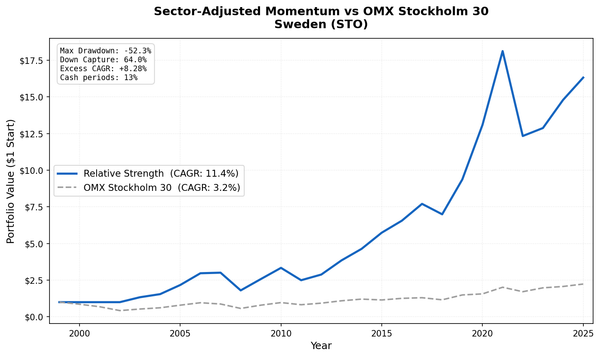
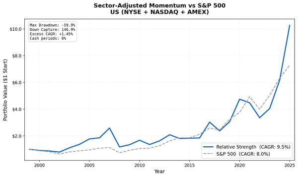
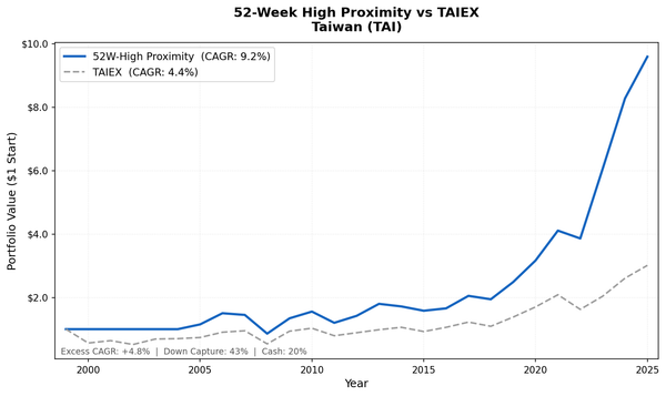
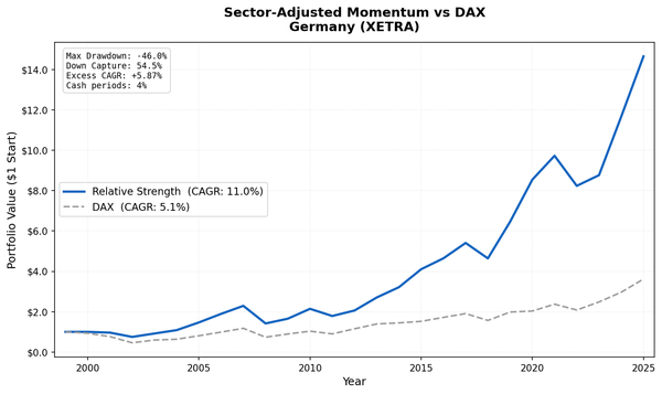
For the comparison across 13 global markets, see the companion post. The geographic pattern tells its own story.
Data: Ceta Research (FMP financial data warehouse). Backtest: 2000–2025. Past performance does not guarantee future results. Full methodology at github.com/ceta-research/backtests.