Asset Growth Anomaly on Canadian Stocks: 7.52% CAGR, +3.57% Over TSX

Asset Growth Anomaly on Canadian Stocks: +3.57% Alpha Over the TSX
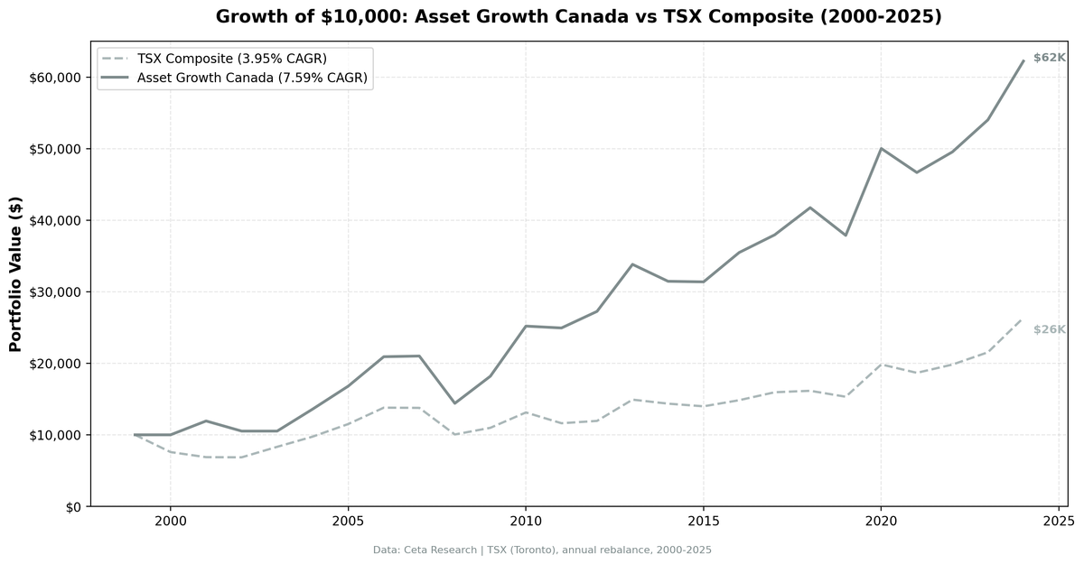
The asset growth screen works on Canadian stocks. Not marginally. Clearly. The strategy returned 7.52% annually on TSX-listed stocks from 2000 to 2025, beating the TSX Composite's 3.95% by 3.57 points per year. That gap compounds: $10,000 grew to $61,270 in the portfolio vs $26,355 in the index. The strategy beat its local benchmark in 15 of 25 years (60% win rate), with a 3.82% alpha and a beta of 0.824. Max drawdown was nearly identical to the index (-31.45% vs -31.44%), but the return was almost double.
Contents
- Method
- Results
- When It Works
- When It Fails
- The Consistency Story
- Limitations
- Run It Yourself
- Current Screen (SQL)
- Backtest
- Takeaway
- Part of a Series
- References
Method
Data source: Ceta Research (FMP financial data warehouse) Universe: TSX (Toronto Stock Exchange), market cap > C$250M (~$181M USD) Period: 2000-2025 (25 annual rebalance periods) Rebalancing: Annual (July), equal weight top 30 by lowest asset growth Benchmark: TSX Composite (^GSPTSE) Cash rule: Hold cash if fewer than 10 stocks qualify Transaction costs: Size-tiered model (0.1% mega-cap, 0.3% large-cap, 0.5% mid-cap) Data quality guards: Entry price > $1, single-period return capped at 200%
Historical financial data with 45-day lag to prevent look-ahead bias. Full methodology: backtests/METHODOLOGY.md.
The filters are identical to our US backtest:
| Criterion | Metric | Threshold |
|---|---|---|
| Capital discipline | Asset Growth (YoY) | -20% to +10% |
| Profitability | Return on Equity | > 8% |
| Asset efficiency | Return on Assets | > 5% |
| Pricing power | Operating Margin | > 10% |
| Size | Market Cap | > C$250M (~$181M USD) |
Results
| Metric | Portfolio | TSX Composite |
|---|---|---|
| CAGR | 7.52% | 3.95% |
| Total Return | 512.7% | 163.55% |
| Max Drawdown | -31.45% | -31.44% |
| Volatility | 16.07% | 14.63% |
| Sharpe Ratio | 0.312 | 0.099 |
| Sortino Ratio | 0.607 | 0.157 |
| Win Rate (vs TSX) | 60% | -- |
| Beta | 0.824 | 1.00 |
| Alpha | 3.82% | -- |
| Up Capture | 123.96% | -- |
| Down Capture | 53.08% | -- |
| Cash Periods | 2/25 | -- |
| Avg Stocks | 24.8 | -- |
| Calmar Ratio | 0.239 | -- |
The excess return is 3.57% per year. That's not a statistical artifact or a rounding error. The portfolio turned $10,000 into $61,270 while the TSX Composite turned it into $26,355. Same drawdown (-31.45% vs -31.44%), but nearly double the return.
The Sharpe ratio tells the story clearly: 0.312 vs 0.099. The Sortino ratio is even more lopsided: 0.607 vs 0.157. The strategy delivered almost 4x the risk-adjusted return of the index. Up capture of 123.96% means the portfolio gained more than the TSX in rising markets. Down capture of 53.08% means it lost only half as much in falling ones.
The 60% win rate is solid. The strategy beat the TSX in 15 of 25 years. The winning years were also larger: the best excess year was +28.7 points (2001), while the worst was -21.4 points (2003, a cash year). That asymmetry compounds.
When It Works
The strategy's strongest periods came during market stress and commodity-cycle recoveries.
2001 (Post Dot-Com): The strategy's single best excess year. The portfolio gained 19.4% while the TSX Composite dropped 9.3%.
| Year | Portfolio | TSX Composite | Excess |
|---|---|---|---|
| 2001 | +19.4% | -9.3% | +28.7 |
TSX-listed companies that grew assets slowly had no dot-com acquisitions to write down and no excess capacity to unwind. (Note: 2000 was a cash year for the Canadian screen, with fewer than 10 stocks qualifying.)
2004-2006 (Resource Boom + Capital Discipline): Canada's resource sector was booming, but the screen didn't select the aggressive growers. It picked the companies investing cautiously while staying profitable. Three straight years of alpha.
| Year | Portfolio | TSX Composite | Excess |
|---|---|---|---|
| 2004 | +29.2% | +17.1% | +12.1 |
| 2005 | +23.6% | +18.0% | +5.5 |
| 2006 | +24.5% | +19.9% | +4.6 |
The quality filters (ROE > 8%, ROA > 5%, OPM > 10%) ensured the portfolio held profitable resource companies, not speculative explorers. Capital discipline during a commodity supercycle is a rare combination, and the market rewarded it.
2009-2012 (Post-Crisis Recovery): Four consecutive years of outperformance, including the two largest single-year excess returns outside 2001.
| Year | Portfolio | TSX Composite | Excess |
|---|---|---|---|
| 2009 | +26.3% | +9.3% | +17.1 |
| 2010 | +38.5% | +19.6% | +18.9 |
| 2011 | -1.0% | -11.5% | +10.5 |
| 2012 | +9.3% | +2.8% | +6.5 |
The portfolio gained in three of four years, while the TSX went negative twice. The cumulative gap over this stretch was +53 points of excess return.
When It Fails
2003 (Cash Year): The portfolio sat in cash while the TSX rallied 21.4%. Fewer than 10 stocks qualified after the dot-com bust thinned the universe.
| Year | Portfolio | TSX Composite | Excess |
|---|---|---|---|
| 2003 | 0.0% | +21.4% | -21.4 |
Cash rules protect against poor-quality selections, but they cost you when the market recovers before the screen catches up. This was the strategy's worst single year of relative performance.
2002 and 2008 (Broad Selloffs): The strategy lost more than the TSX in two severe drawdowns.
| Year | Portfolio | TSX Composite | Excess |
|---|---|---|---|
| 2002 | -11.8% | -0.3% | -11.5 |
| 2008 | -31.4% | -27.0% | -4.5 |
In 2002, the TSX was nearly flat while the portfolio dropped 11.8%. In 2008, both fell hard, but the portfolio's -31.4% was slightly worse than the index's -27.0%. The concentrated portfolio (24-25 stocks) has less diversification than the broad index, so individual stock blowups hit harder in crisis years.
2024 (TSX Momentum Year): The TSX surged 22.4%, led by sectors the strategy underweights. The portfolio gained 15.2%, solid in absolute terms but 7.2 points behind.
| Year | Portfolio | TSX Composite | Excess |
|---|---|---|---|
| 2024 | +15.2% | +22.4% | -7.2 |
When the broad market rallies hard on momentum, capital-disciplined stocks with low asset growth tend to lag. The strategy gives up relative performance in strong bull years.
The Consistency Story
What makes Canada stand out isn't just the 3.57% excess return. It's how evenly distributed that alpha is across time.
Look at the year-by-year pattern. The strategy beat the TSX in 15 of 25 years. It delivered positive excess returns in 7 of the last 10 years (2015-2024). The losing years are scattered, not clustered. There's no multi-year drought where you'd be tempted to abandon the strategy.
The post-crisis recoveries are especially strong. After every major drawdown (2001, 2008-2009, 2011), the strategy bounced back harder than the index. That's the asset growth factor doing what the academic research predicts: capital-disciplined companies recover faster because they didn't overextend during the boom.
The 0.824 beta means the portfolio tracks the TSX closely enough to feel familiar but generates meaningful alpha on top. Up capture of 124% means you get more than the market in good years. Down capture of 53% means you lose about half as much in bad ones. That combination is what drives a Sharpe of 0.312 vs the index's 0.099.
Limitations
Resource sector concentration. The TSX is heavily weighted toward energy, mining, and materials. The quality filters (OPM > 10%) help exclude unprofitable resource companies, but sector concentration is still higher than on diversified exchanges like the NYSE. A commodity crash would hit this portfolio harder than the overall numbers suggest.
Cash years reduce compounding. The strategy sat in cash for 2 of 25 years (2000 and 2003). In 2003, the TSX rallied 21.4% while the portfolio earned nothing. Cash rules protect against low-quality selections, but they cost you in strong recovery years.
Smaller universe. The TSX averaged 24.8 qualifying stocks per period. The US version averaged 26.2 stocks with zero cash years. The Canadian universe is thinner, which means the portfolio is more sensitive to individual stock outcomes and has less room for diversification.
Higher volatility than the benchmark. The portfolio's 16.07% volatility is slightly above the TSX Composite's 14.63%. The extra return more than compensates (Sharpe of 0.312 vs 0.099), but day-to-day swings are wider than the index.
Both portfolio and benchmark are in CAD. Since the benchmark is now the TSX Composite (also in Canadian Dollars), there's no currency mismatch in the excess return calculation. But a USD-based investor would see different absolute returns depending on CAD/USD movements.
Run It Yourself
Run this screen live on Ceta Research
Current Screen (SQL)
WITH bs_current AS (
    SELECT symbol, totalAssets,
        ROW_NUMBER() OVER (PARTITION BY symbol ORDER BY dateEpoch DESC) AS rn
    FROM balance_sheet
    WHERE period = 'FY' AND totalAssets > 0
),
bs_prior AS (
    SELECT symbol, totalAssets AS prior_assets,
        ROW_NUMBER() OVER (PARTITION BY symbol ORDER BY dateEpoch DESC) AS rn
    FROM balance_sheet
    WHERE period = 'FY' AND totalAssets > 0
),
growth AS (
    SELECT bc.symbol,
        (bc.totalAssets - bp.prior_assets) / bp.prior_assets AS asset_growth
    FROM bs_current bc
    JOIN bs_prior bp ON bc.symbol = bp.symbol AND bp.rn = 2
    WHERE bc.rn = 1 AND bp.prior_assets > 0
)
SELECT g.symbol, p.companyName,
    ROUND(g.asset_growth * 100, 2) AS asset_growth_pct,
    ROUND(k.returnOnEquityTTM * 100, 2) AS roe_pct,
    ROUND(k.returnOnAssetsTTM * 100, 2) AS roa_pct,
    ROUND(f.operatingProfitMarginTTM * 100, 2) AS opm_pct,
    ROUND(k.marketCap / 1e9, 2) AS mktcap_bn
FROM growth g
JOIN profile p ON g.symbol = p.symbol
JOIN key_metrics_ttm k ON g.symbol = k.symbol
JOIN financial_ratios_ttm f ON g.symbol = f.symbol
WHERE g.asset_growth < 0.10
  AND g.asset_growth > -0.20
  AND k.returnOnEquityTTM > 0.08
  AND k.returnOnAssetsTTM > 0.05
  AND f.operatingProfitMarginTTM > 0.10
  AND k.marketCap > 250000000
  AND p.exchange = 'TSX'
ORDER BY g.asset_growth ASC
LIMIT 30
Backtest
# Clone the repo
git clone https://github.com/ceta-research/backtests.git
cd backtests

# Run TSX backtest
python3 asset-growth/backtest.py --preset canada --output results.json --verbose

# Run all exchanges
python3 asset-growth/backtest.py --global --output results/exchange_comparison.json
Takeaway
The asset growth anomaly on the TSX delivers 3.57% annual excess return over the TSX Composite, with a 3.82% alpha, a 60% win rate, and a Sharpe ratio 3x higher than the index. $10,000 became $61,270 vs $26,355. Nearly identical max drawdown, nearly double the return.
This is what a working factor looks like on a single-country exchange. Not marginal. Not ambiguous. The screen selects capital-disciplined, profitable Canadian companies and consistently outperforms the broad market. The alpha shows up in recoveries, commodity cycles, and quiet years alike.
Canada is one of the clearest results in the asset growth playbook. The concentrated TSX, with its resource and financial sector tilt, rewards the quality filters. Companies that grow assets slowly while maintaining high profitability compound better than the index over 25 years.
Part of a Series
This analysis is part of our asset growth anomaly global exchange comparison: - Asset Growth on US Stocks (NYSE + NASDAQ + AMEX), 12.78% CAGR, the baseline - Asset Growth on UK Stocks (LSE), 10.94% CAGR, +9.71% over FTSE 100 - Asset Growth: 16-Exchange Global Comparison, full comparison table
Data: Ceta Research (FMP financial data warehouse), 2000-2025. Universe: TSX. Annual rebalance (July), equal weight, top 30 by lowest asset growth. Full methodology: METHODOLOGY.md. Past performance does not guarantee future results. This is educational content, not investment advice.
References
- Cooper, M., Gulen, H. & Schill, M. (2008). "Asset Growth and the Cross-Section of Stock Returns." Journal of Finance, 63(4), 1609-1651.
- Watanabe, A., Xu, Y., Yao, T. & Yu, T. (2013). "The Asset Growth Effect: Insights from International Equity Markets." Journal of Financial Economics, 108(2), 529-563.
- Hou, K., Xue, C. & Zhang, L. (2015). "Digesting Anomalies: An Investment Approach." Review of Financial Studies, 28(3), 650-705.