Rising Dividend Yield on UK Stocks: +5.34% Annual Alpha vs FTSE 100 on LSE
Rising dividend yield on LSE: 6.56% CAGR, +5.34% annual alpha vs FTSE 100. The strategy works as a UK stock selector. Sharpe of 0.139 and -40.80% max drawdown are the honest costs.

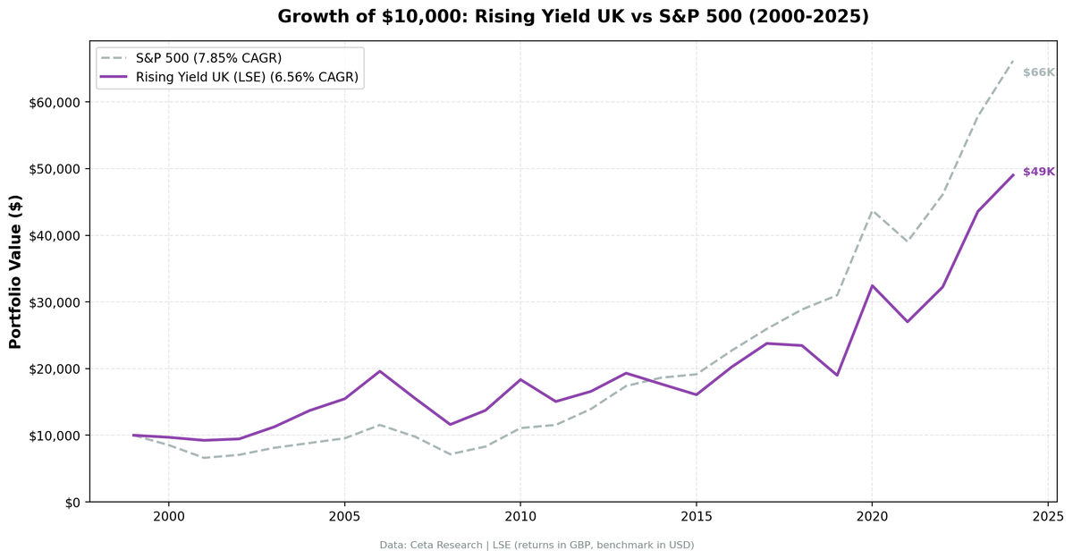
We ran the rising dividend yield screen on 25 years of LSE data. Against the FTSE 100, the strategy delivered +5.34% annual alpha. 6.56% CAGR vs the FTSE 100's 1.23%. That's the honest result. The catch: a Sharpe ratio of 0.139 (the lowest in our series) and a -40.80% max drawdown. The UK is not the best home for this strategy, but the FTSE 100 is a low bar. The screen clears it, and then some.
Contents
- Method
- The Screen (SQL)
- What We Found
- 25 years. +5.34% annual alpha vs FTSE 100. Deep drawdowns are the cost.
- Year-by-Year Returns
- Key Observations
- 2004-2006: Three strong years
- 2008: The worst year
- 2011 and 2014: Structural drags
- 2020: The biggest single year in the UK record
- 2022-2024: Three strong years vs FTSE 100
- The UK: Alpha vs FTSE 100, Lag vs SPY
- Currency Note
- Limitations
- Takeaway
- Part of a Series
- References
- Run This Screen Yourself
Data: FMP financial data warehouse, 2000–2025. Updated March 2026.
Method
Data source: Ceta Research (FMP financial data warehouse) Universe: LSE (London Stock Exchange), market cap > £500M (~$635M USD) Period: 2000-2025 (25 years, 25 annual periods) Rebalancing: Annual (July), equal weight top 30 by 2-year yield expansion Benchmark: FTSE 100 Total Return (GBP, local benchmark) Cash rule: Hold cash if fewer than 10 stocks qualify Transaction costs: Size-tiered (0.1% for >$10B, 0.3% for $2-10B, 0.5% for <$2B, one-way) Returns: Denominated in GBP
For the full methodology and driver classification logic, see the US flagship post.
The Screen (SQL)
WITH yearly_yield AS (
    SELECT r.symbol, r.date,
        r.fiscalYear AS yr,
        r.dividendYield,
        r.dividendPerShare,
        r.dividendPayoutRatio,
        LAG(r.dividendYield, 1) OVER (PARTITION BY r.symbol ORDER BY r.fiscalYear) AS yield_1yr,
        LAG(r.dividendYield, 2) OVER (PARTITION BY r.symbol ORDER BY r.fiscalYear) AS yield_2yr,
        LAG(r.dividendPerShare, 1) OVER (PARTITION BY r.symbol ORDER BY r.fiscalYear) AS dps_1yr,
        LAG(r.dividendPerShare, 2) OVER (PARTITION BY r.symbol ORDER BY r.fiscalYear) AS dps_2yr
    FROM financial_ratios r
    WHERE r.period = 'FY' AND r.dividendYield > 0
),
screened AS (
    SELECT y.symbol, y.date, y.yr,
        y.dividendYield, y.dividendPerShare, y.dividendPayoutRatio,
        (y.dividendYield - y.yield_2yr) AS yield_change_2yr,
        CASE
            WHEN y.dividendPerShare > y.dps_1yr AND y.dps_1yr > y.dps_2yr THEN 'Consecutive DPS Growth'
            WHEN y.dividendPerShare > y.dps_1yr THEN 'Partial DPS Growth'
            ELSE 'Price Decline Driver'
        END AS yield_driver
    FROM yearly_yield y
    WHERE y.yield_2yr IS NOT NULL
      AND y.dividendYield > y.yield_1yr AND y.yield_1yr > y.yield_2yr
      AND y.dividendPerShare > y.dps_1yr
      AND y.dividendPayoutRatio > 0 AND y.dividendPayoutRatio < 0.75
    QUALIFY ROW_NUMBER() OVER (PARTITION BY y.symbol ORDER BY y.date DESC) = 1
)
SELECT s.symbol, p.companyName,
    ROUND(s.dividendYield * 100, 2) AS yield_pct,
    ROUND(s.yield_change_2yr * 100, 2) AS yield_expansion_2yr_pct,
    s.yield_driver,
    ROUND(s.dividendPayoutRatio * 100, 1) AS payout_pct,
    ROUND(k.returnOnEquityTTM * 100, 1) AS roe_pct,
    ROUND(k.marketCap / 1e9, 1) AS market_cap_b
FROM screened s
JOIN key_metrics_ttm k ON s.symbol = k.symbol
JOIN profile p ON s.symbol = p.symbol
WHERE k.returnOnEquityTTM > 0.10
  AND k.marketCap > 500e6  -- £500M
  AND p.exchange = 'LSE'
ORDER BY s.yield_change_2yr DESC
LIMIT 30
What We Found
25 years. +5.34% annual alpha vs FTSE 100. Deep drawdowns are the cost.
| Metric | Rising Yield (LSE) | FTSE 100 (GBP) |
|---|---|---|
| CAGR | 6.56% | 1.23% |
| Volatility | 22.05% | - |
| Max Drawdown | -40.80% | - |
| Sharpe Ratio | 0.139 | - |
| Sortino Ratio | 0.270 | - |
| Beta | 1.320 | - |
| Alpha (annualized) | +5.34% | - |
| Win Rate (annual) | 60% | - |
| Avg Stocks per Period | 14.5 | - |
| Cash Periods | 0 of 25 | - |
The strategy delivered 6.56% CAGR against the FTSE 100's 1.23%. That's +5.34% annual alpha. The FTSE 100 has been one of the worst-performing major indices over this period, so clearing it isn't a high bar. But clearing it by 5.34% annually is still a meaningful result for UK-focused investors.
The risks are real. Max drawdown of -40.80%. Sharpe of 0.139, the lowest in our series. Beta above 1 means the portfolio amplifies market moves. The 60% win rate is strong, but the losing years hit hard.
Zero cash periods. The screen always found enough qualifying LSE stocks, averaging 14.5 per rebalance. That's lower than the US (26.5) or Japan (26.6), suggesting a thinner pool of qualifying companies.
Year-by-Year Returns
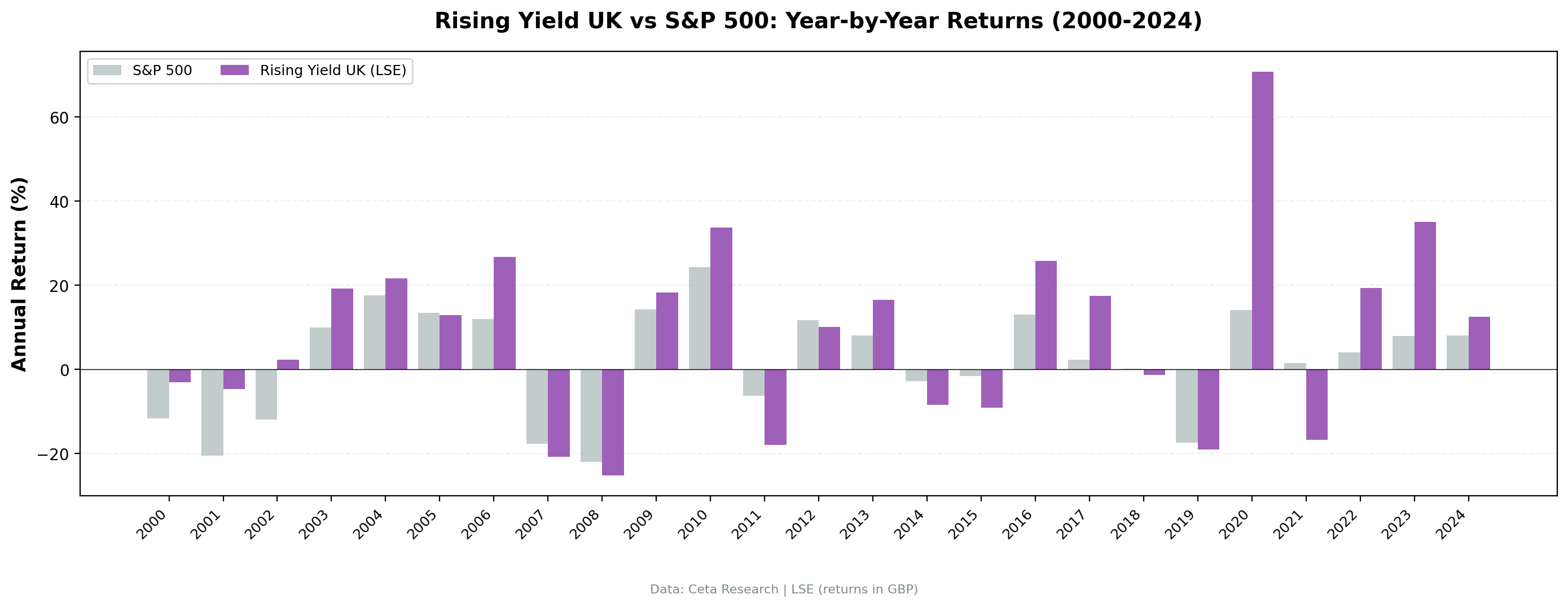
| Year | Rising Yield (GBP) | FTSE 100 | Excess |
|---|---|---|---|
| 2000 | -3.1% | -11.7% | +8.6% |
| 2001 | -4.7% | -20.5% | +15.8% |
| 2002 | +2.3% | -11.9% | +14.2% |
| 2003 | +19.2% | +10.0% | +9.2% |
| 2004 | +21.6% | +17.6% | +4.0% |
| 2005 | +12.8% | +13.5% | -0.7% |
| 2006 | +26.8% | +12.0% | +14.8% |
| 2007 | -20.8% | -17.7% | -3.1% |
| 2008 | -25.2% | -22.0% | -3.3% |
| 2009 | +18.2% | +14.3% | +4.0% |
| 2010 | +33.7% | +24.4% | +9.3% |
| 2011 | -17.9% | -6.3% | -11.6% |
| 2012 | +10.1% | +11.8% | -1.7% |
| 2013 | +16.5% | +8.1% | +8.4% |
| 2014 | -8.4% | -2.7% | -5.7% |
| 2015 | -9.1% | -1.6% | -7.5% |
| 2016 | +25.9% | +13.1% | +12.8% |
| 2017 | +17.5% | +2.3% | +15.2% |
| 2018 | -1.3% | +0.1% | -1.5% |
| 2019 | -19.0% | -17.4% | -1.6% |
| 2020 | +70.8% | +14.2% | +56.6% |
| 2021 | -16.7% | +1.5% | -18.2% |
| 2022 | +19.3% | +4.1% | +15.3% |
| 2023 | +35.1% | +7.9% | +27.2% |
| 2024 | +12.5% | +8.1% | +4.5% |
Key Observations
2004-2006: Three strong years
+21.6%, +12.8%, +26.8%. The strategy beat the FTSE 100 in 2004 and 2006 (by +4.0 and +14.8 points) and roughly matched it in 2005. UK dividend growers benefited from the pre-crisis economic expansion, strong commodity prices (benefiting miners and energy companies), and a housing-driven consumer boom.
2008: The worst year
-25.2% vs -22.0% for the FTSE 100. The UK version fell harder than the local benchmark by 3.3 percentage points. Beta above 1 explains part of this. But the deeper issue is sector concentration. The LSE's dividend growers are heavily weighted toward financials and commodities. Both sectors were hit especially hard during the financial crisis. The quality filters (ROE > 10%, payout < 75%) weren't enough to avoid banks that were growing dividends right up until they collapsed.
2011 and 2014: Structural drags
-17.9% in 2011, -8.4% in 2014. Both years saw the strategy underperform the FTSE 100, by 11.6 points in 2011 and 5.7 points in 2014. In 2011, the European debt crisis hit UK banks and their trading partners. In 2014, the commodity downturn slammed mining companies (BHP, Rio Tinto, Glencore) that had been growing dividends aggressively.
2020: The biggest single year in the UK record
+70.8%, the biggest single-year return in the UK's record and one of the largest the rising yield strategy produced across the 15 markets we tested. The pandemic crash in March 2020 hit UK dividend stocks especially hard because the market was already cheap from Brexit uncertainty. The July 2019 rebalance had loaded the portfolio with beaten-down names. When the recovery came, the snapback was violent. The +56.6% excess vs FTSE 100 is the largest single-year alpha in the UK record.
One outlier year inflates the headline numbers. If you remove 2020, the CAGR drops to roughly 4.0%.
2022-2024: Three strong years vs FTSE 100
+19.3%, +35.1%, +12.5% in 2022-2024. The strategy beat the FTSE 100 in all three years, by 15.3%, 27.2%, and 4.5% respectively. UK dividend growers have fared well in this period, while the FTSE 100's overall composition has lagged global tech-driven gains.
The UK: Alpha vs FTSE 100, Lag vs SPY
The strategy beats the FTSE 100 by +5.34% annually. But the FTSE 100 itself has underperformed the S&P 500 by roughly 6-7% annually over this period. So the strategy is a good UK stock selector in a structurally underperforming market.
Sector concentration is extreme. The FTSE 100's top sectors are financials, energy, mining, consumer staples, and pharma. Many of the UK's biggest dividend payers are commodity-exposed. When oil or metals fall, these companies' dividends come under pressure at the same time their stock prices decline. The screen sometimes captures companies whose yield is rising partly because of price decline, even after filtering for DPS growth. The DPS might grow 2% while the price drops 15%.
The £500M threshold is high for the LSE. Only 14.5 stocks qualified on average, among the lowest stock counts of any market in our series. A thinner portfolio means less diversification and more concentration risk. Each individual stock has an outsized impact on annual returns.
No tech counterweight. The US version of this strategy occasionally catches technology companies that have matured into dividend growers (Apple, Microsoft, Broadcom). The LSE has almost none of these. The portfolio is always tilted toward old-economy sectors, which have structurally lagged the technology-driven global equity rally since 2010. This explains why the strategy beats FTSE 100 (same structural exposure, better stock selection) but trails SPY (the US market itself has outperformed).
Currency Note
Returns are in British Pounds. GBP/USD moved from roughly 1.50 in 2000 to roughly 1.27 in 2024, a ~15% depreciation. That's about 0.7% annual drag for a USD-based investor.
Rough currency adjustment:
| Metric | LSE (GBP) | LSE (est. USD) | S&P 500 (USD) |
|---|---|---|---|
| CAGR | 6.56% | ~5.8% | 7.85% |
| Alpha vs FTSE 100 | +5.34% | - | - |
Against the local FTSE 100 in GBP, the +5.34% annual alpha is the relevant measure for UK investors. For US-based investors, currency drag reduces returns by ~0.7% annually.
Limitations
Local benchmark. Returns are GBP, benchmark is FTSE 100, also in GBP. The +5.34% alpha is the local comparison. Against SPY in USD, the strategy trails by ~1.3% CAGR when currency drag is included.
Sector bias. 14.5 average stocks, concentrated in financials, energy, and mining. This is a partial sector bet, not a diversified factor exposure.
Post-Brexit structural change. The UK's economic relationship with Europe changed fundamentally after 2016. The strategy's post-2016 returns may not be representative of future performance as the UK economy continues to adjust.
Survivorship bias. Exchange membership uses current LSE listings. Delisted companies, including some that cut dividends before delisting, aren't captured.
The £500M filter creates a small universe. Many UK companies that would pass the fundamental screen fall below the market cap threshold. A lower threshold might produce different results but would also introduce liquidity risk.
Takeaway
The rising yield screen beats FTSE 100 by +5.34% annually. But the Sharpe ratio (0.139) remains the lowest in our study, and the -40.80% max drawdown is among the deepest. The strategy works as a UK stock selector. The underlying market creates challenges.
The UK result is honest on both sides. The screen does generate alpha relative to the FTSE 100. But the FTSE 100 has been a weak benchmark. UK-focused investors using this screen have beaten their local index by a wide margin. Global investors comparing to SPY have underperformed. Both things are true.
The structural issues are real: commodity concentration, a thin qualifying universe, no tech exposure. These don't disappear with a benchmark change. The +5.34% alpha tells you the screen is working at stock selection. The low Sharpe tells you the UK market itself carries risks that can't be screened away.
Part of a Series
This analysis is part of our rising dividend yield global exchange comparison: - Rising Yield on US Stocks (NYSE + NASDAQ + AMEX) - 9.54% CAGR, the baseline - Rising Yield on Canadian Stocks (TSX) - 8.48% CAGR, zero cash periods - Rising Yield on Japanese Stocks (JPX) - 8.94% CAGR, highest Sharpe of all markets - Rising Yield: 15-Exchange Global Comparison - full comparison table
References
- Campbell, John Y., and Robert J. Shiller. "The Dividend-Price Ratio and Expectations of Future Dividends and Discount Factors." Review of Financial Studies 1, no. 3 (1988): 195-228.
- Cochrane, John H. "The Dog That Did Not Bark: A Defense of Return Predictability." Review of Financial Studies 21, no. 4 (2008): 1533-1575.
Run This Screen Yourself
All metrics used in this analysis (dividendYield, dividendPerShare, ROE, payout ratio) are queryable via SQL on Ceta Research. Filter by exchange (LSE) and see what passes today.
The full backtest code (Python + DuckDB) is available in our GitHub repository.
Data: Ceta Research, FMP financial data warehouse. Universe: LSE. Annual rebalance (July), equal weight top 30, 2000-2025. Returns in GBP.
Past performance does not guarantee future results. This is educational content, not investment advice.