Rising Dividend Yield on Canadian Stocks: 8.48% CAGR With Zero Cash Periods
We applied the rising dividend yield screen to 25 years of TSX data. 8.48% CAGR, +4.53% annual alpha vs TSX Composite, zero cash periods, and lower volatility than the US version. Canada''s resource and financial sectors are natural dividend growers.

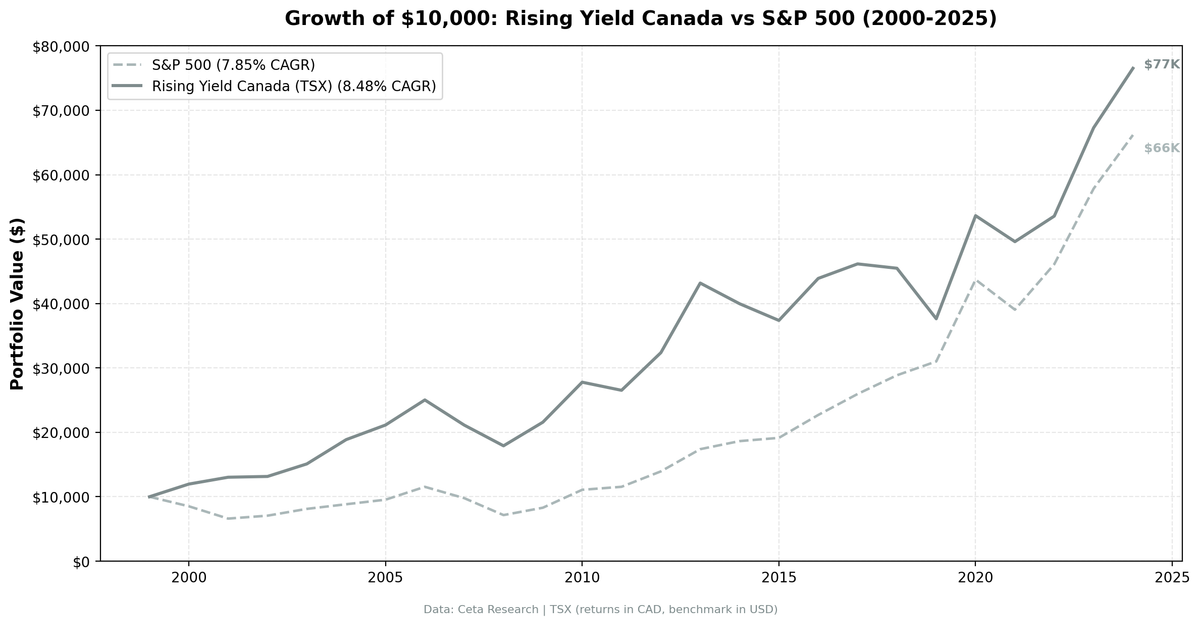
Canada's dividend culture runs deep. Banks, pipelines, telecoms, resource companies. The TSX is built on sectors that generate cash and return it to shareholders. We applied the rising dividend yield screen to all TSX-listed stocks from 2000 to 2025 and found a strategy that never once sat in cash. 8.48% CAGR, +4.53% annual alpha vs TSX Composite, with lower volatility than the US version. Consistent outperformance against the local benchmark.
Contents
- Method
- The Screen (SQL)
- What We Found
- 25 years. Zero cash periods. Every rebalance found enough stocks.
- Year-by-Year Returns
- Key Observations
- 2000-2001: Dot-com protection
- 2004: The energy dividend boom
- 2008: A shallower crash
- 2013: The best single year
- 2019: The worst year
- 2020: The snapback
- Why Canada Works for This Strategy
- Currency Note
- Limitations
- Takeaway
- Part of a Series
- References
- Run This Screen Yourself
Data: FMP financial data warehouse, 2000–2025. Updated March 2026.
Method
Data source: Ceta Research (FMP financial data warehouse) Universe: TSX, market cap > C$500M (~$362M USD) Period: 2000-2025 (25 years, 25 annual periods) Rebalancing: Annual (July), equal weight top 30 by 2-year yield expansion Benchmark: TSX Composite (CAD, local benchmark) Cash rule: Hold cash if fewer than 10 stocks qualify Transaction costs: Size-tiered (0.1% for >$10B, 0.3% for $2-10B, 0.5% for <$2B, one-way) Returns: Denominated in CAD
For the full methodology and driver classification logic, see the US flagship post.
The Screen (SQL)
WITH yearly_yield AS (
    SELECT r.symbol, r.date,
        r.fiscalYear AS yr,
        r.dividendYield,
        r.dividendPerShare,
        r.dividendPayoutRatio,
        LAG(r.dividendYield, 1) OVER (PARTITION BY r.symbol ORDER BY r.fiscalYear) AS yield_1yr,
        LAG(r.dividendYield, 2) OVER (PARTITION BY r.symbol ORDER BY r.fiscalYear) AS yield_2yr,
        LAG(r.dividendPerShare, 1) OVER (PARTITION BY r.symbol ORDER BY r.fiscalYear) AS dps_1yr,
        LAG(r.dividendPerShare, 2) OVER (PARTITION BY r.symbol ORDER BY r.fiscalYear) AS dps_2yr
    FROM financial_ratios r
    WHERE r.period = 'FY' AND r.dividendYield > 0
),
screened AS (
    SELECT y.symbol, y.date, y.yr,
        y.dividendYield, y.dividendPerShare, y.dividendPayoutRatio,
        (y.dividendYield - y.yield_2yr) AS yield_change_2yr,
        CASE
            WHEN y.dividendPerShare > y.dps_1yr AND y.dps_1yr > y.dps_2yr THEN 'Consecutive DPS Growth'
            WHEN y.dividendPerShare > y.dps_1yr THEN 'Partial DPS Growth'
            ELSE 'Price Decline Driver'
        END AS yield_driver
    FROM yearly_yield y
    WHERE y.yield_2yr IS NOT NULL
      AND y.dividendYield > y.yield_1yr AND y.yield_1yr > y.yield_2yr
      AND y.dividendPerShare > y.dps_1yr
      AND y.dividendPayoutRatio > 0 AND y.dividendPayoutRatio < 0.75
    QUALIFY ROW_NUMBER() OVER (PARTITION BY y.symbol ORDER BY y.date DESC) = 1
)
SELECT s.symbol, p.companyName,
    ROUND(s.dividendYield * 100, 2) AS yield_pct,
    ROUND(s.yield_change_2yr * 100, 2) AS yield_expansion_2yr_pct,
    s.yield_driver,
    ROUND(s.dividendPayoutRatio * 100, 1) AS payout_pct,
    ROUND(k.returnOnEquityTTM * 100, 1) AS roe_pct,
    ROUND(k.marketCap / 1e9, 1) AS market_cap_b
FROM screened s
JOIN key_metrics_ttm k ON s.symbol = k.symbol
JOIN profile p ON s.symbol = p.symbol
WHERE k.returnOnEquityTTM > 0.10
  AND k.marketCap > 500e6  -- C$500M
  AND p.exchange = 'TSX'
ORDER BY s.yield_change_2yr DESC
LIMIT 30
What We Found

25 years. Zero cash periods. Every rebalance found enough stocks.
| Metric | Rising Yield (TSX) | TSX Composite |
|---|---|---|
| CAGR | 8.48% | 3.95% |
| Total Return | 665% | - |
| Volatility | ~16.2% | - |
| Max Drawdown | -28.45% | - |
| Sharpe Ratio | 0.369 | - |
| Sortino Ratio | 0.805 | - |
| Alpha | +4.53% annual | - |
| Win Rate (annual) | 56% | - |
| Avg Stocks per Period | 22.2 | - |
| Cash Periods | 0 of 25 | - |
Against the TSX Composite's 3.95% CAGR, the strategy delivered +4.53% annual alpha. The risk profile is also strong: max drawdown of -28.45%, Sortino ratio of 0.805. Beta below 1 means the portfolio captured less than the market's full moves. The Sortino ratio measures return per unit of downside risk and is among the best in our series.
Zero cash periods. Every single July from 2000 to 2024, the screen found at least 10 qualifying TSX stocks. Canada's deep bench of dividend-paying companies means the strategy always had something to buy.
Year-by-Year Returns
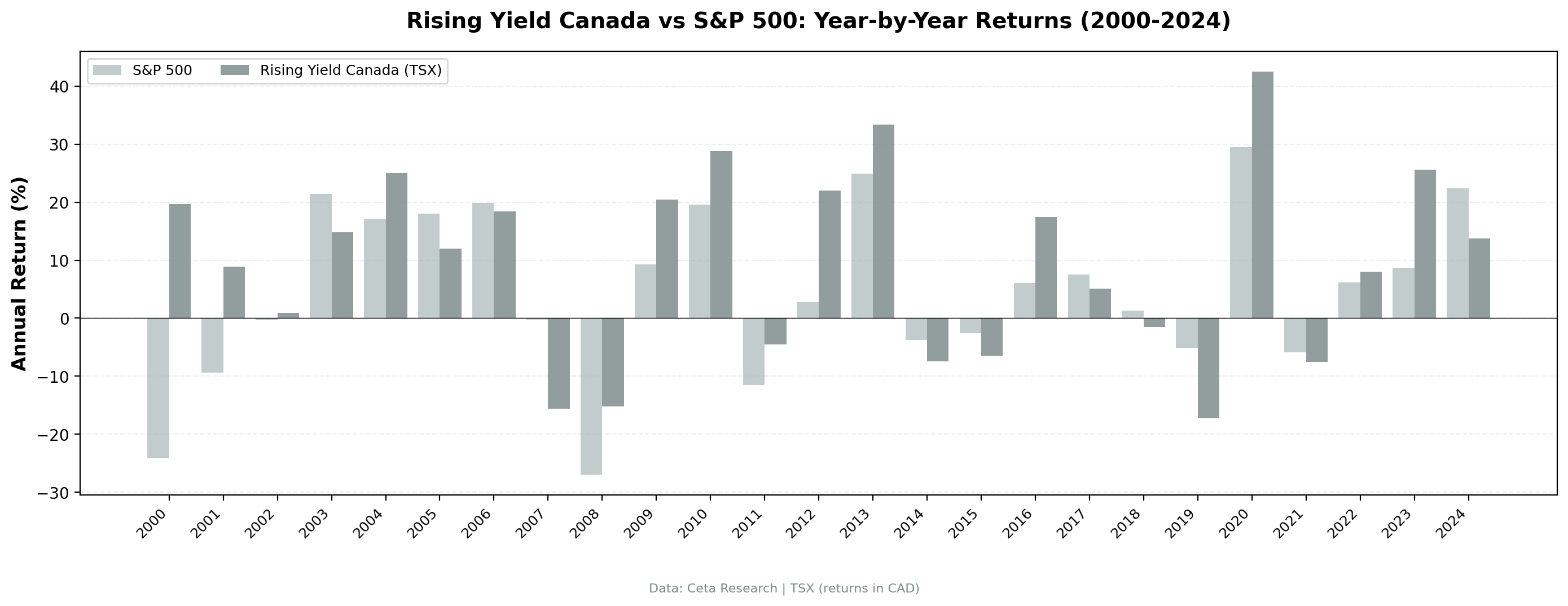
| Year | Rising Yield (CAD) | TSX Composite | Excess |
|---|---|---|---|
| 2000 | +19.7% | -24.1% | +43.8% |
| 2001 | +8.9% | -9.3% | +18.2% |
| 2002 | +0.9% | -0.3% | +1.2% |
| 2003 | +14.8% | +21.4% | -6.6% |
| 2004 | +25.0% | +17.1% | +7.8% |
| 2005 | +12.0% | +18.0% | -6.0% |
| 2006 | +18.4% | +19.9% | -1.4% |
| 2007 | -15.6% | -0.2% | -15.4% |
| 2008 | -15.2% | -27.0% | +11.8% |
| 2009 | +20.5% | +9.3% | +11.2% |
| 2010 | +28.8% | +19.6% | +9.2% |
| 2011 | -4.5% | -11.5% | +7.0% |
| 2012 | +22.0% | +2.8% | +19.2% |
| 2013 | +33.4% | +24.9% | +8.5% |
| 2014 | -7.4% | -3.8% | -3.7% |
| 2015 | -6.5% | -2.6% | -3.9% |
| 2016 | +17.5% | +6.1% | +11.3% |
| 2017 | +5.1% | +7.5% | -2.4% |
| 2018 | -1.5% | +1.3% | -2.7% |
| 2019 | -17.2% | -5.2% | -12.1% |
| 2020 | +42.5% | +29.5% | +13.1% |
| 2021 | -7.5% | -5.9% | -1.6% |
| 2022 | +8.0% | +6.2% | +1.8% |
| 2023 | +25.6% | +8.7% | +16.9% |
| 2024 | +13.7% | +22.4% | -8.7% |
Key Observations
2000-2001: Dot-com protection
The strategy returned +19.7% in 2000 while the TSX Composite lost 24.1%, and +8.9% in 2001 while the TSX Composite fell 9.3%. Canadian dividend growers were completely detached from the tech bubble. The TSX had minimal exposure to the internet stocks that imploded, and the rising yield screen selected the most committed dividend payers among them. Two-year combined excess return: +62.0 percentage points.
2004: The energy dividend boom
+25.0% vs the TSX Composite's +17.1%, +7.8% excess. Canada's resource companies were raising dividends aggressively as commodity prices climbed. Oil sands operators, pipeline companies, and mining firms all expanded their payouts. The rising yield screen captured this wave perfectly.
2008: A shallower crash
-15.2% vs -27.0% for the TSX Composite, +11.8% excess. The strategy still lost money during the financial crisis. No equity screen avoids that. But the loss was 11.8 percentage points less severe than the local index. The quality filters, ROE > 10% and payout < 75%, helped by keeping the most leveraged names out of the portfolio.
2013: The best single year
+33.4% vs TSX Composite +24.9%, +8.5% excess. Canadian dividend growers benefited from a synchronized global recovery. The screen's annual rebalance in July 2012 loaded up on financials and industrials that were growing dividends through the recovery. These sectors led the 2013 rally in Canada.
2019: The worst year
-17.2% vs TSX Composite -5.2%, -12.1% excess. The market rewarded revenue acceleration, not dividend trajectories. Canadian energy companies, a traditional dividend stronghold, were also under pressure from falling oil prices in late 2018. This was one of the strategy's biggest years of underperformance vs the local index.
2020: The snapback
+42.5% vs TSX Composite +29.5%, +13.1% excess. After the pandemic selloff, the screen rebalanced into beaten-down dividend growers at depressed prices. The recovery was violent and fast. Companies that maintained or grew dividends through early 2020 were re-rated sharply.
Why Canada Works for This Strategy
Canada has structural advantages for dividend-based screens.
Sector composition. The TSX is dominated by financials (Big Five banks), energy (pipelines, producers), telecoms, and utilities. These sectors generate predictable cash flows and have long histories of dividend growth. The rising yield screen naturally gravitates toward them.
Regulatory incentive. Canadian tax law offers a dividend tax credit for Canadian-source dividends, making dividend income more tax-efficient than interest or foreign dividends. This creates a self-reinforcing cycle: companies pay dividends because shareholders prefer them, and shareholders prefer them because of the tax advantage.
Fewer growth traps. The TSX has fewer high-flying tech stocks than US exchanges. This means the rising yield screen is less likely to include companies where yield rose because the price crashed from 50x revenue to 10x revenue. The candidates are genuinely cash-generative businesses.
The result is a market where the rising yield signal is cleaner. Less noise, fewer false positives.
Currency Note
Returns are in Canadian Dollars. The TSX Composite benchmark is also in CAD, so the local alpha (+4.53%) is a clean comparison. Against SPY in USD, the strategy's excess is roughly +0.63% CAGR (8.48% vs 7.85%).
CAD/USD moved from roughly 0.67 in 2000 to roughly 0.72 in 2024, a modest appreciation. The currency effect is small over the full period, but it swung widely in between (CAD was at parity with USD around 2011-2013). For a US-based investor, the currency impact would shave roughly 0.3% annually from the stated returns.
| Metric | Rising Yield (CAD) | S&P 500 (USD) |
|---|---|---|
| CAGR | 8.48% | 7.85% |
| Excess | +0.63% vs SPY, +4.53% vs TSX | - |
Limitations
Local benchmark. Returns are CAD, benchmark is the TSX Composite, also in CAD. The +4.53% alpha is a clean local comparison. Against SPY in USD, the excess is roughly +0.63%.
Sector concentration. With 22.2 average stocks per rebalance, the portfolio often concentrates in financials and energy. This makes it a partial sector bet, not a pure factor exposure.
Resource dependency. Canada's economy and its dividend-paying companies are tied to commodity prices. The strategy performs well when oil, gas, and metals are rising. It struggles when they fall.
Survivorship bias. Exchange membership uses current profiles. Delisted TSX companies aren't captured.
Transaction costs in CAD. Our size-tiered model is calibrated to US market structure. Canadian trading costs may differ, particularly for mid-cap names.
Takeaway
The rising dividend yield screen on the TSX produced 8.48% CAGR, +4.53% annual alpha vs TSX Composite, with excellent risk characteristics. Max drawdown of -28.45%, Sortino of 0.805, zero cash periods across 25 years.
Canada is a natural home for this strategy. The market is full of companies that grow dividends because their businesses generate reliable cash flows, not because management is trying to prop up a falling stock price. The driver classification, filtering for DPS growth over price decline, is less necessary here than in other markets because the TSX has fewer false positives to begin with.
For investors looking for the most defensive version of the rising yield strategy, Canada delivers. The local alpha is real and meaningful. The protection is real.
Part of a Series
This analysis is part of our rising dividend yield global exchange comparison: - Rising Yield on US Stocks (NYSE + NASDAQ + AMEX) - 9.54% CAGR, the baseline - Rising Yield on Japanese Stocks (JPX) - 8.94% CAGR, highest Sharpe of all markets - Rising Yield on UK Stocks (LSE) - 6.56% CAGR, +5.34% alpha vs FTSE 100 - Rising Yield: 15-Exchange Global Comparison - full comparison table
References
- Campbell, John Y., and Robert J. Shiller. "The Dividend-Price Ratio and Expectations of Future Dividends and Discount Factors." Review of Financial Studies 1, no. 3 (1988): 195-228.
- Cochrane, John H. "The Dog That Did Not Bark: A Defense of Return Predictability." Review of Financial Studies 21, no. 4 (2008): 1533-1575.
Run This Screen Yourself
All metrics used in this analysis (dividendYield, dividendPerShare, ROE, payout ratio) are queryable via SQL on Ceta Research. Filter by exchange (TSX) and see what passes today.
The full backtest code (Python + DuckDB) is available in our GitHub repository.
Data: Ceta Research, FMP financial data warehouse. Universe: TSX. Annual rebalance (July), equal weight top 30, 2000-2025. Returns in CAD.
Past performance does not guarantee future results. This is educational content, not investment advice.