We Tested Revenue Acceleration in 15 Markets. Two Beat the S&P 500.
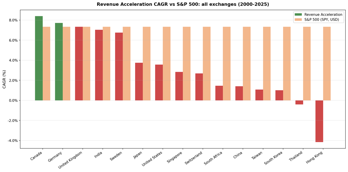
Revenue acceleration tested in 15 markets over 25 years. Canada (+1.07%) and Germany (+0.38%) beat the S&P 500, the UK drew level, and twelve lost. Hong Kong lost by 11.49% a year.

Revenue acceleration sounds like a sensible signal. Buy companies whose revenue growth rate is speeding up, not just growing. The second derivative of revenue, applied to portfolio construction.
Contents
- Method
- Which benchmark to read
- The Global Picture
- Fifteen markets, two winners.
- What We Found
- The developed West held up. Asia didn't.
- Down capture predicts the result better than anything else.
- China's 9.9% down capture is extraordinary and useless.
- Hong Kong is the worst result in the study.
- India is where the two benchmarks disagree most.
- Why the Signal Fails Broadly
- What Works vs What Doesn't
- Limitations
- Takeaway
- Individual Market Deep Dives
- References
We tested it in 15 markets over 25 years. Canada beat the S&P 500 by 1.07% a year, Germany by 0.38%, the UK drew exactly level, and the other twelve lost. Hong Kong lost by 11.49% a year.
There's a second answer hiding in that first one. Measured against each market's own index instead of the S&P 500, seven of the fifteen look positive. Most of that is an artifact of what those indices measure, and the section below explains which part is real.
Data: FMP financial data warehouse, 2000–2025. Updated August 2026.
Method
Data source: Ceta Research (FMP financial data warehouse) Universe: 15 exchanges (see table below) Period: 2000–2025 (25 years per exchange) Rebalancing: Annual (April 1), equal weight Execution: Next-day close. The screen is computed on the rebalance date and filled at the following session's close Benchmarks: each market's local index, plus the S&P 500 (SPY) as the common cross-market yardstick Cash rule: Hold cash if fewer than 10 stocks qualify Transaction costs: Size-tiered model (0.1–0.5% one-way)
Signal: Revenue growth acceleration computed from 3 consecutive annual FY filings. Filters: growth rate speeding up, current growth > 5%, ROE > 10%, debt/equity < 1.5, exchange-specific minimum market cap. Top 30 stocks by acceleration magnitude.
Excluded for data quality: Australia (ASX) and Brazil (SAO), where FMP's adjusted close doesn't apply splits and consolidations retroactively and produces impossible returns. Singapore appears under its working exchange code, SES.
Which benchmark to read
Both columns below are honest, and they answer different questions.
The S&P 500 column is the fair cross-market comparison. SPY is a total-return series in USD, identical for every row, so the excess numbers are comparable to each other.
The local index column is the fair within-market comparison, but with one large caveat: almost every national index here is a price index that excludes dividends, while the portfolio's returns include them. That inflates the local excess by roughly each market's dividend yield, typically 2% to 4% a year. The DAX is the exception. It's a performance index that reinvests dividends, which makes Germany's +3.20% the only local-benchmark number in this table that is genuinely like for like.
These benchmarks leave dividends out. Portfolio returns here use dividend-adjusted prices, so they include dividends. Most of the indices we measure against do not. The FTSE 100, Hang Seng, KOSPI, Nikkei 225, OMX Stockholm 30, SET Index, SMI, SSE Composite, STI, Sensex, TAIEX and TSX Composite are price indices, so excess return against them is overstated by roughly the local dividend yield, which has run between about 1.3% and 3.5% in these markets. Those comparisons are like for like: the S&P 500 figure runs through SPY, which is dividend-adjusted; the DAX is a performance index. Treat any edge thinner than the local yield as a tie rather than a win.
The Global Picture
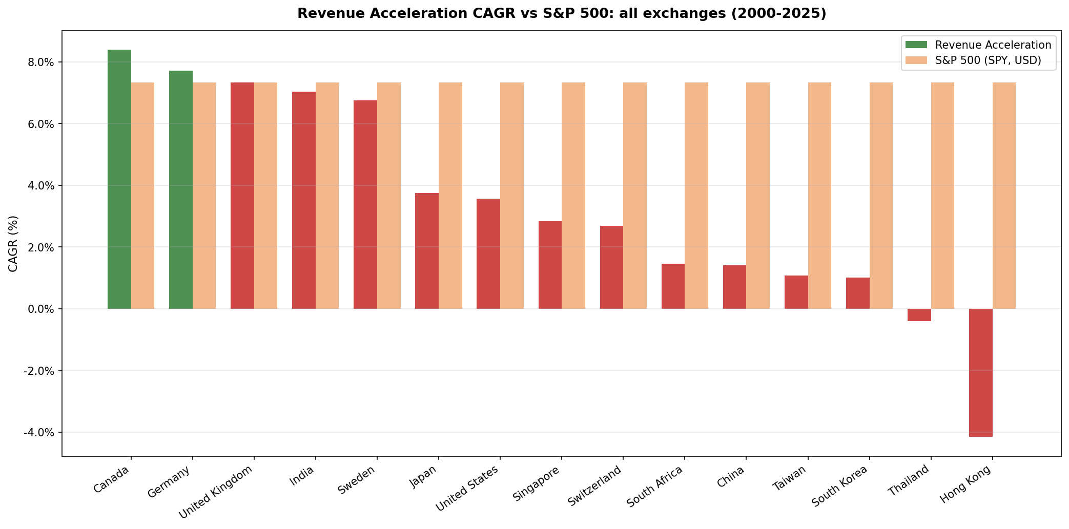
Fifteen markets, two winners.
Sorted by excess return against the S&P 500.
| Market | CAGR | Excess vs S&P 500 | Local index | Local CAGR | Excess vs local | Down capture | Max drawdown | Cash % | Avg stk |
|---|---|---|---|---|---|---|---|---|---|
| Canada (TSX) | 8.39% | +1.07% | TSX Composite | 4.05% | +4.34% | 43.2% | -33.45% | 0% | 21.8 |
| Germany (XETRA) | 7.71% | +0.38% | DAX | 4.51% | +3.20% | 34.4% | -21.52% | 0% | 15.2 |
| UK (LSE) | 7.33% | 0.00% | FTSE 100 | 1.15% | +6.17% | 58.3% | -40.03% | 0% | 11.2 |
| India (NSE) | 7.03% | -0.29% | Sensex | 11.49% | -4.45% | 47.0% | -47.87% | 28% | 21.7 |
| Sweden (STO) | 6.75% | -0.57% | OMX Stockholm 30 | 2.40% | +4.35% | 77.3% | -46.09% | 24% | 20.0 |
| Japan (JPX) | 3.75% | -3.58% | Nikkei 225 | 2.20% | +1.55% | 85.4% | -57.37% | 20% | 25.2 |
| US (NYSE+NASDAQ+AMEX) | 3.56% | -3.77% | S&P 500 | 7.33% | -3.77% | 107.0% | -45.72% | 0% | 23.6 |
| Singapore (SES) | 2.83% | -4.50% | STI | 2.65% | +0.18% | 82.0% | -52.37% | 24% | 8.1 |
| Switzerland (SIX) | 2.68% | -4.65% | SMI | 2.08% | +0.60% | 123.2% | -57.76% | 0% | 12.8 |
| South Africa (JNB) | 1.45% | -5.87% | none available | N/A | N/A | 61.3% | -30.86% | 36% | 10.9 |
| China (SHZ+SHH) | 1.40% | -5.93% | SSE Composite | 2.51% | -1.12% | 9.9% | -53.60% | 0% | 22.9 |
| Taiwan (TAI+TWO) | 1.07% | -6.25% | TAIEX | 3.05% | -1.97% | 53.9% | -37.29% | 28% | 25.0 |
| Korea (KSC) | 1.00% | -6.33% | KOSPI | 4.44% | -3.43% | 60.2% | -35.43% | 36% | 24.1 |
| Thailand (SET) | -0.41% | -7.73% | SET Index | 4.41% | -4.81% | 86.8% | -54.06% | 20% | 20.8 |
| Hong Kong (HKSE) | -4.16% | -11.49% | Hang Seng | 1.28% | -5.44% | 92.6% | -67.66% | 0% | 17.3 |
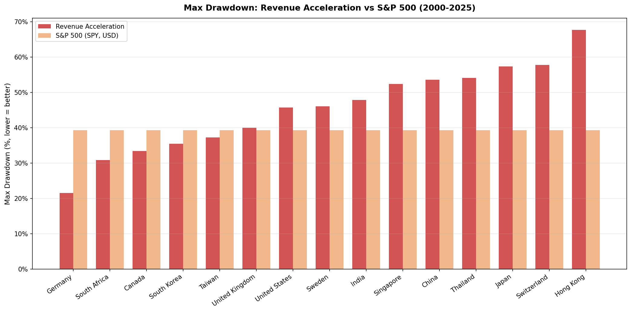
The S&P 500 returned 7.33% a year with a -39.33% max drawdown over the same period. Down capture is measured against the S&P 500 so the column is comparable across rows. South Africa has no usable local index in the price data, so both of its comparisons are against the S&P 500.
What We Found
The developed West held up. Asia didn't.
The top of the table is almost entirely developed Western markets: Canada, Germany, the UK, and Sweden, with India slotted in among them. The bottom is Asia: China, Taiwan, Korea, Thailand, and Hong Kong, every one of them losing to the S&P 500 by close to six points a year or more.
The split isn't about which markets went up. It's about what the screen selects in each one. Canada's revenue accelerators land in energy, materials, and industrials. Germany's land in capital goods and specialty manufacturing. Both produce portfolios with down capture in the 30s and 40s. In the US and Switzerland, the same filters produce portfolios that capture more of the market's declines than the market itself, at 107% and 123%.
Down capture predicts the result better than anything else.
Both markets that beat the S&P 500, Germany at 34.4% and Canada at 43.2%, sit in the five lowest down capture readings. The three highest, Switzerland at 123.2%, the US at 107.0%, and Hong Kong at 92.6%, all lost by at least 3.7 points a year, and Hong Kong by 11.5.
The relationship isn't clean. China has the lowest down capture in the table at 9.9% and still lost by 5.93 points, because a portfolio that doesn't fall with the market can also fail to rise with it. Low down capture turns out to be necessary and not sufficient: no market with down capture above 60% beat the benchmark, but plenty below it lost anyway.
This is the strategy's actual mechanism, and it isn't a growth-selection mechanism. Revenue acceleration doesn't beat markets by finding better growers. Where it wins, it wins by accidentally selecting into defensive sectors.
China's 9.9% down capture is extraordinary and useless.
Chinese revenue accelerators produced 1.40% CAGR over 25 years, which is a poor absolute result. But the down capture of 9.9% means that when the S&P 500 fell, this portfolio barely moved. The A-share market has a different structure: domestic retail investors drive price action, and accelerating mid-cap companies often don't correlate with the large-cap declines that dominate the S&P 500 comparison.
This is a curiosity, not a recommendation. 1.40% CAGR is not a portfolio to run.
Hong Kong is the worst result in the study.
-4.16% CAGR, -11.49% annual excess against the S&P 500, and a max drawdown of -67.66%. Revenue-accelerating Hong Kong companies are heavily exposed to Chinese growth cycles and property sector volatility. The strategy picks exactly the names that captured China's expansion, then captures every contraction as well, amplified.
Hong Kong also loses to its own index. The Hang Seng returned 1.28% a year on a price basis, and the strategy still trailed it by 5.44%. This is one of the few markets where the local-index comparison makes the result look worse, not better.
India is where the two benchmarks disagree most.
India returns 7.03% and looks close to the S&P 500, at -0.29%. Against the Sensex, which compounded at 11.49%, it's -4.45%. The Sensex is a price index, so the true gap is wider still. Indian revenue accelerators badly lagged a market that was one of the strongest in the world over this period, and only the strength of that market makes the absolute return look respectable.
This is the case for always checking the local benchmark. Judged against a US index, India looks like a near miss. Judged against what an Indian investor could have bought instead, it's one of the clearer failures in the table.
Why the Signal Fails Broadly
Revenue acceleration identifies companies at or near peak growth velocity. The underreaction case, that markets are slow to update on improving fundamentals, comes from Chan, Jegadeesh & Lakonishok (1996), who found drift after past returns and past earnings surprises. The evidence over 25 years says markets have priced this particular signal in.
There are three plausible mechanisms:
1. Information is priced. Revenue acceleration from annual filings is widely tracked by analysts and quant funds. By the time a company shows 3 consecutive years of accelerating revenue in its annual filings, that trajectory has already appeared in quarterly earnings, guidance revisions, and analyst models. The annual backtest is acting on stale information.
2. Peak acceleration is late cycle. Companies showing the strongest revenue acceleration in fiscal year filings have often been accelerating for 2 or 3 years. They're concentrated in whatever sector led the prior cycle. When growth slows or the cycle turns, these are the first names to get hit, which explains the elevated down capture in the markets where the signal fails.
3. Quality filters compound the problem. Adding ROE > 10% and D/E < 1.5 selects for profitable accelerators, but it also selects for companies that are already well known. The most interesting revenue acceleration opportunities, small companies early in their trajectory, get filtered out by the market cap floor.
Underneath all three sits a more basic problem. Chan, Karceski & Lakonishok (2003) found almost no persistence in company growth rates beyond what chance would produce. A signal that ranks on last year's acceleration is ranking on a number with little predictive content, which is consistent with a result that varies across markets by sector composition rather than by anything the signal itself is measuring.
What Works vs What Doesn't
Low down capture is the only thing that correlates with success. Canada (43.2%), Germany (34.4%), and India (47.0%) have the best defensive characteristics. Two of the three are the only markets that beat the S&P 500. Markets with down capture above 90% all show severe underperformance.
Cash periods hurt. Korea and South Africa spent 36% of the period in cash, Taiwan and India 28%, Sweden and Singapore 24%. These exchanges had years in the 2000 to 2006 stretch where fewer than 10 stocks qualified, so the portfolio sat in cash through part of a bull market. This is thinner early data coverage as much as it is a property of the signal.
Some universes are too thin to trust. Singapore averages 8.1 holdings when invested and the UK 11.2. At that size a single position moves the annual return by several points, and the results should be read as indicative rather than robust.
A smaller universe isn't automatically worse. Germany's tighter selection, at 15.2 average holdings, produced the shallowest drawdown in the study. The quality filter does more work when the universe is naturally smaller.
Limitations
Local indices mostly exclude dividends. As noted above, every local-index excess in this table except Germany's is inflated by the dividend yield the index leaves out. Treat the S&P 500 column as the conservative read.
Currency effects are not neutralized. The S&P 500 comparison puts local-currency portfolio returns against a USD benchmark. In periods of significant USD appreciation or depreciation the comparison shifts. The local-index comparisons are currency-clean.
The universe includes closed-end funds. Funds report investment income in the revenue field, so a fund whose portfolio marked up can post enormous "revenue acceleration" and enter the top 30. In April 2018 this took 18 of 30 slots in both the US and the UK; in 2005, 2012 and 2023 it was 1 to 7 depending on market. Rerunning with funds and ETFs excluded moves CAGR by +0.70 points in the US, +0.58 in the UK, +0.13 in Canada and +0.07 in Germany. No conclusion in this table changes, but the composition in some years is not what the strategy name implies.
25 years per exchange, but start quality varies. Exchanges with thin early-period data have more cash periods in 2000 to 2006. Starting each exchange from the point its coverage became consistent would typically improve those markets modestly.
Survivorship bias. All exchanges use current listings. Companies that delisted during the period aren't tracked through failure, which biases every row upward.
Twenty-five annual observations is a small sample. At the volatility these portfolios run, gaps of 1 to 2 points a year are not distinguishable from noise. The large negatives at the bottom of the table are more trustworthy than the small positives at the top.
Takeaway
Twelve of the fifteen markets we tested lost to the S&P 500 and the UK drew level. Canada beat it by 1.07% and Germany by 0.38%, and neither margin is large enough to claim statistical significance with 25 annual observations.
The signal isn't worthless everywhere. In Canada and Germany it produces portfolios with real downside protection: 43% and 34% down capture, and in Germany the shallowest drawdown of any market in the study. But read what that means. Both of those results come from the portfolio losing less in crashes, not from picking better growth stories, and both depend heavily on a sample that starts at the dot-com peak.
As a standalone strategy, revenue acceleration doesn't work globally. As a secondary filter in a multi-factor model, or as a way to build defensively positioned portfolios in specific markets, the historical characteristics are worth knowing.
Individual Market Deep Dives
- US: 3.56% CAGR, -3.77% excess. The flagship failure. 107% down capture and fourteen straight years of negative excess return from 2011
- Canada: 8.39% CAGR, +1.07% excess. The best result, on 43% down capture
- Germany: 7.71% CAGR, +3.20% over the DAX. The shallowest drawdown in the study at -21.52%
References
- Chan, L. K. C., Jegadeesh, N., & Lakonishok, J. (1996). "Momentum Strategies." Journal of Finance, 51(5), 1681–1713.
- Lakonishok, J., Shleifer, A., & Vishny, R. (1994). "Contrarian Investment, Extrapolation, and Risk." Journal of Finance, 49(5), 1541–1578.
- Chan, L. K. C., Karceski, J., & Lakonishok, J. (2003). "The Level and Persistence of Growth Rates." Journal of Finance, 58(2), 643–684.
Data: Ceta Research, FMP financial data warehouse. 15 exchanges, annual rebalance (April), next-day close execution, equal weight, transaction costs included, 2000–2025. Not investment advice.