EV/EBITDA Sector Discount on UK Stocks: Consistent, Not Spectacular
We backtested a sector-relative EV/EBITDA screen on 25 years of UK stock data (LSE). 9.77% CAGR vs 0.86% for the FTSE 100 (price return), zero cash periods, and a max drawdown of -31.12%. Note: FTSE 100 is price-only — true excess vs total-return FTSE is closer to +5-6% annually.

The UK market doesn't generate headlines. It doesn't deliver the +74% years you get in India or the explosive recoveries you see in the US after crises. What 25 years of LSE data gives you is something more useful for most investors: consistent, steady outperformance with limited drawdowns.
Contents
- Method
- The Screen
- What We Found
- Annual Returns
- The Dot-Com Years: UK's Strongest Period
- The Brexit Uncertainty Period: 2013-2016
- Crisis Comparison
- 2017 and the Recovery
- Limitations
- Conclusion
We ran a sector-relative EV/EBITDA screen on London Stock Exchange stocks from 2000 through 2025. The result: 9.77% CAGR against 0.86% for the FTSE 100 (price return), with a max drawdown of -31.12% and zero cash periods across all 25 years. That's +8.91% annual excess vs the FTSE 100 price index.
One important caveat up front: the FTSE 100 is a price-only index that excludes dividends. A fair comparison against the total-return FTSE 100 would reduce the excess to roughly +5-6% annually. Still meaningful, but the headline gap overstates the true advantage.
Here's what we found.
Data: FMP financial data warehouse, 2000–2025. Updated March 2026.
Method
We screened LSE-listed stocks each January, computed sector median EV/EBITDA, and selected the 30 stocks trading at the deepest discount to sector peers. The portfolio held for 12 months before the next reset.
| Parameter | Value |
|---|---|
| Universe | LSE (London Stock Exchange) |
| Market cap minimum | £500M |
| EV/EBITDA range | 0.5x to 25x |
| ROE filter | > 8% |
| D/E filter | < 2.0 |
| Sector discount required | ≥ 30% below sector median |
| Selection | Top 30 by deepest discount |
| Rebalancing | Annual (January) |
| Cash condition | If fewer than 10 qualify |
| Data source | Ceta Research (FMP financial data warehouse) |
| Filing lag | 45 days (point-in-time, avoids look-ahead) |
| Period | 2000-2025 (25 years) |
| Benchmark | FTSE 100 (price return) |
| Returns currency | GBP |
Why EV/EBITDA works particularly well in the UK.
The LSE has a high concentration of capital-intensive industries: oil and gas, mining, utilities, financial services, and industrials. These sectors carry significant debt by nature. P/E ratios in these businesses are distorted by interest charges, making cross-sector comparison misleading. EV/EBITDA neutralizes that by measuring operating earnings relative to the full enterprise value before financing costs.
The sector-relative framing matters because UK sector valuations diverge substantially. UK consumer staples have historically traded at 12-16x EV/EBITDA while basic materials names sit at 4-7x. Measuring discount relative to sector peers correctly identifies value within the context of what's normal for that industry.
A note on the benchmark. We use the FTSE 100 as the local benchmark for this updated comparison. Returns are in GBP. One important note: the FTSE 100 is a price-only index that excludes dividend reinvestment. The total-return FTSE 100 would typically add 3-4% per year, so the +8.91% excess vs the price index overstates the true advantage by that margin. Against a total-return FTSE 100, the realistic excess is closer to +5-6% annually.
The Screen
Here's the current sector-relative EV/EBITDA screen for UK stocks, running against the live FMP warehouse.
WITH universe AS (
    SELECT k.symbol, p.companyName, p.exchange, p.sector,
           k.evToEBITDATTM AS ev_ebitda, k.returnOnEquityTTM AS roe,
           fr.debtToEquityRatioTTM AS de, k.marketCap
    FROM key_metrics_ttm k
    JOIN financial_ratios_ttm fr ON k.symbol = fr.symbol
    JOIN profile p ON k.symbol = p.symbol
    WHERE k.evToEBITDATTM BETWEEN 0.5 AND 25
      AND k.returnOnEquityTTM > 0.08
      AND (fr.debtToEquityRatioTTM IS NULL OR (fr.debtToEquityRatioTTM >= 0 AND fr.debtToEquityRatioTTM < 2.0))
      AND k.marketCap > 500000000
      AND p.sector IS NOT NULL
      AND p.exchange IN ('LSE')
),
sector_medians AS (
    SELECT exchange, sector,
           PERCENTILE_CONT(0.5) WITHIN GROUP (ORDER BY ev_ebitda) AS median_ev_ebitda,
           COUNT(*) AS n_sector_stocks
    FROM universe GROUP BY exchange, sector HAVING COUNT(*) >= 5
)
SELECT u.symbol, u.companyName, u.exchange, u.sector,
       ROUND(u.ev_ebitda, 2) AS ev_ebitda_ttm,
       ROUND(sm.median_ev_ebitda, 2) AS sector_median_ev_ebitda,
       ROUND(u.ev_ebitda / sm.median_ev_ebitda, 3) AS ev_ratio_to_sector,
       ROUND((1 - u.ev_ebitda / sm.median_ev_ebitda) * 100, 1) AS discount_pct,
       ROUND(u.roe * 100, 1) AS roe_pct,
       ROUND(u.de, 2) AS debt_to_equity,
       ROUND(u.marketCap / 1e9, 2) AS mktcap_b
FROM universe u JOIN sector_medians sm ON u.exchange = sm.exchange AND u.sector = sm.sector
WHERE u.ev_ebitda / sm.median_ev_ebitda < 0.70
ORDER BY u.ev_ebitda / sm.median_ev_ebitda ASC LIMIT 30
Run this query on the live data: cetaresearch.com/data-explorer?q=WbioTyff-7
What We Found
The UK strategy held investments all 25 years, with a smaller average portfolio size (15.1 stocks) than the US (21.9). The LSE is a more concentrated exchange at the £500M threshold, with fewer names in some sectors. Despite the smaller holding count, performance was consistent.
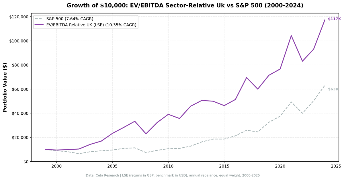
$10,000 invested in January 2000 grew to $102,800 by end of 2025 (total return 927.92%). The FTSE 100 price index grew at 0.86% CAGR over the same period.
| Metric | Strategy | FTSE 100 |
|---|---|---|
| CAGR | 9.77% | 0.86% (price return) |
| Excess return | +8.91% vs FTSE 100 price | — |
| True excess (est.) | ~+5-6% vs total-return FTSE | — |
| Total return | 927.92% | — |
| Sharpe ratio | 0.315 | — |
| Max drawdown | -31.12% | — |
| Down capture | 57.0% | 100% |
| Up capture | 224.4% | 100% |
| Win rate | 68% | — |
| Cash periods | 0 / 25 | — |
| Invested periods | 25 / 25 | — |
| Avg stocks held | 15.1 | — |
The Sharpe of 0.315 and max drawdown of -31.12% tell the story. This is a lower-volatility implementation than the US or India versions. The down-capture of 57% vs the FTSE 100 is the standout number: during down years for the UK market, this portfolio typically fell only about half as much. The +8.91% headline excess vs the FTSE 100 is against a price-only index, so the honest comparison is closer to +5-6% annually against total return. Still a meaningful edge over 25 years.

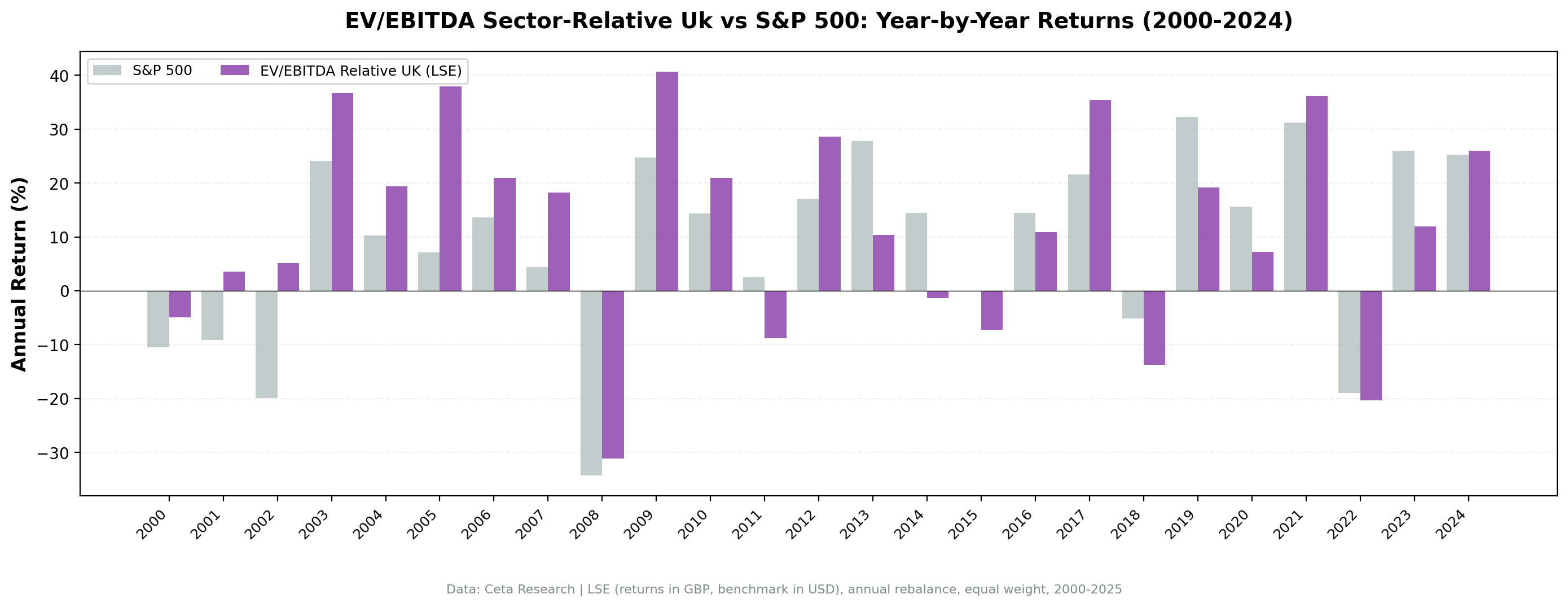
Annual Returns
| Year | Strategy | FTSE 100 | Excess |
|---|---|---|---|
| 2000 | -9.1% | -7.4% | -1.7% |
| 2001 | +5.8% | -15.5% | +21.3% |
| 2002 | -7.9% | -23.2% | +15.3% |
| 2003 | +36.3% | +12.5% | +23.8% |
| 2004 | +22.0% | +7.5% | +14.5% |
| 2005 | +37.9% | +17.2% | +20.7% |
| 2006 | +20.9% | +11.1% | +9.8% |
| 2007 | +18.2% | +1.7% | +16.5% |
| 2008 | -31.1% | -28.9% | -2.2% |
| 2009 | +40.7% | +20.6% | +20.1% |
| 2010 | +21.0% | +9.3% | +11.7% |
| 2011 | -8.8% | -5.2% | -3.6% |
| 2012 | +28.6% | +5.8% | +22.8% |
| 2013 | +10.4% | +11.5% | -1.1% |
| 2014 | -1.3% | -2.5% | +1.2% |
| 2015 | -7.3% | -6.9% | -0.4% |
| 2016 | +10.9% | +17.8% | -6.9% |
| 2017 | +35.4% | +6.6% | +28.8% |
| 2018 | -13.8% | -12.0% | -1.8% |
| 2019 | +19.1% | +12.9% | +6.2% |
| 2020 | +7.8% | -13.6% | +21.4% |
| 2021 | +36.2% | +14.2% | +22.0% |
| 2022 | -20.3% | +0.7% | -21.0% |
| 2023 | +12.0% | +2.2% | +9.8% |
| 2024 | +26.0% | +7.0% | +19.0% |
The Dot-Com Years: UK's Strongest Period
The UK put together strong relative numbers in the early 2000s. In 2001 and 2002, the strategy returned +5.8% and -7.9% while the FTSE 100 fell -15.5% and -23.2%. Cumulative excess over 2001-2002 was roughly +37 percentage points vs the FTSE 100.
The UK market's composition explains a large part of this. The LSE is heavily weighted toward value sectors: energy, mining, pharmaceuticals, and financial services. Tech exposure is limited. When the US growth bubble deflated, UK sector-relative value names were largely insulated. The screen was already tilted toward the sectors that held up or recovered fastest.
Then came 2005 (+37.9%, +20.7% excess vs FTSE 100) and the 2003-2007 run more broadly. UK equities benefited from the commodity supercycle, strong financial sector profits, and emerging market demand for UK-listed resources companies. The strategy captured the upside with extra force in those years.
The Brexit Uncertainty Period: 2013-2016
Performance was mixed in the years leading up to the Brexit vote. From 2013 to 2016, the strategy returned +10.4%, -1.3%, -7.3%, and +10.9%. Against the FTSE 100, the excess was modest: -1.1%, +1.2%, -0.4%, and -6.9%. The UK market itself was being repriced downward as uncertainty over trade relationships, regulatory access, and capital flows kept institutional investors cautious about LSE exposure.
This wasn't a signal failure. It was a macro overhang on the entire market. The strategy's value names were no more immune to UK-specific macro headwinds than any other UK equity. The sector-relative discount signal identifies relative mispricing within UK markets, not protection from UK-wide de-rating.
Crisis Comparison
| Event | Strategy | FTSE 100 | Excess |
|---|---|---|---|
| Dot-com bust (2001-2002) | -2.6% cumulative | -35.9% cumulative | +33.3% |
| GFC 2008 | -31.1% | -28.9% | -2.2% |
| Eurozone stress 2011 | -8.8% | -5.2% | -3.6% |
| COVID 2020 | +7.8% | -13.6% | +21.4% |
| Rate shock 2022 | -20.3% | +0.7% | -21.0% |
The 2008 comparison is a caution. The UK strategy fell -31.1% while the FTSE 100 fell -28.9%, meaning the strategy actually underperformed the local benchmark in that year. In systemic, liquidity-driven crashes, sector-relative discounts stop mattering. The protection in 2020 was significant: +7.8% vs -13.6% for the FTSE 100 is a 21.4 percentage point edge.
The 2022 rate shock year shows the other side. The strategy fell -20.3% while the FTSE 100 (helped by its energy and commodity weighting) returned +0.7%. That's a painful gap in a year where the strategy's approach to finding discounts didn't protect against the UK market's defensive positioning during rate rises.
2017 and the Recovery
After the Brexit vote in June 2016 and the ensuing sterling depreciation, UK equities staged a significant recovery. The portfolio gained +35.4% in 2017 (+28.8% excess vs FTSE 100). Companies with high international revenues benefited from the weak pound, and the sector-relative discount signal identified the specific names within those sectors trading at the steepest discounts.
2020 produced +7.8% while the FTSE 100 fell -13.6% (+21.4% excess), one of the strongest relative years in the backtest. 2021 added +36.2% (+22.0% excess) as the UK market recovered from COVID and the Brexit trade deal was finalized. The signal worked well in both recovery phases.
Limitations
Small portfolio size. Averaging 15.1 stocks means the UK portfolio is meaningfully more concentrated than the US (21.9) or India (26.0). Individual company blowups have higher impact. This is a structural feature of the £500M market cap filter applied to a smaller exchange.
Currency. UK returns are in GBP. The 2016 sterling depreciation distorted year-level comparisons versus any dollar benchmark. Comparing to the FTSE 100 (also in GBP) removes this noise.
Brexit-specific risk. The 2013-2016 underperformance shows this strategy isn't immune to market-wide political repricing. Any future UK-specific macro shock (trade policy changes, regulatory divergence) could repeat the pattern.
Sector concentration. The LSE at £500M+ has deep representation in energy, mining, and financial services, and thinner coverage in technology. The sector-relative signal will naturally tilt toward the heavier sectors, which may not always be what an investor wants.
Benchmark caveat. The +8.91% excess vs the FTSE 100 looks compelling. But the FTSE 100 is a price-only index. Against a total-return FTSE 100 that includes dividends, the honest excess is closer to +5-6% annually. Still meaningful over 25 years, but not +9%.
Conclusion
A sector-relative EV/EBITDA screen on UK stocks produced 9.77% annualized over 25 years against 0.86% for the FTSE 100 price index, with a max drawdown of -31.12% and consistent investment across all 25 years. The headline excess of +8.91% is vs a price-only benchmark. Against the total-return FTSE 100 (dividends included), the true advantage is closer to +5-6% annually.
The honest summary: the UK result is steady outperformance with lower drawdowns than the local market. It's not a high-octane strategy. The 2001-2003 period and the post-COVID recovery (2020-2021) are the strongest relative windows. The 2022 rate shock year was a clear weak spot, where the FTSE 100's energy and commodity tilt held up while the strategy fell -20.3%.
For investors seeking systematic value exposure on the LSE, the sector-relative EV/EBITDA filter provides a data-driven approach to identifying the mispriced names within each sector.
What's your experience with UK value strategies? Does the sector-relative framing work better or worse than absolute multiple filters on the LSE?
Data: Ceta Research (FMP financial data warehouse). Backtest covers 2000-2025 using point-in-time financial data with 45-day filing lag. Returns in GBP. Benchmark (SPY) in USD. Results are hypothetical and do not reflect actual investment results. Past performance does not guarantee future results.