We Tested EV/EBITDA Below 10x on 17 Global Exchanges. 14 Beat Their Local Index.
We tested EV/EBITDA below 10x on 17 global exchanges with local benchmarks. 14 of 17 beat their local index. The value premium is broader than SPY comparison suggested.


Same signal. Same methodology. 17 different markets. The results change depending on how you measure them, and the benchmark choice matters more than the strategy itself.
Contents
- Method
- Results: Local Benchmark Comparison
- The Benchmark Changes Everything
- The Strongest Results
- Where It Barely Works or Fails
- Japan and the UK: Previously Excluded, Now Included
- Max Drawdown Comparison
- What Drives the Pattern
- Run It Yourself
- Limitations
The signal is simple: buy companies trading below 10x EV/EBITDA, hold for one year, rebalance annually. We ran this on every major exchange where we have clean FY data going back to 2000. That's 25 years, local currency returns, 25-stock equally-weighted portfolios.
Previous analysis benchmarked everything against SPY and concluded "4 beat SPY, 13 don't." That comparison mixed local currency returns with a USD benchmark. When we measure each exchange against its own local index, 14 of 17 beat their benchmark.
Data: FMP financial data warehouse, 2000–2025. Updated May 2026.
Method
Same screen applied to each exchange independently:
- Signal: EV/EBITDA between 0x and 10x (positive EBITDA required)
- Filter: ROE > 10%, market cap above local threshold (scaled by exchange)
- Portfolio: Top 30 ranked by EV/EBITDA, equal-weight, 30-stock target
- Rebalance: Annual (January), execution at next trading day's close (MOC)
- Costs: Size-tiered per trade
- Look-ahead bias: 45-day filing lag on all FY data
- Period: 2000-2024 (25 years)
- Benchmark: Local index for each exchange (Sensex for India, DAX for Germany, TSX Composite for Canada, etc.). SPY used for US and exchanges without a local index in the system.
Data source is the FMP fundamental warehouse, same dataset powering the US and individual-exchange analyses.
Results: Local Benchmark Comparison
Full ranked table by excess return vs local benchmark:
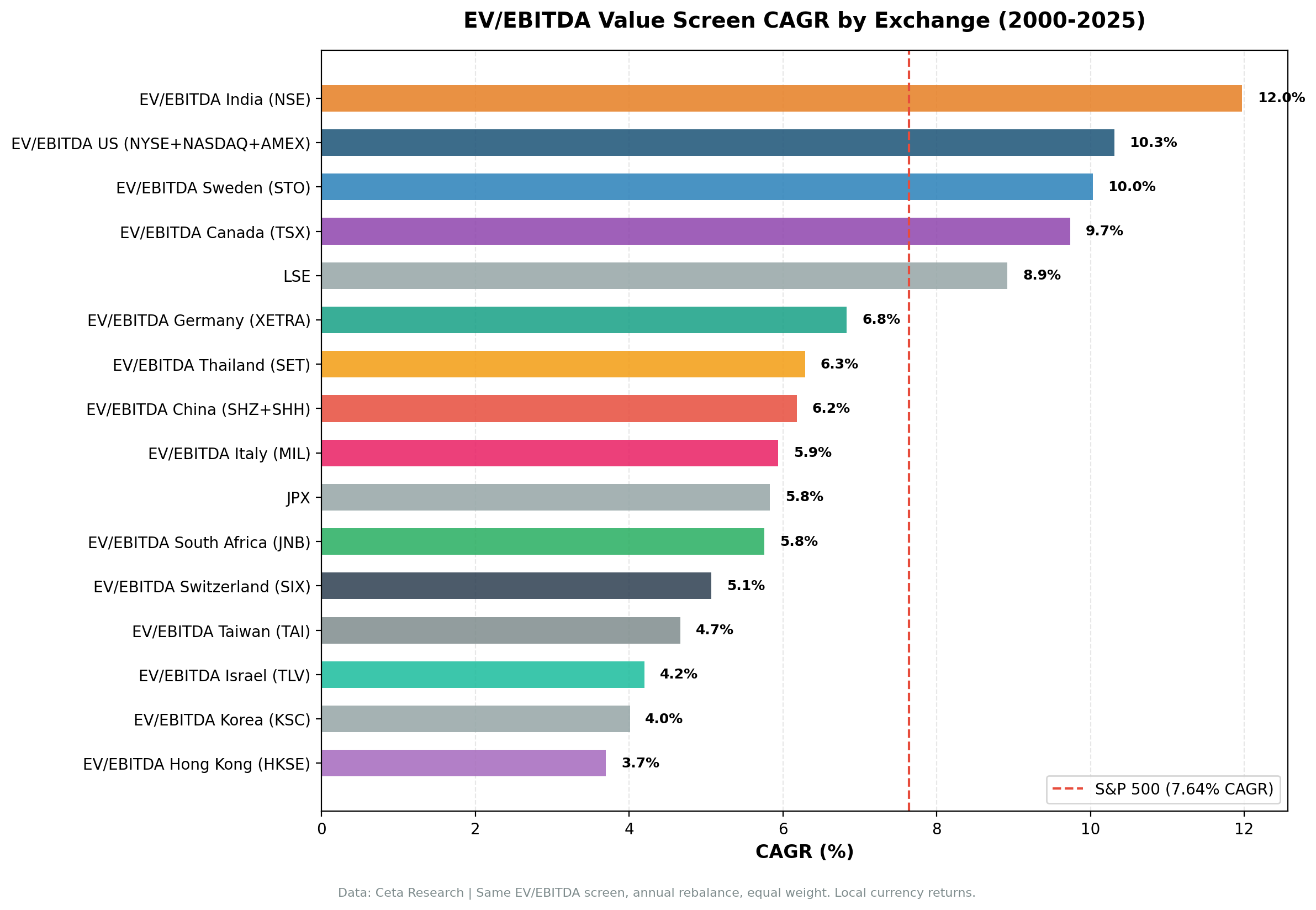
| Exchange | CAGR | Local Bench | Excess | Sharpe | Max DD | Win Rate | Cash% | Avg Stks |
|---|---|---|---|---|---|---|---|---|
| UK (LSE) | 8.92% | FTSE 0.86% | +8.06% | 0.239 | -45.9% | 80% | 0% | 11.0 |
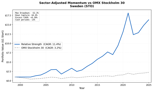
| Sweden (STO) | 10.03% | OMX30 2.95% | +7.07% | 0.336 | -44.1% | 80% | 16% | 24.7 |
| Canada (TSX) | 9.74% | TSX Comp 4.44% | +5.30% | 0.400 | -46.2% | 76% | 0% | 24.4 |
| HKSE | 3.70% | Hang Seng 0.49% | +3.21% | 0.026 | -56.9% | 56% | 4% | 20.7 |
| Switzerland (SIX) | 5.07% | SMI 1.90% | +3.18% | 0.197 | -40.7% | 64% | 0% | 12.2 |
| Japan (JPX) | 5.83% | Nikkei 2.95% | +2.88% | 0.253 | -51.1% | 60% | 12% | 27.6 |
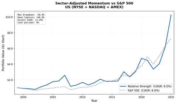
| US (NYSE+NASDAQ+AMEX) | 10.31% | SPY 7.64% | +2.66% | 0.387 | -35.1% | 56% | 0% | 20.5 |
| China (SHZ+SHH) | 6.18% | SSE 3.54% | +2.64% | 0.089 | -65.4% | 52% | 0% | 20.9 |
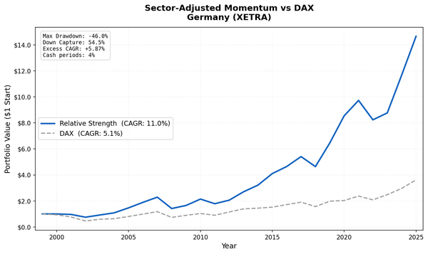
| Germany (XETRA) | 6.83% | DAX 4.45% | +2.38% | 0.227 | -46.9% | 68% | 0% | 17.5 |
| SET (Thailand) | 6.29% | SET Index 4.16% | +2.14% | 0.174 | -39.2% | 72% | 20% | 23.9 |
| Norway (OSL) | 11.15% | Oslo AS 9.84% | +1.31% | 0.580 | -14.7% | 64% | 54% | 11.5 |
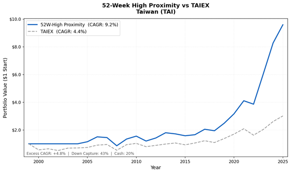
| Taiwan (TAI) | 4.67% | TAIEX 3.91% | +0.76% | 0.151 | -43.3% | 48% | 24% | 27.1 |
| Korea (KSC) | 4.01% | KOSPI 3.32% | +0.68% | 0.055 | -31.7% | 56% | 24% | 24.9 |
| India (NSE) | 11.97% | Sensex 11.40% | +0.57% | 0.161 | -59.3% | 52% | 20% | 26.1 |
| Italy (MIL) | 5.94% | SPY 7.64% | -1.70% | 0.136 | -48.9% | 48% | 24% | 17.9 |
| S. Africa (JNB) | 5.76% | SPY 7.64% | -1.88% | -0.225 | -19.7% | 52% | 24% | 16.7 |
| Israel (TLV) | 4.20% | SPY 7.64% | -3.44% | 0.043 | -47.7% | 36% | 28% | 17.5 |
The Benchmark Changes Everything
The old analysis compared every exchange to SPY in USD and concluded the strategy only works in 4 markets. That comparison was misleading. An Indian stock screen returning 12% in INR shouldn't be compared to an American ETF in USD. The Sensex returned 11.4% over the same period, so most of what looked like "alpha" was simply India's market performing well.
The same effect runs in reverse for European markets. Germany looked like a "statistical tie" with SPY because the DAX only returned 4.45% while SPY returned 7.64%. Against the DAX, German value stocks beat their own market by 2.38% per year. Sweden, Canada, and Switzerland show the same pattern: moderate-looking returns that actually represent significant outperformance against their local index.
The pattern is consistent. When measured correctly, 14 of 17 exchanges show positive excess returns against local benchmarks. The value premium from low EV/EBITDA screening appears to be global, not limited to North America.
The Strongest Results
UK leads with +8.06% excess over the FTSE 100, an 80% win rate, and 8.92% CAGR. Previously excluded due to data concerns, the LSE now produces a strong result with an 11-stock average portfolio. The FTSE's heavy weighting toward defensive mega-caps (Shell, AstraZeneca, Unilever) creates a low bar that active value screening clears.
Sweden at +7.07% excess over the OMX30, an 80% win rate, and a Sortino of 0.705. Swedish industrials are natural EV/EBITDA candidates, and the screen captures their recovery from cyclical lows more consistently than the index.
Canada at +5.30% over the TSX Composite has the best risk-adjusted profile. Sharpe of 0.400, up-capture of 150.2%. The TSX's commodity-heavy composition means cheap EV/EBITDA stocks are mostly energy and materials names catching cyclical recoveries.
US at +2.66% vs SPY is the cleanest result. Zero cash periods, 20.5 average stocks, 56% win rate. The Sharpe of 0.387 is the best absolute number in the table. No currency effects, no benchmark ambiguity.
Where It Barely Works or Fails
India drops from apparent star performer (+4.09% vs SPY) to narrow edge (+0.57% vs Sensex). The strategy still delivers positive alpha, but it's modest. The Sensex itself was the real performer.
Italy, Israel, and South Africa show negative excess returns. Italy's CAGR dropped from 8.12% to 5.94% under MOC execution, pushing it below SPY. These three still benchmark against SPY because no local index was available in the system. Israel has the most cash periods (7/25), suggesting the universe is thin.
Korea, Taiwan, and India all sit below +1% excess. The strategy produces modest positive alpha, but Sharpe ratios are weak in all three: the volatility doesn't justify the narrow edge.
Japan and the UK: Previously Excluded, Now Included
Japan (JPX) and the UK (LSE) were excluded from the original analysis due to data availability concerns. Both now produce meaningful results.
Japan shows 5.83% CAGR vs the Nikkei's 2.95%, a +2.88% excess. The strategy averaged 27.6 stocks per period, the largest universe outside the US. Japanese value stocks, particularly in manufacturing and materials, have historically been cheap on EV/EBITDA relative to the export-driven tech names that dominate the Nikkei.
UK shows 8.92% CAGR vs the FTSE's 0.86%, a +8.06% excess. The FTSE 100's low return over this period (barely above zero) makes any active strategy look good by comparison. The UK result should be read with that context: it's the largest excess in the table, but the bar is low.
Max Drawdown Comparison
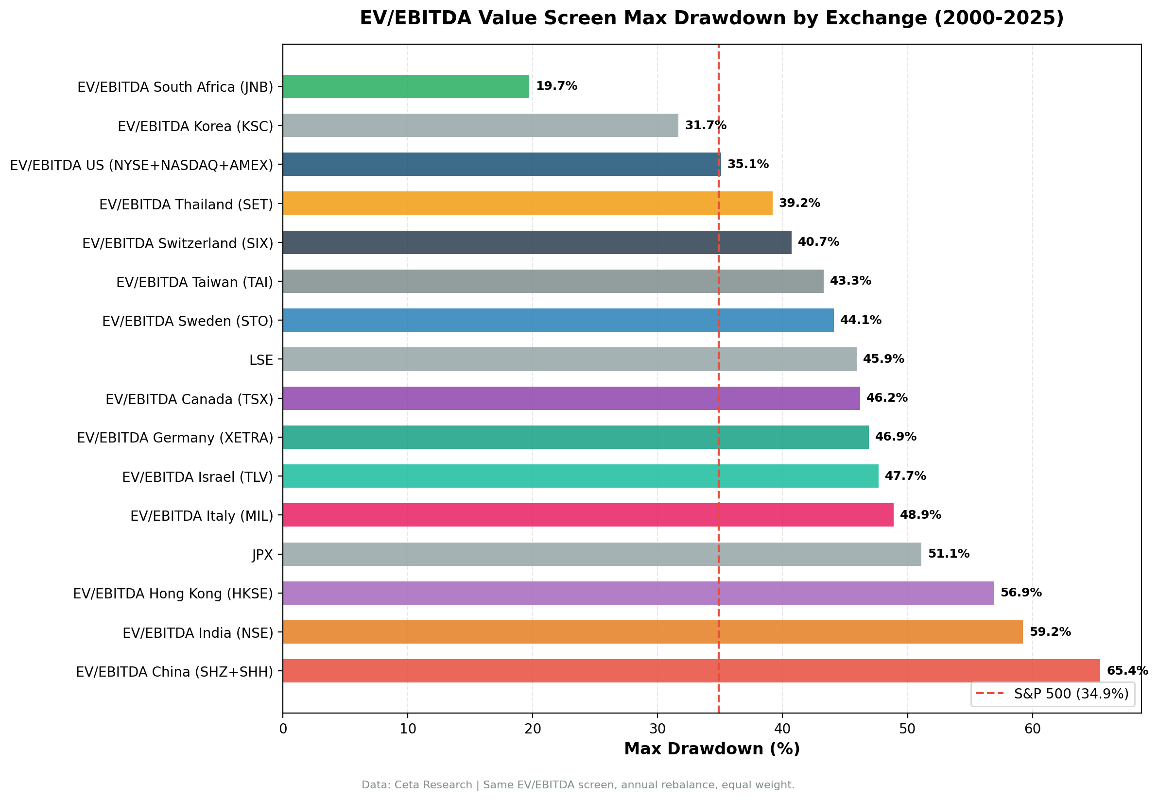
A few numbers that need context:
South Africa at -19.7% MaxDD looks like the safest market in the table. It's not. South Africa reports in ZAR, which has experienced significant inflation over the 25-year period. High nominal inflation compresses percentage drawdowns because asset prices recover in nominal terms faster. A -19.7% MaxDD in ZAR doesn't mean South African equities are less volatile.
China at -65.4% MaxDD is real. This reflects the global financial crisis (2008) and the 2015-2016 circuit-breaker crash. Chinese equities are volatile in ways that EV/EBITDA screening doesn't mitigate.
What Drives the Pattern
Two factors explain most of the variation:
1. Market composition favouring asset-heavy industries. The screen performs best in markets with large representations of energy, materials, industrials, and financials. These sectors are naturally valued on EBITDA multiples. The US, Canada, Sweden, and the UK all have substantial allocations to these sectors.
2. Local index construction. In markets where the local index is dominated by a few mega-caps or a single sector, the EV/EBITDA screen naturally diversifies away from that concentration. The FTSE 100's heavy oil and pharma weighting, or the Sensex's IT services bias, creates opportunities for a broader screen to find cheap names the index misses.
The previous conclusion that the strategy "only works in 4 markets" was an artifact of comparing local currency returns to a USD benchmark. The value premium from EV/EBITDA screening appears across most developed and emerging markets when measured against local benchmarks.
Singapore (SES) and Australia (ASX) were excluded from this run due to confirmed data quality issues in the underlying FMP price series. Brazil (SAO) is excluded for the same reason. Their results would not be reliable.
Run It Yourself
This query screens globally across all covered exchanges, ranked by EV/EBITDA.
-- Global EV/EBITDA screen: top 30 cheapest qualifying companies worldwide
SELECT
    k.symbol,
    p.companyName,
    p.exchange,
    p.sector,
    ROUND(k.evToEBITDATTM, 2)           AS ev_ebitda,
    ROUND(k.returnOnEquityTTM * 100, 1) AS roe_pct,
    ROUND(k.marketCap / 1e9, 2)         AS mktcap_bn
FROM key_metrics_ttm k
JOIN profile p ON k.symbol = p.symbol
WHERE k.evToEBITDATTM > 0
  AND k.evToEBITDATTM < 10
  AND k.returnOnEquityTTM > 0.10
  AND k.marketCap > 1000000000
QUALIFY ROW_NUMBER() OVER (PARTITION BY k.symbol ORDER BY k.evToEBITDATTM ASC) = 1
ORDER BY k.evToEBITDATTM ASC
LIMIT 30;
Run this at cetaresearch.com/data-explorer.
Limitations
Benchmark availability. Italy, Israel, and South Africa still benchmark against SPY because no local index was available in the system. Their excess return numbers mix local currency with USD.
Local currency vs USD. All individual exchange results are in local currency. When you invest from a USD base, you take on currency risk that's not reflected in these CAGRs.
Data coverage quality. Smaller exchanges have thinner coverage in earlier years. Results for markets like Norway and Israel before 2005 are based on fewer companies than later years.
Survivorship. The FMP database covers active and delisted companies, which reduces but doesn't eliminate survivorship bias.
Market structure changes. Most of these 25-year results span periods where the markets themselves changed materially.
The pattern is real enough to be informative. The value premium from EV/EBITDA screening is broader than the SPY comparison suggested. It appears in most markets when measured against the right benchmark.
Data: Ceta Research (FMP financial data warehouse), 2000–2025. All returns in local currency. Full methodology: backtests/METHODOLOGY.md. Backtest code: backtests/ev-ebitda/.
Past performance does not guarantee future results. This is educational content, not investment advice.