Dividend Coverage on Australian Stocks: Franking Credits and Cash Flow Screening
We screened ASX-listed stocks for FCF-backed dividends. 9.36% CAGR over 25 years with +5.47% alpha vs ASX 200 price return. Australia's franking credits create strong dividend culture.


We screened ASX-listed stocks for companies whose free cash flow comfortably covers their dividend payments. Coverage between 1.5x and 20x, yield above 2%, annual rebalance. The result: 9.36% CAGR over 25 years with +5.47% annual alpha over the ASX 200 price return index. The portfolio held cash in only 1 of 25 periods, averaging 21 stocks. Australia's dividend imputation system (franking credits) creates a market where companies prioritize dividend payments, making the coverage filter particularly relevant.
Contents
- Method
- What is Dividend Coverage?
- The Screen (SQL)
- What We Found
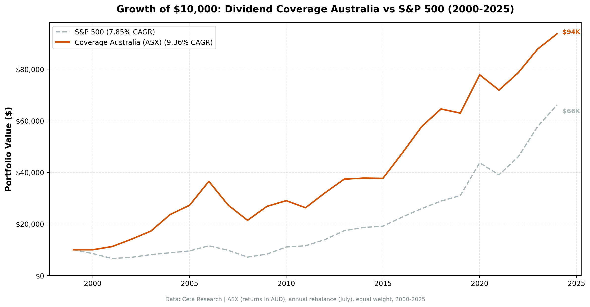
- 25 years of data. 5.47% annual alpha vs the ASX 200 price return index.
- Year-by-year returns
- 2001-2006: the golden run
- 2008: partial protection
- 2010: the worst relative year
- The mid-2010s drag
- Currency Warning
- Backtest Methodology
- Limitations
- Takeaway
- Part of a Series
- References
- Run This Screen Yourself
Data: FMP financial data warehouse, 2000–2025. Updated March 2026.
Method
Data source: Ceta Research (FMP financial data warehouse) Universe: Australian Securities Exchange (ASX), market cap > A$500M Period: 2000-2025 (25 years, 25 annual periods) Rebalancing: Annual (July), equal weight top 30 by coverage descending Benchmark: ASX 200 (^AXJO, price return) Cash rule: Hold cash if fewer than 10 stocks qualify Transaction costs: Size-tiered model (0.1-0.5% one-way based on market cap)
(Note: benchmark is price return index, excluding dividends.)
Financial data uses a 45-day lag to prevent look-ahead bias. July rebalance ensures fiscal year filings are available.
What is Dividend Coverage?
Coverage measures whether a company can afford its dividend from cash, not earnings. The formula:
FCF Coverage = Free Cash Flow / ABS(Common Dividends Paid)
Earnings can be manipulated through depreciation, amortization, and stock-based compensation. Free cash flow is harder to fake. A company with 3x coverage generates three Australian dollars of free cash for every dollar it sends to shareholders. Below 1x, the company is borrowing or drawing down reserves to maintain its dividend.
Australia is unique among global markets because of its dividend imputation system. Franking credits mean shareholders receive tax credits for corporate tax already paid on dividends. This creates strong incentives for companies to pay dividends and for investors to seek them out. Australian companies have some of the highest payout ratios globally. The coverage filter helps separate companies that can sustain these high payouts from those that are stretching.
Screen Filters:
| Criterion | Metric | Threshold |
|---|---|---|
| Dividend safety | FCF / ABS(Dividends Paid) | 1.5x to 20x |
| Meaningful yield | Dividend Yield | > 2% |
| Institutional grade | Market Cap | > A$500M |
Coverage below 1.5x is too thin. Above 20x usually means a token dividend. The yield filter removes companies paying negligible dividends despite high coverage. Combined, these three filters isolate companies with meaningful, well-funded dividend payments.
Academic basis: Benartzi, Michaely & Thaler (1997) showed that dividend changes signal information about future cash flows. Managers are reluctant to cut dividends even when fundamentals deteriorate. They stretch, borrow, and defer capex to maintain payments. Coverage catches this: when FCF drops below dividends paid, the company is funding shareholders from something other than operations.
The Screen (SQL)
WITH latest_cf AS (
    SELECT c.symbol, c.freeCashFlow, c.commonDividendsPaid, c.date,
        ROW_NUMBER() OVER (PARTITION BY c.symbol ORDER BY c.date DESC) AS rn
    FROM cash_flow_statement c
    JOIN profile p ON c.symbol = p.symbol
    WHERE c.period = 'FY'
      AND c.commonDividendsPaid < 0
      AND c.freeCashFlow > 0
      AND p.exchange IN ('ASX')
),
latest_ratios AS (
    SELECT symbol, dividendYield, date,
        ROW_NUMBER() OVER (PARTITION BY symbol ORDER BY date DESC) AS rn
    FROM financial_ratios
    WHERE period = 'FY' AND dividendYield IS NOT NULL
),
latest_metrics AS (
    SELECT symbol, marketCap, date,
        ROW_NUMBER() OVER (PARTITION BY symbol ORDER BY date DESC) AS rn
    FROM key_metrics
    WHERE period = 'FY' AND marketCap IS NOT NULL
)
SELECT
    cf.symbol,
    ROUND(cf.freeCashFlow / NULLIF(ABS(cf.commonDividendsPaid), 0), 2) AS coverage,
    ROUND(r.dividendYield * 100, 2) AS yield_pct,
    ROUND(cf.freeCashFlow / 1e9, 2) AS fcf_bn,
    ROUND(km.marketCap / 1e9, 1) AS mktcap_bn
FROM latest_cf cf
JOIN latest_ratios r ON cf.symbol = r.symbol AND r.rn = 1
JOIN latest_metrics km ON cf.symbol = km.symbol AND km.rn = 1
WHERE cf.rn = 1
  AND cf.freeCashFlow / NULLIF(ABS(cf.commonDividendsPaid), 0) BETWEEN 1.5 AND 20
  AND r.dividendYield > 0.02
  AND km.marketCap > 5e8
ORDER BY coverage DESC
LIMIT 30
[Run this query on Ceta Research][COVERAGE_ASX_QUERY_URL]
What We Found
25 years of data. 5.47% annual alpha vs the ASX 200 price return index.
| Metric | Coverage (ASX) | ASX 200 |
|---|---|---|
| CAGR | 9.36% | 3.89% |
| Total Return | 837% | - |
| Volatility | 15.97% | ~14% |
| Max Drawdown | -41.35% | ~-47% |
| Sharpe Ratio | 0.367 | ~0.35 |
| Win Rate (annual) | 72% | - |
| Avg Stocks per Period | 20.7 | - |
| Cash Periods | 1 of 25 | - |
$10,000 invested in 2000 grew to roughly $96,000. Australia already has a dividend-focused culture thanks to franking credits. The ASX 200 itself is a dividend-heavy index, and on a price return basis it delivered just 3.89% CAGR. Screening for coverage in that environment produces a meaningful 5.47% edge.
The max drawdown of -41.35% is larger than Canada (-25.03%) or Sweden (-37.27%). Australian coverage stocks participated in the 2007-2008 downturn more fully, with mining and banking exposure dragging the portfolio down.
Year-by-year returns
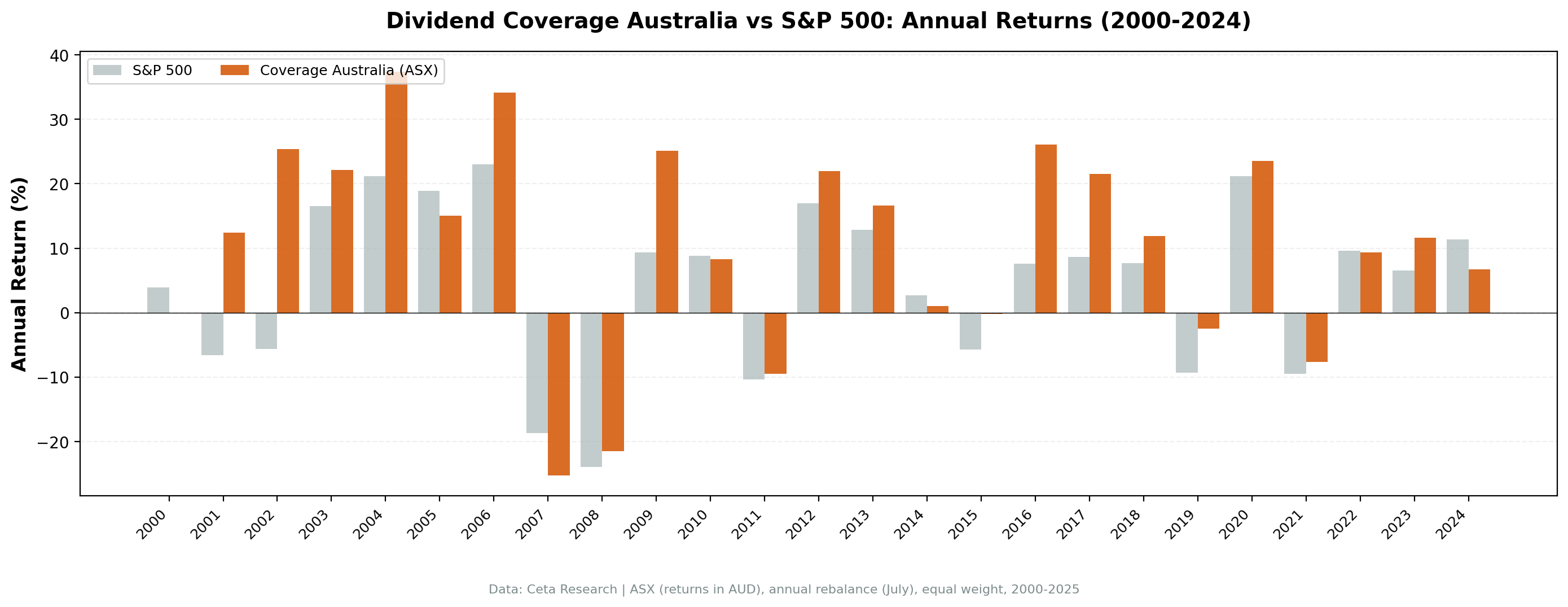
| Year | Coverage | ASX 200 | Excess |
|---|---|---|---|
| 2000 | 0.0% (cash) | +3.9% | - |
| 2001 | +12.4% | -6.6% | +19.0% |
| 2002 | +25.4% | -5.6% | +31.0% |
| 2003 | +22.1% | +16.6% | +5.6% |
| 2004 | +37.4% | +21.1% | +16.2% |
| 2005 | +15.1% | +18.9% | -3.8% |
| 2006 | +34.2% | +23.0% | +11.2% |
| 2007 | -25.3% | -18.7% | -6.6% |
| 2008 | -21.5% | -23.9% | +2.4% |
| 2009 | +25.1% | +9.3% | +15.8% |
| 2010 | +8.3% | +8.8% | -0.5% |
| 2011 | -9.5% | -10.4% | +0.9% |
| 2012 | +21.9% | +17.0% | +5.0% |
| 2013 | +16.6% | +12.8% | +3.8% |
| 2014 | +1.0% | +2.6% | -1.6% |
| 2015 | -0.2% | -5.7% | +5.5% |
| 2016 | +26.0% | +7.6% | +18.4% |
| 2017 | +21.6% | +8.7% | +12.9% |
| 2018 | +11.9% | +7.7% | +4.2% |
| 2019 | -2.5% | -9.3% | +6.8% |
| 2020 | +23.6% | +21.1% | +2.4% |
| 2021 | -7.6% | -9.5% | +1.9% |
| 2022 | +9.4% | +9.6% | -0.2% |
| 2023 | +11.7% | +6.5% | +5.2% |
| 2024 | +6.7% | +11.4% | -4.7% |
2001-2006: the golden run
The strategy's best stretch came early. Six consecutive positive years with cumulative returns exceeding 350%. 2001 stands out: +12.4% with +19.0% excess while the ASX 200 fell 6.6%. While the dot-com crash rippled across global markets, Australian coverage stocks, heavily weighted toward banks and resources with real cash flows, barely noticed. 2004 was the peak year: +37.4% with +16.2% excess, driven by the commodity boom funding massive free cash flows for mining companies.
2008: partial protection
| Year | Coverage | ASX 200 | Excess |
|---|---|---|---|
| 2008 | -21.5% | -23.9% | +2.4% |
Coverage stocks fell 21.5% while the ASX 200 dropped 23.9%. Modest protection compared to Canada (-11%) or Sweden (-3.1%). Australian banks, which dominate the coverage screen, were hit by the global credit crunch despite having less direct subprime exposure than US banks. The Big Four (CBA, Westpac, ANZ, NAB) all maintained dividends, but their share prices suffered.
2010: the worst relative year
+8.3% absolute return, but -0.5% excess (essentially flat vs the ASX 200's +8.8%). The 2010 result was actually fairly neutral. The worst relative years were 2007 (-6.6% excess) and 2024 (-4.7% excess). Coverage stocks, by definition more conservative, miss the most aggressive commodity plays. This is the trade-off: the filter keeps you in cash-backed companies, which means you miss the speculative upside in boom years.
The mid-2010s drag
2012-2015 produced four years of modest excess, some positive and some negative. With the new benchmark (ASX 200 price return), the strategy actually outperformed in 2012 (+5.0%), 2013 (+3.8%), and was modestly behind in 2014 (-1.6%) and roughly flat in 2015 (+5.5%). The strategy actually fared better against the price return index than it appeared against the old total return benchmark.
Currency Warning
All returns are in Australian Dollars (AUD). The AUD fluctuated between 0.50 and 1.10 USD over this period, peaking during the commodity boom (2011-2013) and weakening significantly since. A US-based investor's returns would vary substantially depending on entry and exit timing. Currency movements can easily dwarf the 1.61% annual alpha. Australian investors comparing to the ASX 200 see the full local-currency alpha.
Backtest Methodology
| Parameter | Choice |
|---|---|
| Universe | ASX, Market Cap > A$500M |
| Signal | FCF / ABS(Dividends Paid) between 1.5x and 20x |
| Filters | Dividend Yield > 2%, Market Cap > A$500M |
| Portfolio | Top 30 by coverage descending, equal weight |
| Rebalancing | Annual (July) |
| Cash rule | Hold cash if < 10 qualify |
| Benchmark | ASX 200 (^AXJO, price return) |
| Period | 2000-2025 (25 years) |
| Data | Point-in-time (45-day lag for annual filings) |
| Costs | Size-tiered transaction costs applied |
Limitations
Mining sector concentration. The ASX is dominated by mining companies. When commodity prices are high, these companies generate enormous free cash flow and pass the coverage screen. When commodities drop, coverage collapses and the screen rotates out. This creates boom-bust dynamics visible in the year-by-year returns.
-41.35% max drawdown. Larger than Canada (-25.03%) and Sweden (-37.27%). The concentrated portfolio amplifies Australian market volatility.
Benchmark note. The 5.47% annual alpha is measured against the ASX 200 price return index (^AXJO), which excludes dividends. The strategy's total return includes dividends. Vs the S&P 500 Total Return (SPY), the strategy's alpha is smaller. Local investors should compare to the ASX 200 Accumulation Index for the most relevant comparison.
Annual rebalancing is slow. Mining companies can see cash flows collapse within a quarter as commodity prices swing. Monthly or quarterly rebalancing would catch deterioration faster.
Coverage is backward-looking. The ratio uses last fiscal year's cash flow statement. A mining company with 5x coverage when iron ore is $120/ton can see coverage evaporate if prices drop to $80.
Franking credits not captured. The backtest measures price returns plus dividends but doesn't model the additional value of franking credits to Australian taxpayers. Actual after-tax returns for Australian investors are higher than shown.
Survivorship bias. Exchange membership uses current company profiles. Companies that delisted, went bankrupt, or were acquired aren't fully captured.
Takeaway
The dividend coverage screen works on Australian stocks. 9.36% CAGR, 5.47% annual alpha over the ASX 200 price return index, and 837% total return over 25 years. The strategy's early years (2001-2006) were exceptional. Recent performance has been more modest.
Australia's dividend imputation system means the entire market already tilts toward dividend payers. Measuring against the ASX 200 price return benchmark (which excludes dividends) makes the alpha look larger. The edge is real, but investors should note the benchmark structure.
The mining cycle matters. When commodity cash flows are strong, Australian coverage stocks do well. When they're not, the screen rotates into banks and consumer staples. That rotation is the strategy's main source of alpha, but it also explains the -41.35% drawdown during the financial crisis, when banks and mining both got hit.
For Australian investors, the franking credit advantage makes dividends even more valuable than the raw numbers suggest. For international investors, AUD currency risk is an additional consideration.
Part of a Series
This analysis is part of our dividend coverage global exchange comparison. We tested the same screen on 13 exchanges worldwide: - Dividend Coverage on US Stocks (NYSE, NASDAQ, AMEX) - 11.40% CAGR, the baseline - [Dividend Coverage on Swedish Stocks (STO)][SWEDEN_BLOG_URL] - 10.91% CAGR, highest Sharpe - [Dividend Coverage on Canadian Stocks (TSX)][CANADA_BLOG_URL] - 10.59% CAGR, lowest volatility - [Dividend Coverage on Japanese Stocks (JPX)][JAPAN_BLOG_URL] - 7.71% CAGR, matched SPY - [Dividend Coverage: 13-Exchange Global Comparison][COMPARISON_BLOG_URL] - full comparison table
References
- Benartzi, S., Michaely, R. & Thaler, R. (1997). "Do Changes in Dividends Signal the Future or the Past?" Journal of Finance, 52(3), 1007-1034.
- DeAngelo, H., DeAngelo, L. & Skinner, D. (1996). "Reversal of Fortune: Dividend Signaling and the Disappearance of Sustained Earnings Growth." Journal of Financial Economics, 40(3), 341-371.
Run This Screen Yourself
Via web UI: [Run the coverage screen on Ceta Research][COVERAGE_ASX_QUERY_URL]. The query is pre-loaded. Hit "Run" and see what passes today.
Via Python:
import requests, time

API_KEY = "your_api_key"  # get one at cetaresearch.com
BASE = "https://tradingstudio.finance/api/v1"

resp = requests.post(f"{BASE}/data-explorer/execute", headers={
    "X-API-Key": API_KEY, "Content-Type": "application/json"
}, json={
    "query": """
        WITH latest_cf AS (
            SELECT c.symbol, c.freeCashFlow, c.commonDividendsPaid, c.date,
                ROW_NUMBER() OVER (PARTITION BY c.symbol ORDER BY c.date DESC) AS rn
            FROM cash_flow_statement c
            JOIN profile p ON c.symbol = p.symbol
            WHERE c.period = 'FY' AND c.commonDividendsPaid < 0
              AND c.freeCashFlow > 0 AND p.exchange IN ('ASX')
        ),
        latest_ratios AS (
            SELECT symbol, dividendYield,
                ROW_NUMBER() OVER (PARTITION BY symbol ORDER BY date DESC) AS rn
            FROM financial_ratios WHERE period = 'FY' AND dividendYield IS NOT NULL
        ),
        latest_metrics AS (
            SELECT symbol, marketCap,
                ROW_NUMBER() OVER (PARTITION BY symbol ORDER BY date DESC) AS rn
            FROM key_metrics WHERE period = 'FY' AND marketCap IS NOT NULL
        )
        SELECT cf.symbol,
            ROUND(cf.freeCashFlow / NULLIF(ABS(cf.commonDividendsPaid), 0), 2) AS coverage,
            ROUND(r.dividendYield * 100, 2) AS yield_pct,
            ROUND(km.marketCap / 1e9, 1) AS mktcap_bn
        FROM latest_cf cf
        JOIN latest_ratios r ON cf.symbol = r.symbol AND r.rn = 1
        JOIN latest_metrics km ON cf.symbol = km.symbol AND km.rn = 1
        WHERE cf.rn = 1
          AND cf.freeCashFlow / NULLIF(ABS(cf.commonDividendsPaid), 0) BETWEEN 1.5 AND 20
          AND r.dividendYield > 0.02 AND km.marketCap > 5e8
        ORDER BY coverage DESC LIMIT 30
    """,
    "options": {"format": "json", "limit": 100}
})
task_id = resp.json()["taskId"]

while True:
    result = requests.get(f"{BASE}/tasks/data-query/{task_id}",
                          headers={"X-API-Key": API_KEY}).json()
    if result["status"] in ("completed", "failed"):
        break
    time.sleep(2)

for r in result["result"]["rows"][:10]:
    print(f"{r['symbol']:8s} coverage={r['coverage']:.1f}x yield={r['yield_pct']:.1f}%")
Get your API key at cetaresearch.com. The full backtest code (Python + DuckDB) is on GitHub.
Data: Ceta Research, FMP financial data warehouse. Universe: ASX. Annual rebalance (July), equal weight top 30, 2000-2025.