Japan's 52-Week High Proximity: Steady Alpha in a Flat Market
We tested the 52-week high proximity strategy on Japanese stocks (JPX) from 2000 to 2025. 8.43% CAGR, +5.03% vs Nikkei 225, 41.3% down capture. In a market that went sideways for a decade, the signal found the winners and avoided the worst drawdowns.


We ran the 52-week high proximity strategy on Japanese stocks (JPX) from 2000 to 2025. The result: 8.43% annualized, +5.03% above the Nikkei 225, Sharpe of 0.509. A ¥1 investment grew to ¥8.04. The Nikkei 225 grew to ¥2.36 over the same period.
Contents
- Method
- What is the 52-Week High Proximity Strategy?
- What We Found
- 8.43% CAGR. +5.03% vs Nikkei. 41.3% down capture.
- Year-by-Year Returns
- The "lost decade" context (2000–2012)
- 2008: the crisis year shows clear protection
- 2013: Abenomics and the biggest year at +60.1%
- 2022 protection: -8.0% vs Nikkei -12.2%
- 2025: +21.8%, outperforming as the yen repatriates
- Why Japan Is the Risk-Adjusted Story
- Limitations
- Run This Screen Yourself
- Part of a Series
- References
The Japan result shows meaningful alpha when benchmarked properly against the Nikkei. India and Korea deliver the largest excess returns in this strategy's global comparison (+7.8% and +7.3% vs local benchmarks). Thailand offers +6.7%. Japan's +5.03% is substantial for a price signal in a structurally weak market. The protection metrics are strong: Sharpe of 0.509, 41.3% down capture, -22.5% in the 2008 crash versus Nikkei's -38.5% (+16.0% excess), and -8.0% in 2022 when the Nikkei fell 12.2%.
Japan is the risk-adjusted story. In a market that went sideways for a decade, the proximity signal found the winners within the malaise and avoided most of the worst drawdowns in the process.
Data: FMP financial data warehouse, 2000-2025. Updated June 2026.
Method
Data source: Ceta Research (FMP financial data warehouse) Universe: JPX (Japan Exchange Group), market cap > ¥100B Period: 2000–2025 (25 years, 103 quarterly periods) Rebalancing: Quarterly (January, April, July, October), equal weight Execution: Next-day close (MOC) Benchmark: Nikkei 225 (JPY, local currency comparison) Returns: Calculated in JPY; benchmark in JPY Cash rule: Hold cash if fewer than 10 stocks qualify
The signal is the proximity ratio: current price divided by the 52-week high (rolling 252 trading days). Stocks are ranked by proximity ratio and the top 30 are held each quarter. Japan has only 2% cash periods. The JPX universe is large enough and liquid enough that 30 qualifying stocks are almost always available.
Note on benchmarking: Returns are in JPY, same currency as the portfolio. Comparing to the Nikkei 225 enables an honest same-currency benchmark. Cross-currency comparison to SPY would include currency effects.
What is the 52-Week High Proximity Strategy?
George and Hwang (2004) showed that stocks trading near their 52-week high outperform stocks far from it. The Journal of Finance paper established the pattern across US stocks, but the mechanism (anchoring bias) should be universal. Investors anchor to the 52-week high as a mental ceiling and sell preemptively near that level. This creates a temporary discount. When fundamentals push the stock through the anchor, the discount corrects.
Proximity ratio = adjClose / MAX(high over 252 trading days)
We select the top 30 stocks by this ratio, closest to their annual peak, and hold them equal weight for one quarter.
What We Found
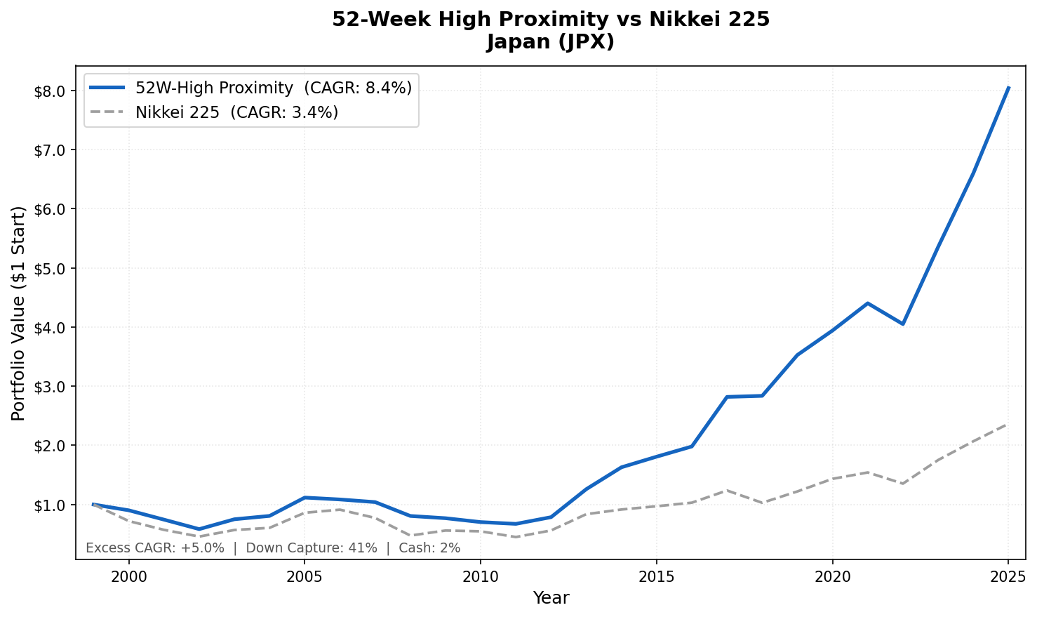
8.43% CAGR. +5.03% vs Nikkei. 41.3% down capture.
| Metric | 52-Week High Japan | Nikkei 225 |
|---|---|---|
| CAGR | 8.43% | 3.40% |
| Excess Return | +5.03% | - |
| Total Return | ¥8.04 per ¥1 | ¥2.36 per ¥1 |
| Max Drawdown | -42.75% | -61.06% |
| Sharpe Ratio | 0.509 | 0.157 |
| Sortino Ratio | 0.925 | - |
| Calmar Ratio | 0.197 | - |
| Up Capture | 77.85% | - |
| Down Capture | 41.31% | - |
| Cash Periods | 2% of quarters | - |
| Avg Stocks (invested) | 29.3 | - |
| Win Rate | 56.3% | - |
The Sharpe of 0.509 versus Nikkei's 0.157 is the key number. The strategy earns substantially more return per unit of risk than the local benchmark, in a market that struggled for much of the 25-year period.
The win rate of 56.3% means the strategy beat the Nikkei in a majority of quarters. The edge isn't just frequency: the strategy also loses less when it loses than it wins when it wins. That asymmetry, on top of the win rate, is where the alpha comes from.
The 41.3% down capture means the strategy absorbs less than half of Nikkei declines. That's better protection than the old SPY comparison suggested and stronger than most Asia-Pacific markets. With 2% cash periods, the portfolio is almost always fully invested. The protection comes not from going to cash but from holding the subset of stocks within Japan that maintain relative strength during market selloffs.
Year-by-Year Returns
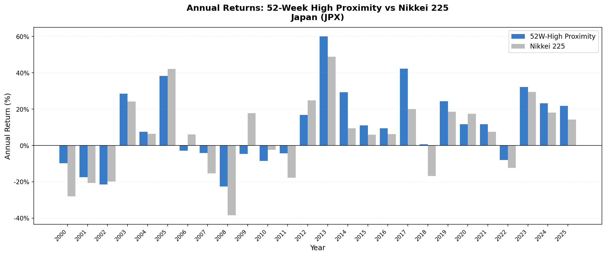
| Year | Japan Strategy | Nikkei 225 | Excess |
|---|---|---|---|
| 2000 | -9.8% | -28.0% | +18.2% |
| 2001 | -17.5% | -20.6% | +3.1% |
| 2002 | -21.5% | -19.9% | -1.7% |
| 2003 | +28.5% | +24.2% | +4.3% |
| 2004 | +7.5% | +6.4% | +1.1% |
| 2005 | +38.4% | +42.1% | -3.7% |
| 2006 | -2.9% | +6.1% | -8.9% |
| 2007 | -4.1% | -15.3% | +11.3% |
| 2008 | -22.5% | -38.5% | +16.0% |
| 2009 | -4.7% | +17.8% | -22.5% |
| 2010 | -8.6% | -2.4% | -6.1% |
| 2011 | -4.3% | -17.7% | +13.4% |
| 2012 | +16.8% | +24.9% | -8.0% |
| 2013 | +60.1% | +48.9% | +11.3% |
| 2014 | +29.4% | +9.4% | +20.0% |
| 2015 | +11.0% | +6.0% | +5.0% |
| 2016 | +9.5% | +6.2% | +3.3% |
| 2017 | +42.3% | +20.0% | +22.3% |
| 2018 | +0.6% | -16.8% | +17.4% |
| 2019 | +24.3% | +18.6% | +5.7% |
| 2020 | +11.7% | +17.5% | -5.7% |
| 2021 | +11.7% | +7.5% | +4.2% |
| 2022 | -8.0% | -12.2% | +4.2% |
| 2023 | +32.2% | +29.4% | +2.8% |
| 2024 | +23.3% | +18.1% | +5.2% |
| 2025 | +21.8% | +14.3% | +7.5% |
The "lost decade" context (2000–2012)
Japan's equity market is often described as a cautionary tale: the Nikkei peaked in December 1989 at nearly 39,000 and spent 30 years recovering. During our backtest period, the Japanese economy grew at near-zero or negative GDP rates for most of the 2000s.
In that environment, 2000 (-9.8%), 2001 (-17.5%), and 2002 (-21.5%) look difficult. But compare to the Nikkei: -28.0%, -20.6%, -19.9%. The Japan strategy lost substantially less in 2000 (+18.2% excess) and roughly in line in 2001-2002. The proximity signal in a declining market still found the relative winners within the universe.
2009 and 2010 are the notable misses. The Nikkei recovered +17.8% and -2.4% respectively. Japan's market was erratic post-2008, and the proximity signal found fewer strong setups. The strategy was -4.7% and -8.6% in those two years. These are years when the protection mechanism cut both ways: the strategy avoided some volatility but also missed part of the recovery.
2008: the crisis year shows clear protection
2008 is the clearest test. The global financial crisis hit Japan hard: the Nikkei fell 38.5%, and the yen strengthened sharply (which hurt exporters). The Japan 52-week high strategy fell 22.5%, 16.0 percentage points better than the Nikkei.
The reason: the proximity filter kept the portfolio in domestic-oriented Japanese companies that were closer to their annual highs at the start of 2008. Export-heavy industrials and financials had already broken down from their peaks before the year began. The signal naturally de-selected them.
2013: Abenomics and the biggest year at +60.1%
Prime Minister Abe's reflationary policy (massive fiscal stimulus, aggressive monetary easing, structural reform) launched in late 2012 and generated one of Japan's strongest equity market years in decades. The Nikkei rose 48.9% in 2013.
The 52-week high proximity strategy returned +60.1%, outperforming by 11.3%. The signal was already positioned in Japan's strongest companies when the Abenomics rally accelerated. The proximity filter had selected the stocks that maintained relative strength through the market's bottom in 2012. Those same stocks were the first to break out as the policy shift took hold.
2022 protection: -8.0% vs Nikkei -12.2%
2022 shows the same pattern as other markets in this series. US rate hikes drove a global selloff. But Japan's central bank maintained ultra-loose policy. The Bank of Japan held rates near zero and continued yield curve control through 2022. Japanese equities were less sensitive to the global rate shock than US markets.
The proximity signal found the subset of Japanese stocks holding relative strength within that environment: domestically-oriented companies, banks that benefited from steepening yield expectations, and exporters benefiting from a weakening yen. The result: -8.0% while the Nikkei fell 12.2% (+4.2% excess).
2025: +21.8%, outperforming as the yen repatriates
2025's +21.8% against the Nikkei's +14.3% reflects Japan's ongoing normalization. The Bank of Japan began rate hikes in 2024. Japanese institutional capital, long invested abroad in higher-yielding assets, began repatriating. Domestic equity markets benefited. The proximity signal captured the leading edge of that reallocation with +7.5% excess return.
Why Japan Is the Risk-Adjusted Story
Japan's flat market over most of the 2000s is the reason the risk-adjusted numbers are interesting. In a structurally weak market, the average stock does poorly. The proximity signal doesn't find the average stock. It finds the stocks showing relative strength within that weak environment.
Those stocks tend to be:
- Companies with strong domestic earnings insulated from export headwinds and currency pressure
- Companies where institutional ownership has been buying (pushing price toward annual highs)
- Companies that have already survived a downturn and are early in a recovery cycle
Japan's equity market has high institutional participation from domestic insurance companies, pension funds, and the Government Pension Investment Fund (GPIF). When these large buyers accumulate a position, the stock naturally rises toward its annual high. The proximity signal captures these institutionally-driven moves before the full repricing.
The near-zero cash periods (2%) reflect Japan's market depth. The JPX universe has thousands of qualifying companies above the ¥100B market cap threshold. Even in weak markets, 30 companies are near their 52-week highs. The protection mechanism operates through stock selection rather than cash migration.
Limitations
JPY currency risk. Returns are in JPY. The yen has been volatile against the USD over this period: strengthening sharply in 2008, weakening significantly from 2012–2022, then strengthening again. International investors absorb that volatility on top of the equity returns.
41.3% down capture is incomplete protection. In a severe global event, the Japan strategy still absorbs a meaningful portion of the decline through stock losses rather than cash. The protection is real but not absolute.
Max drawdown of 42.75%. Better than the Nikkei's 61.06% but still a large peak-to-trough loss. A 2007-entry investor would have experienced a painful 2008.
Survivorship bias. Japanese companies that delisted during the 25-year period aren't fully tracked. Japan has had notable corporate failures and takeovers. This likely understates historical drawdowns.
Run This Screen Yourself
Current 52-week high proximity screen (Japanese stocks):
WITH price_window AS (
    SELECT
        symbol,
        TRY_CAST(date AS DATE) AS trade_date,
        adjClose,
        high,
        dateEpoch,
        MAX(high) OVER (
            PARTITION BY symbol ORDER BY dateEpoch
            ROWS BETWEEN 251 PRECEDING AND CURRENT ROW
        ) AS high_52w,
        COUNT(*) OVER (
            PARTITION BY symbol ORDER BY dateEpoch
            ROWS BETWEEN 251 PRECEDING AND CURRENT ROW
        ) AS row_count
    FROM stock_eod
    WHERE TRY_CAST(date AS DATE) >= CURRENT_DATE - INTERVAL '14' MONTH
      AND adjClose > 0 AND high > 0
),
latest AS (
    SELECT symbol, adjClose, high_52w
    FROM price_window
    WHERE trade_date >= CURRENT_DATE - INTERVAL '10' DAY
      AND high_52w > 0 AND row_count >= 100
    QUALIFY ROW_NUMBER() OVER (PARTITION BY symbol ORDER BY dateEpoch DESC) = 1
)
SELECT
    l.symbol,
    p.companyName,
    p.sector,
    ROUND(l.adjClose / l.high_52w, 4) AS proximity_ratio,
    ROUND(p.marketCap / 1e9, 2) AS mktcap_bn_jpy
FROM latest l
JOIN profile p ON l.symbol = p.symbol
WHERE p.exchange = 'JPX'
  AND p.marketCap > 100000000000
ORDER BY proximity_ratio DESC
LIMIT 30
Run this screen on Ceta Research
The full backtest code (Python + DuckDB) is on GitHub.
Part of a Series
This post is part of our 52-week high proximity global exchange comparison:
- India (NSE): 19.0% CAGR, +7.8% vs Sensex
- Korea (KSC): 12.1% CAGR, +7.3% vs KOSPI
- Thailand (SET): 10.5% CAGR, +6.7% vs SET
- Global Comparison: 52-Week High Proximity Across Exchanges
References
- George, T. & Hwang, C. (2004). "The 52-Week High and Momentum Investing." Journal of Finance, 59(5), 2145–2176.
- Jegadeesh, N. & Titman, S. (1993). "Returns to Buying Winners and Selling Losers: Implications for Stock Market Efficiency." Journal of Finance, 48(1), 65–91.
- Daniel, K., Hirshleifer, D. & Subrahmanyam, A. (1998). "Investor Psychology and Security Market Under- and Overreactions." Journal of Finance, 53(6), 1839–1885.
Data: Ceta Research (FMP financial data warehouse). Universe: JPX, market cap > ¥100B. Quarterly rebalance, equal weight, next-day close execution, transaction costs included, 2000–2025. Returns in JPY, benchmark Nikkei 225.
Past performance does not guarantee future results. This is educational content, not investment advice.